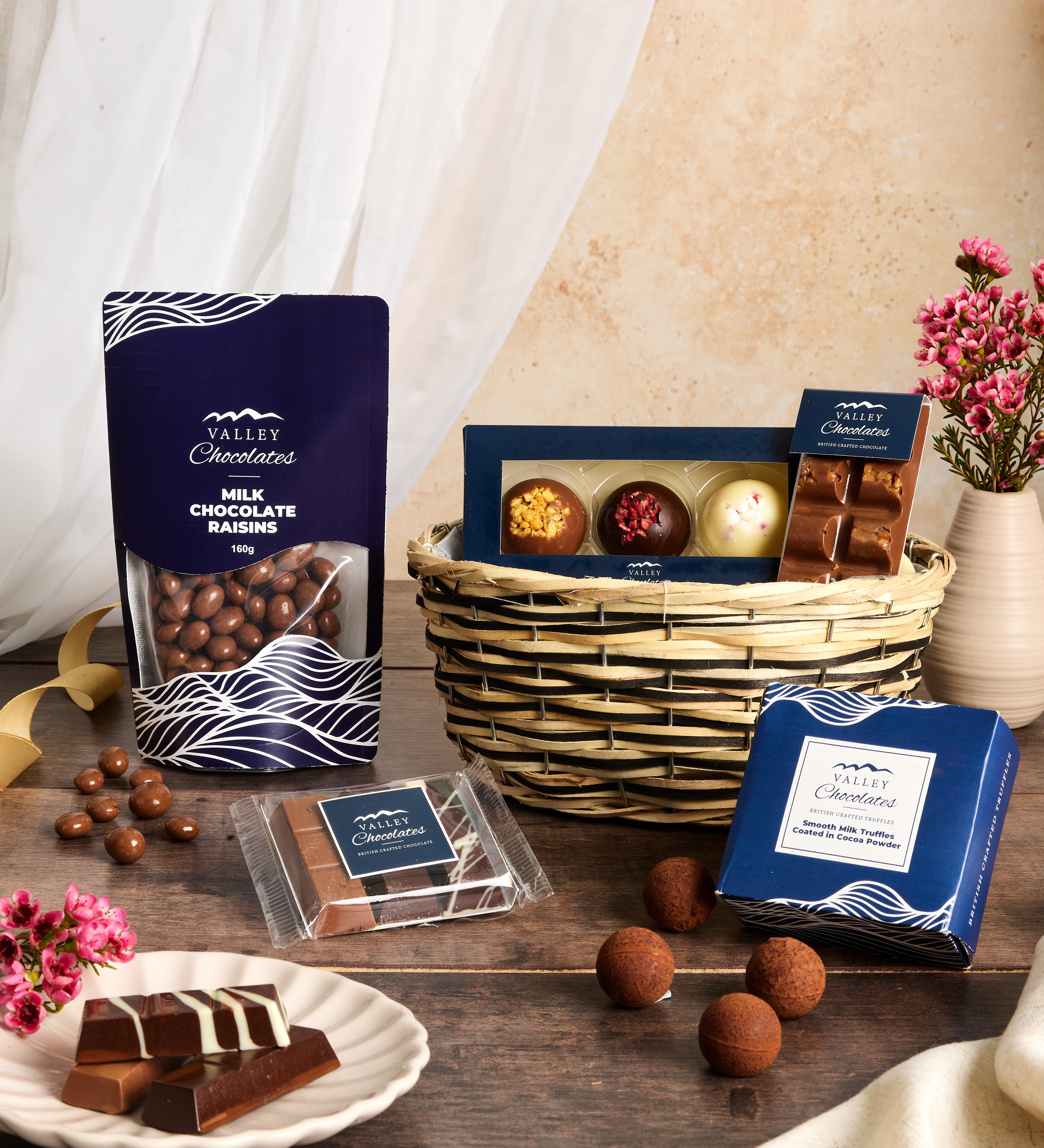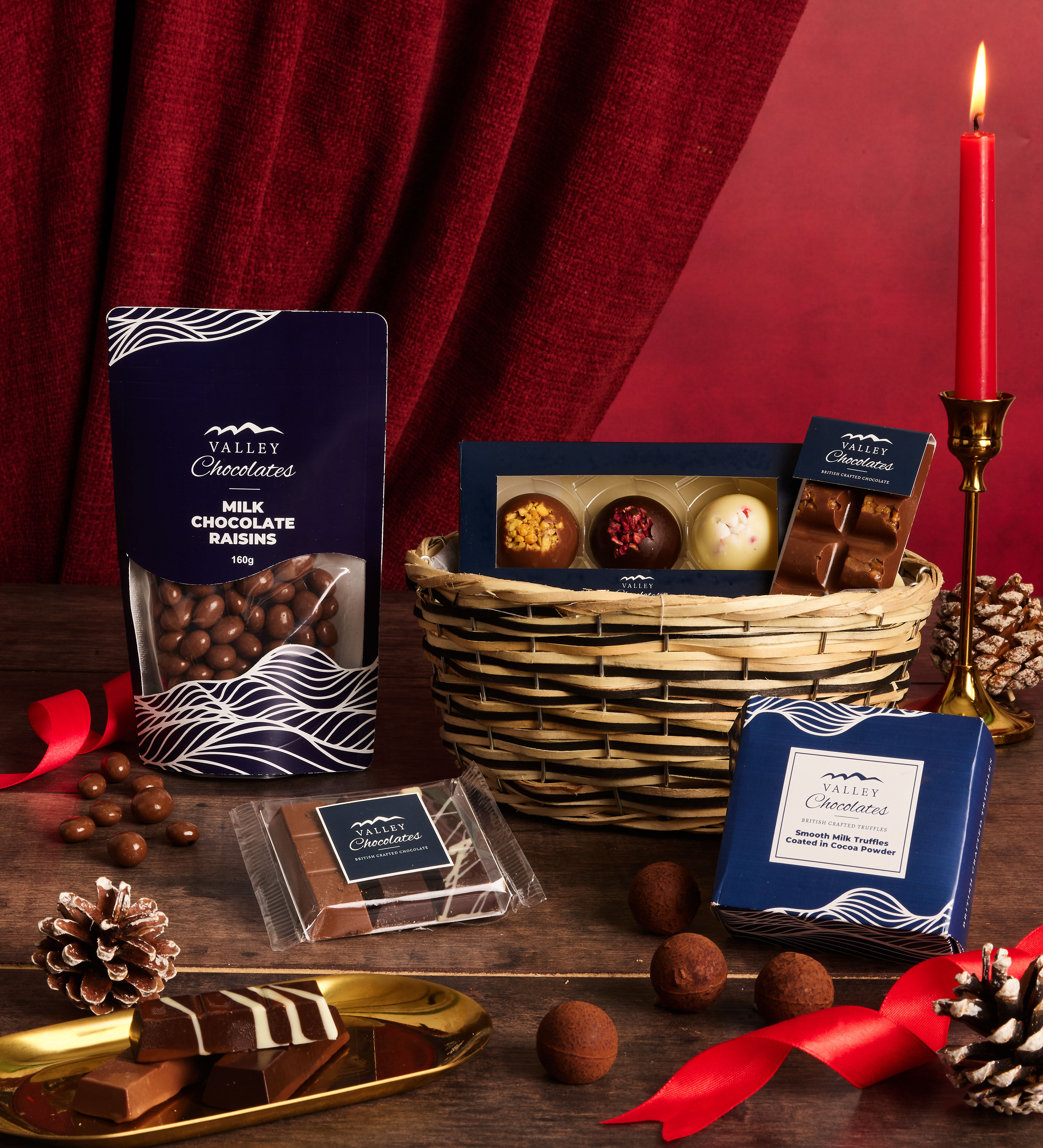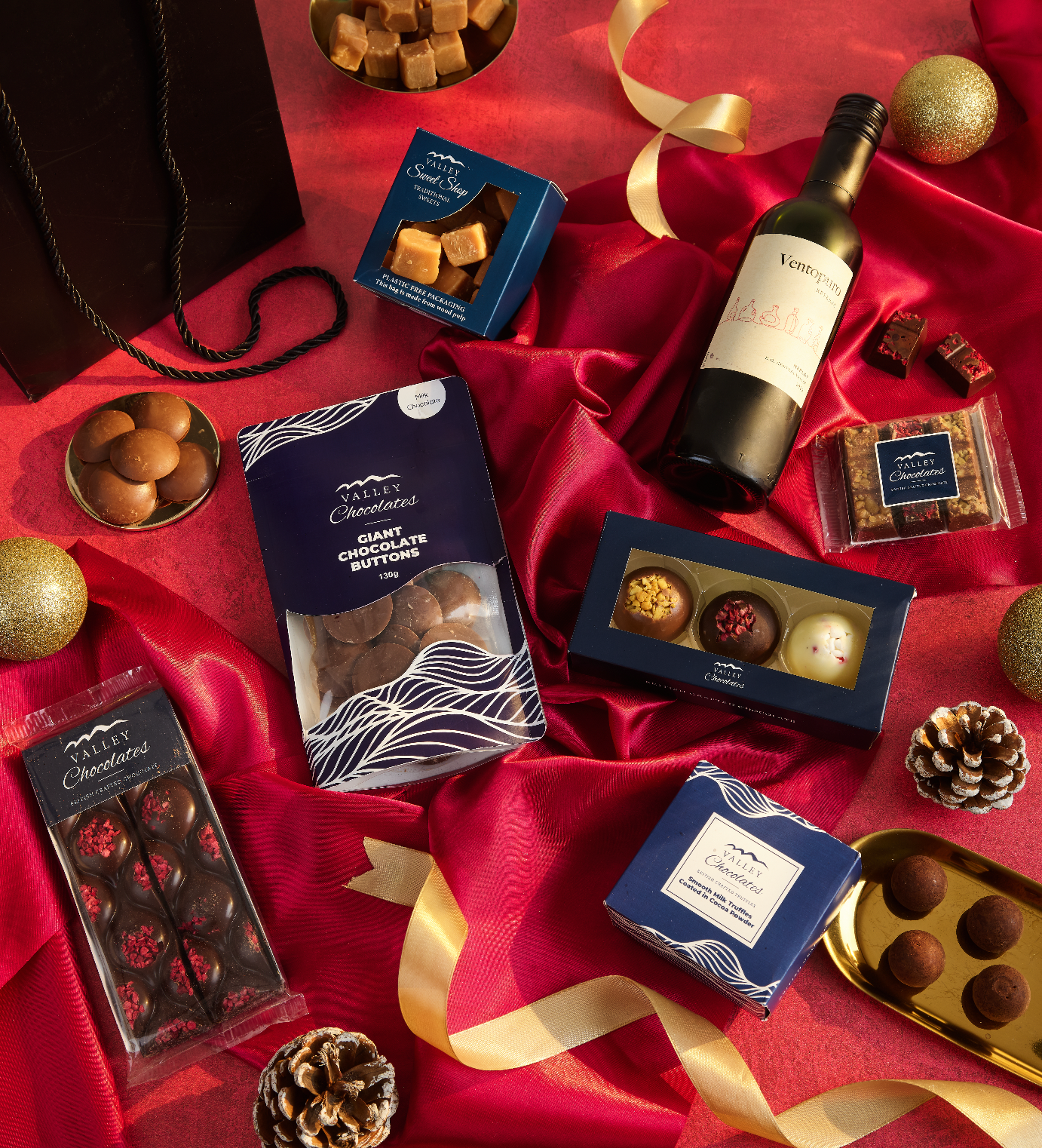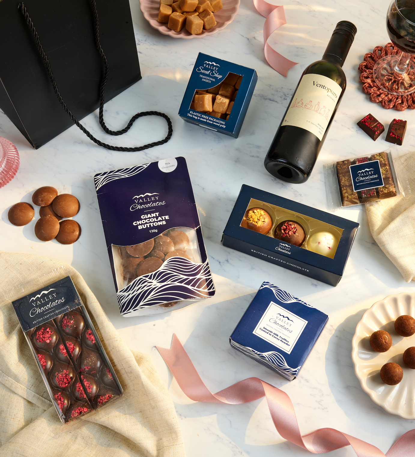
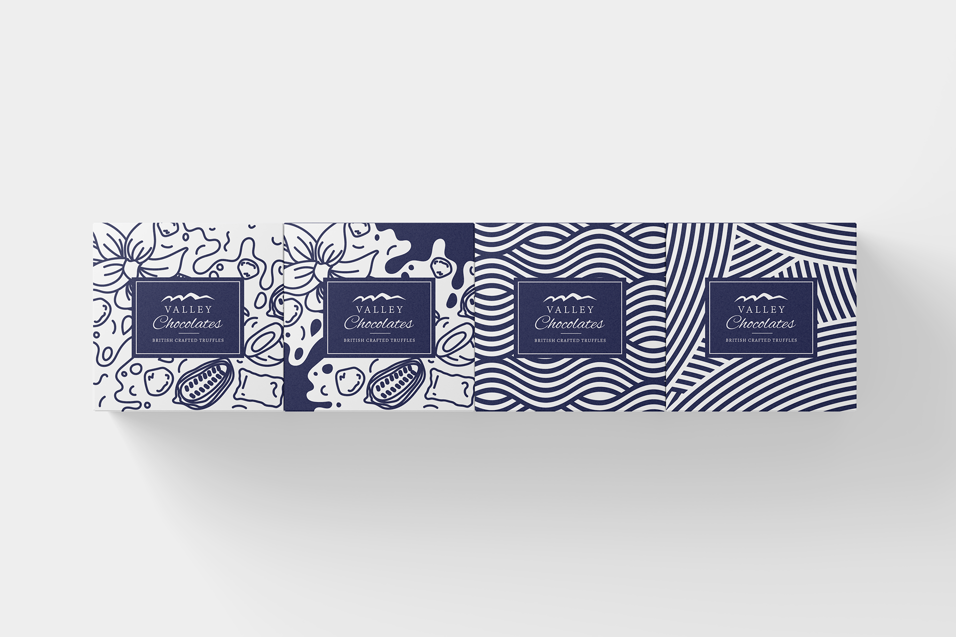
Valley Chocolates – Brand-Led Packaging System
Stand-Up Pouch & Truffle Box | Prestige Gifting
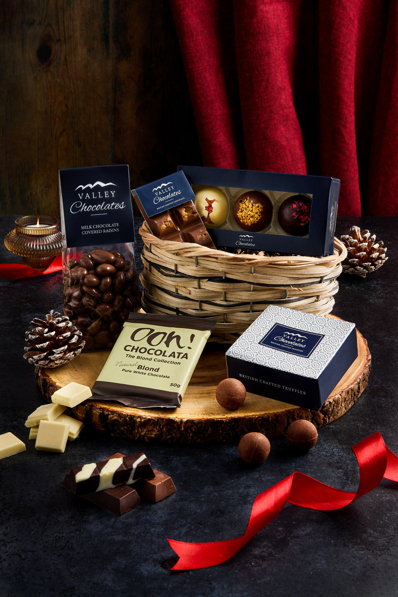
This packaging series was developed during my time at Prestige Gifting for their in-house confectionery brand, Valley Chocolates. The brief from the marketing team was clear: create a packaging system that visually reinforces the brand name “Valley,” while ensuring consistency across product types and suitability for all-year-round retailing.
Stand-Up Pouch & Truffle Box | Prestige Gifting
This packaging series was developed during my time at Prestige Gifting for their in-house confectionery brand, Valley Chocolates. The brief from the marketing team was clear: create a packaging system that visually reinforces the brand name “Valley,” while ensuring consistency across product types and suitability for all-year-round retailing.
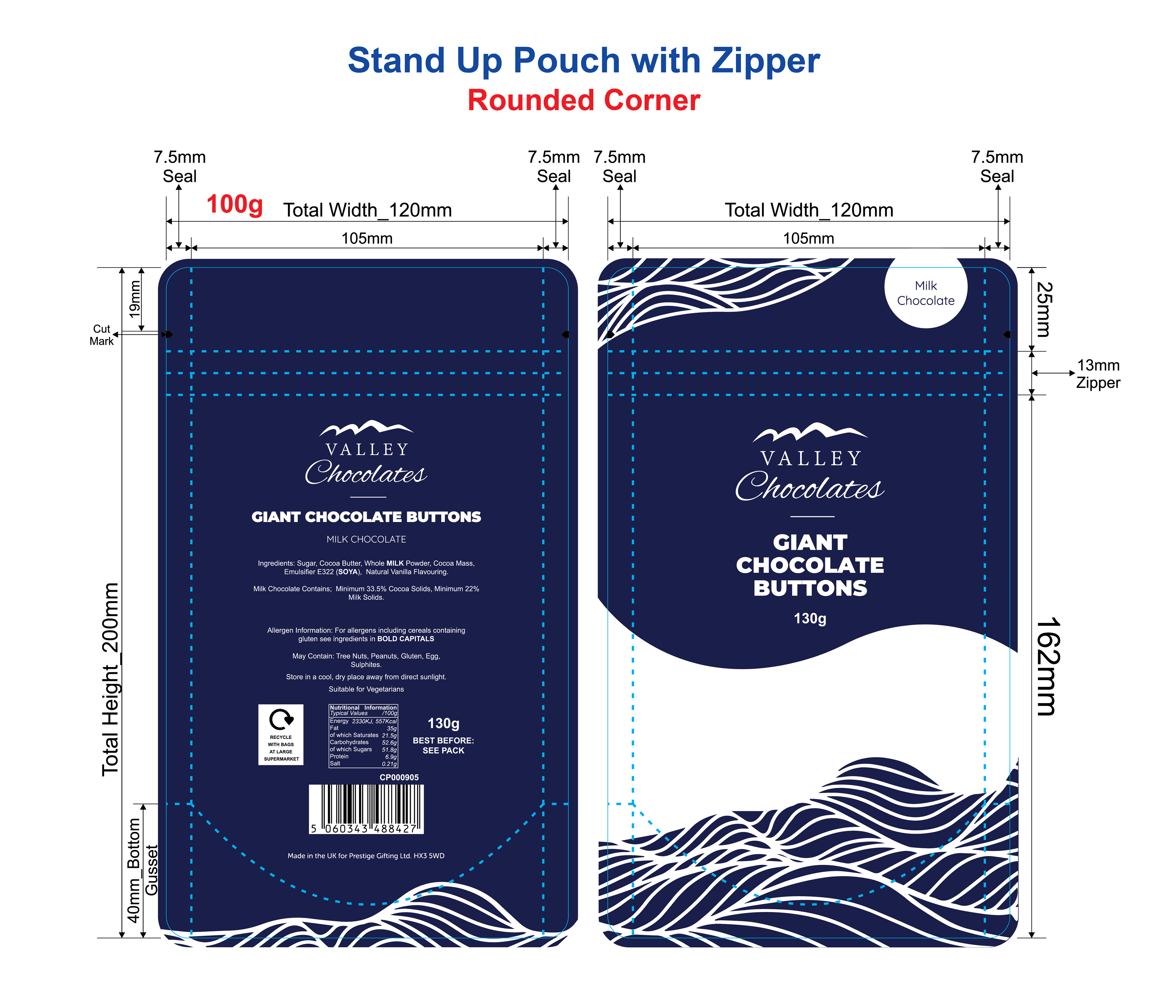
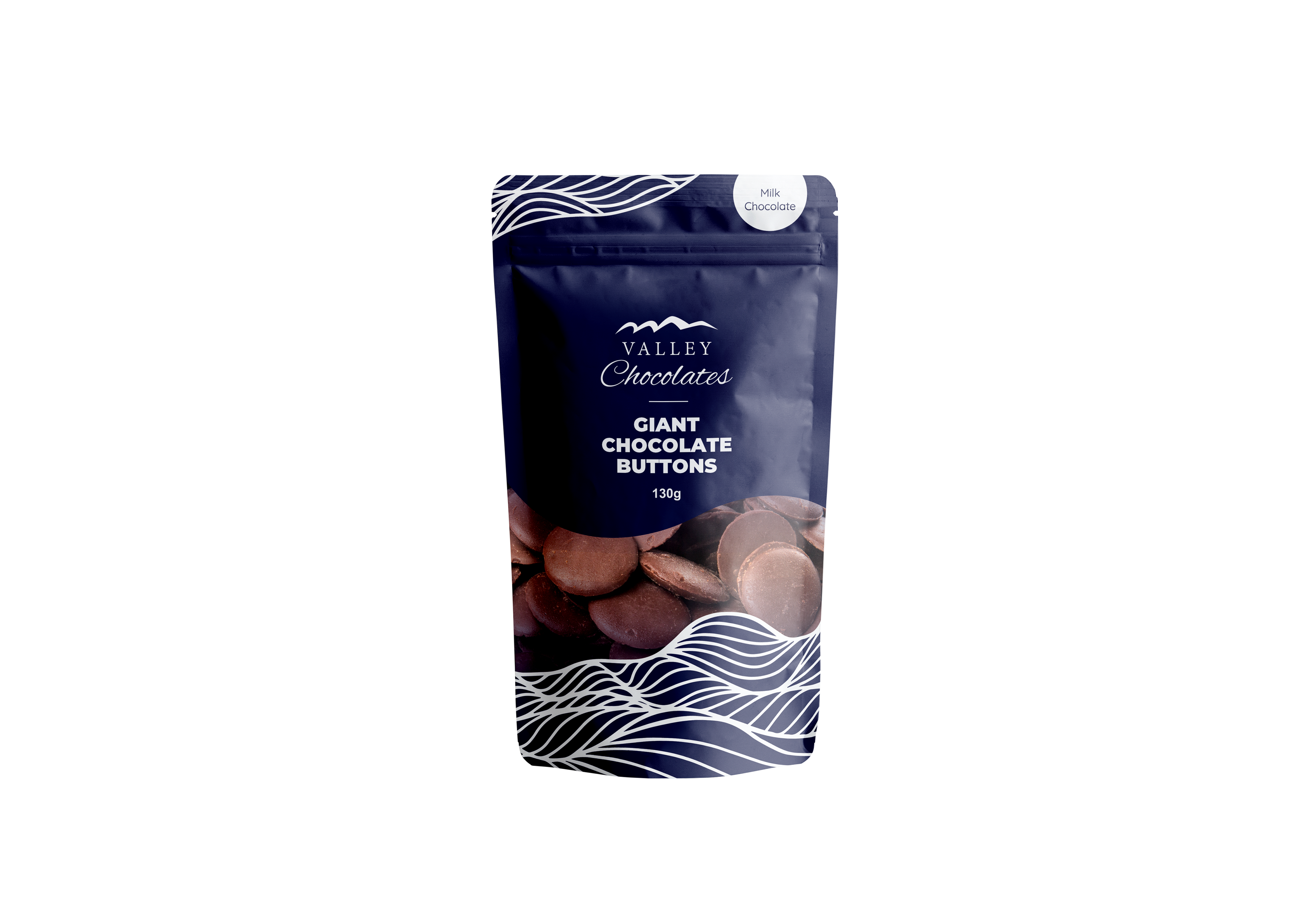
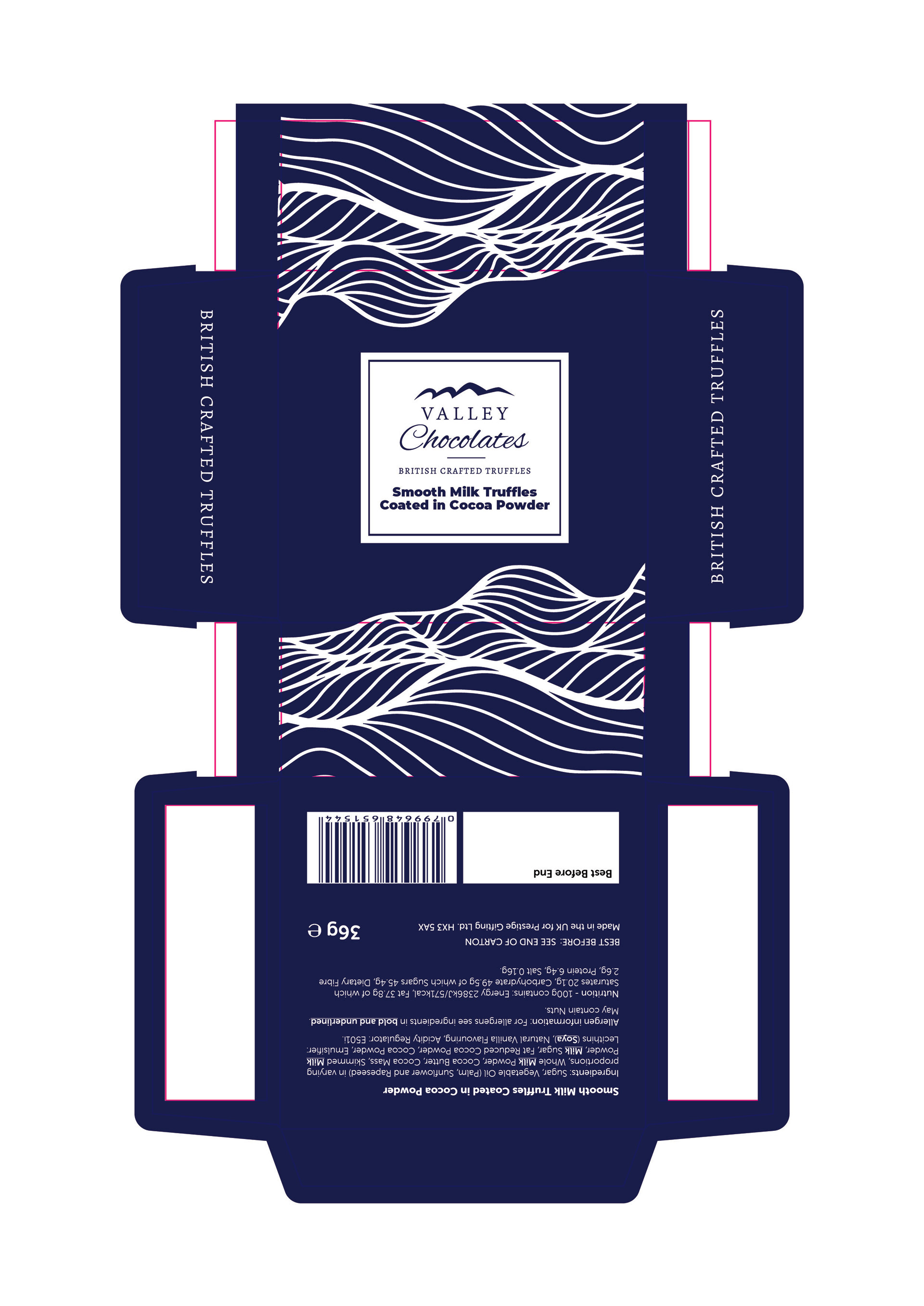
To respond to this, I designed a unified graphic system featuring flowing wave motifs that subtly reference the shape of valleys—directly linking the visuals to the brand identity. These dynamic line illustrations evoke a sense of natural elegance and movement, while also suggesting the richness and smoothness of melted chocolate.
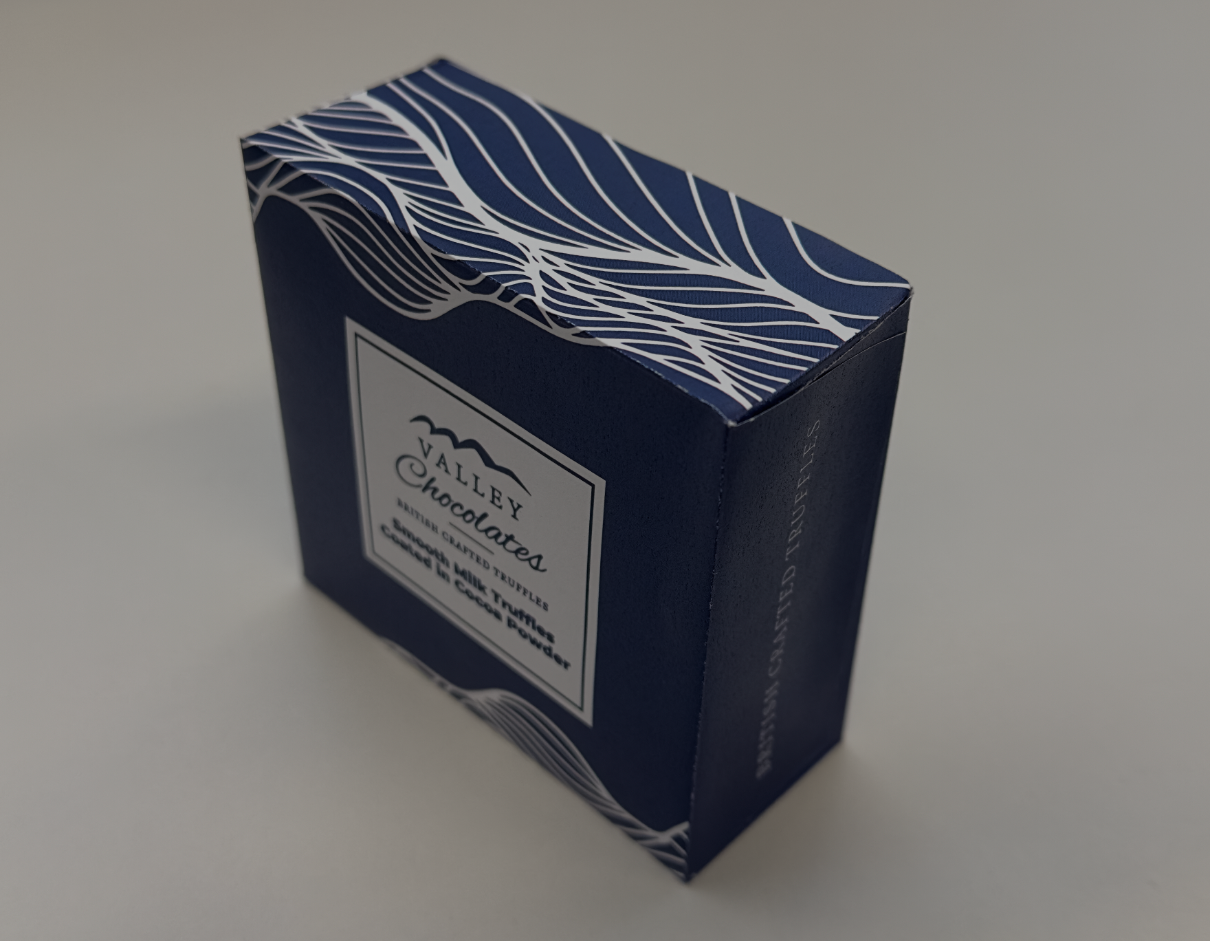
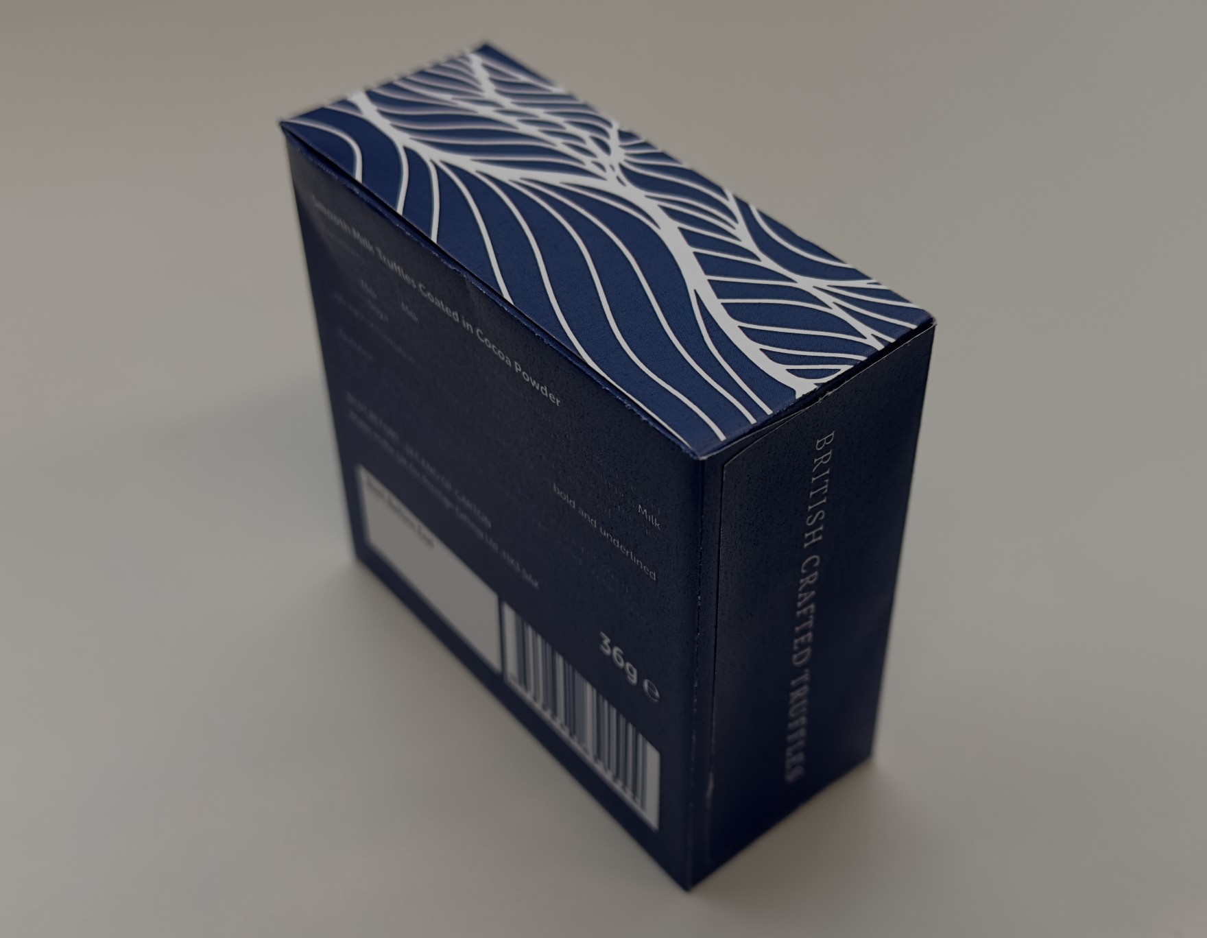
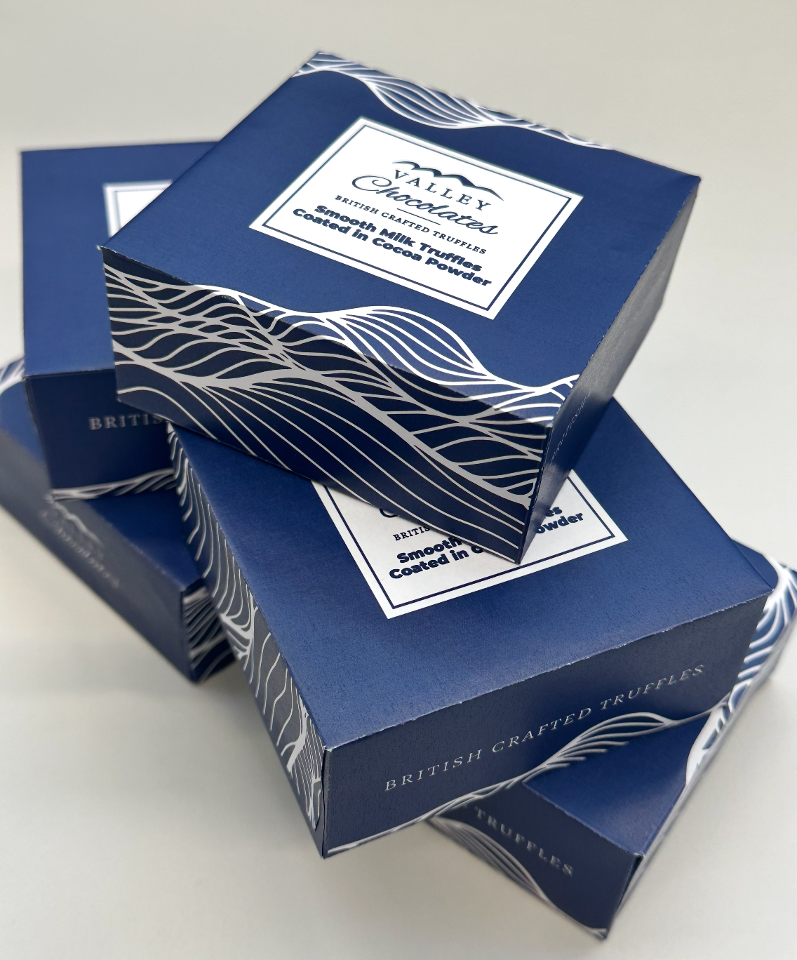
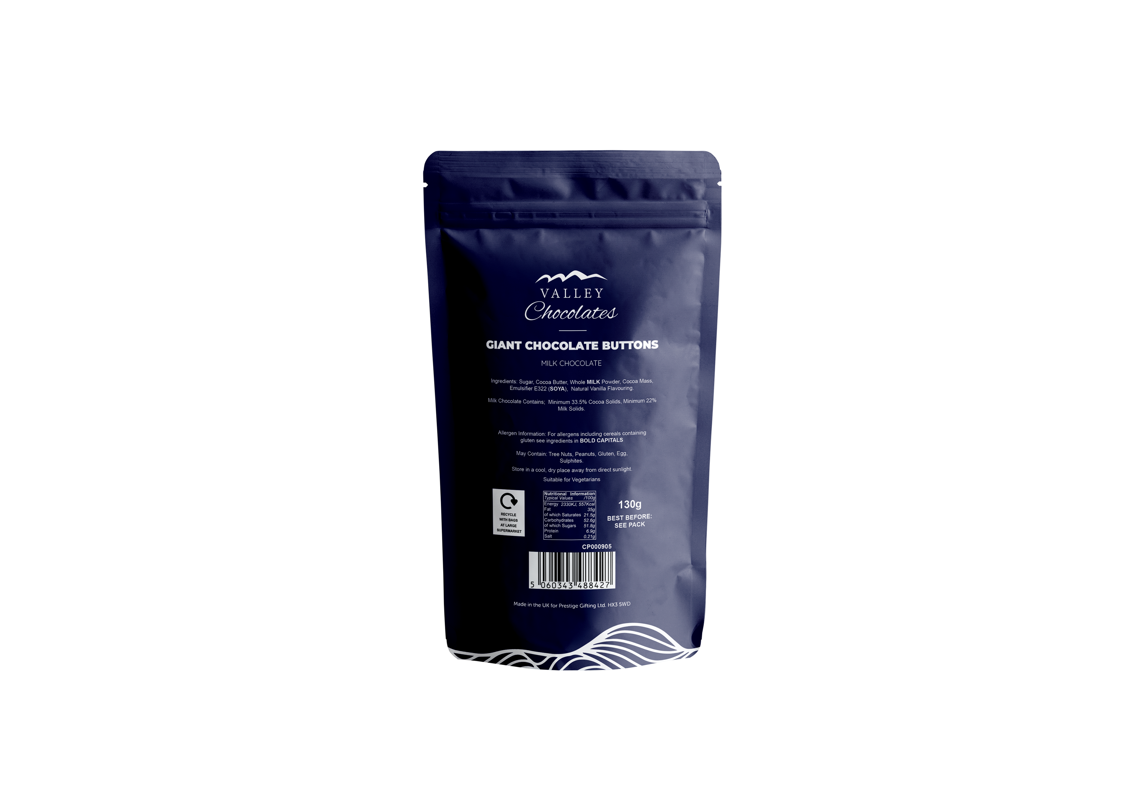
The series includes a stand-up pouch for products such as milk chocolate raisins and buttons, and a truffle box for cocoa-dusted milk truffles. Despite the different formats, the packaging maintains strong visual cohesion through shared colours (a deep, premium navy), typography, and graphic language. The pouch includes a resealable zipper for practicality, while the box was developed with a clean dieline for easy stacking and gifting appeal.
This was an all-year-round packaging solution, designed to be versatile enough for seasonal promotions while maintaining an evergreen retail presence. I was responsible for concept development, visual identity execution, packaging layout, and print-ready artwork delivery.

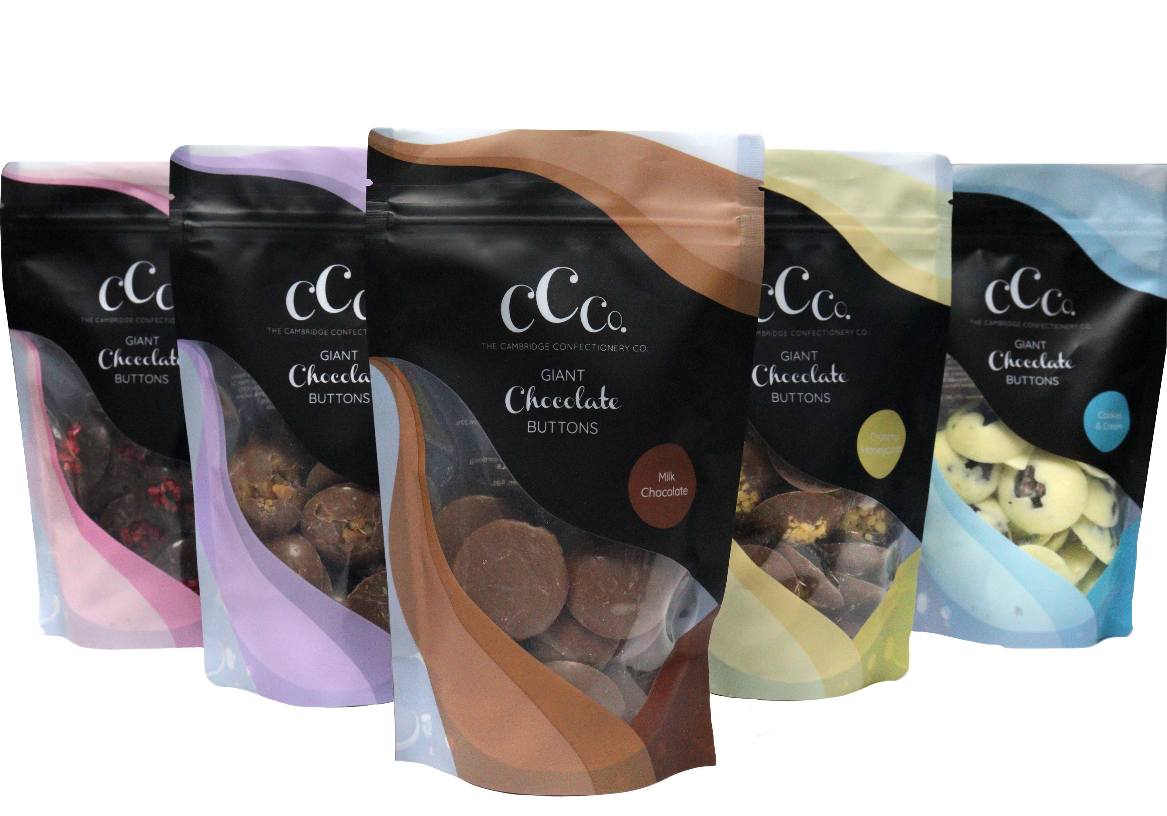
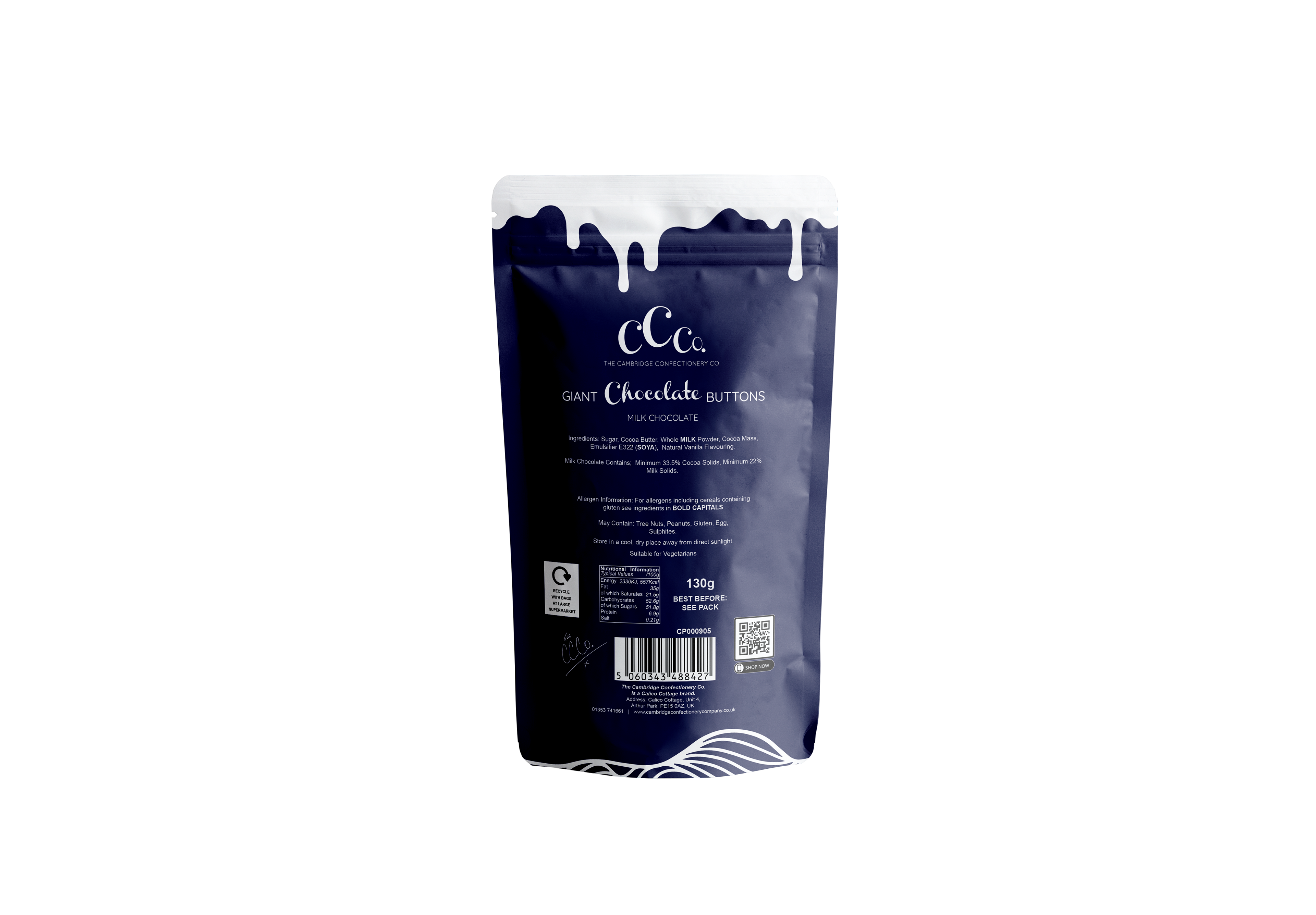
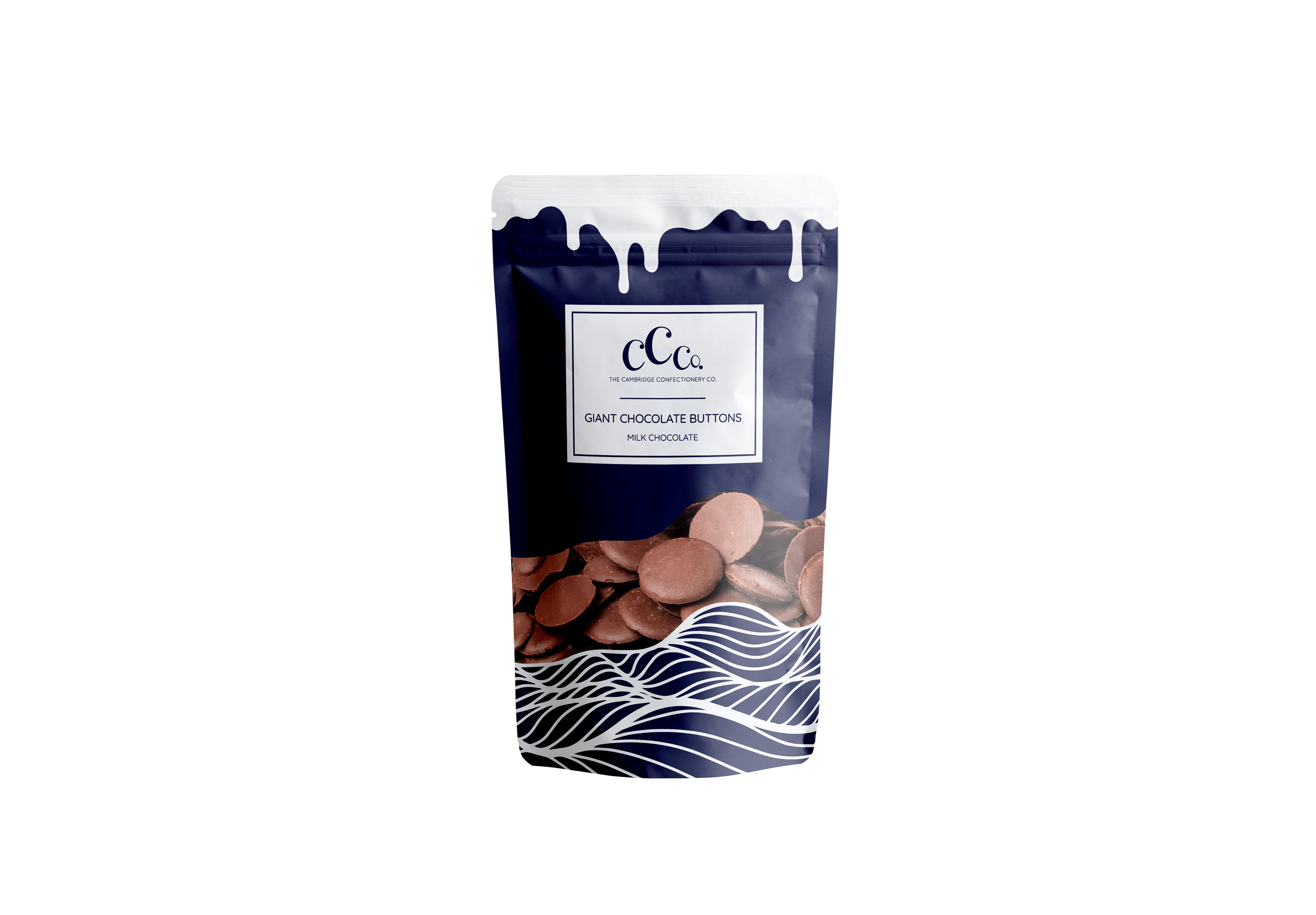
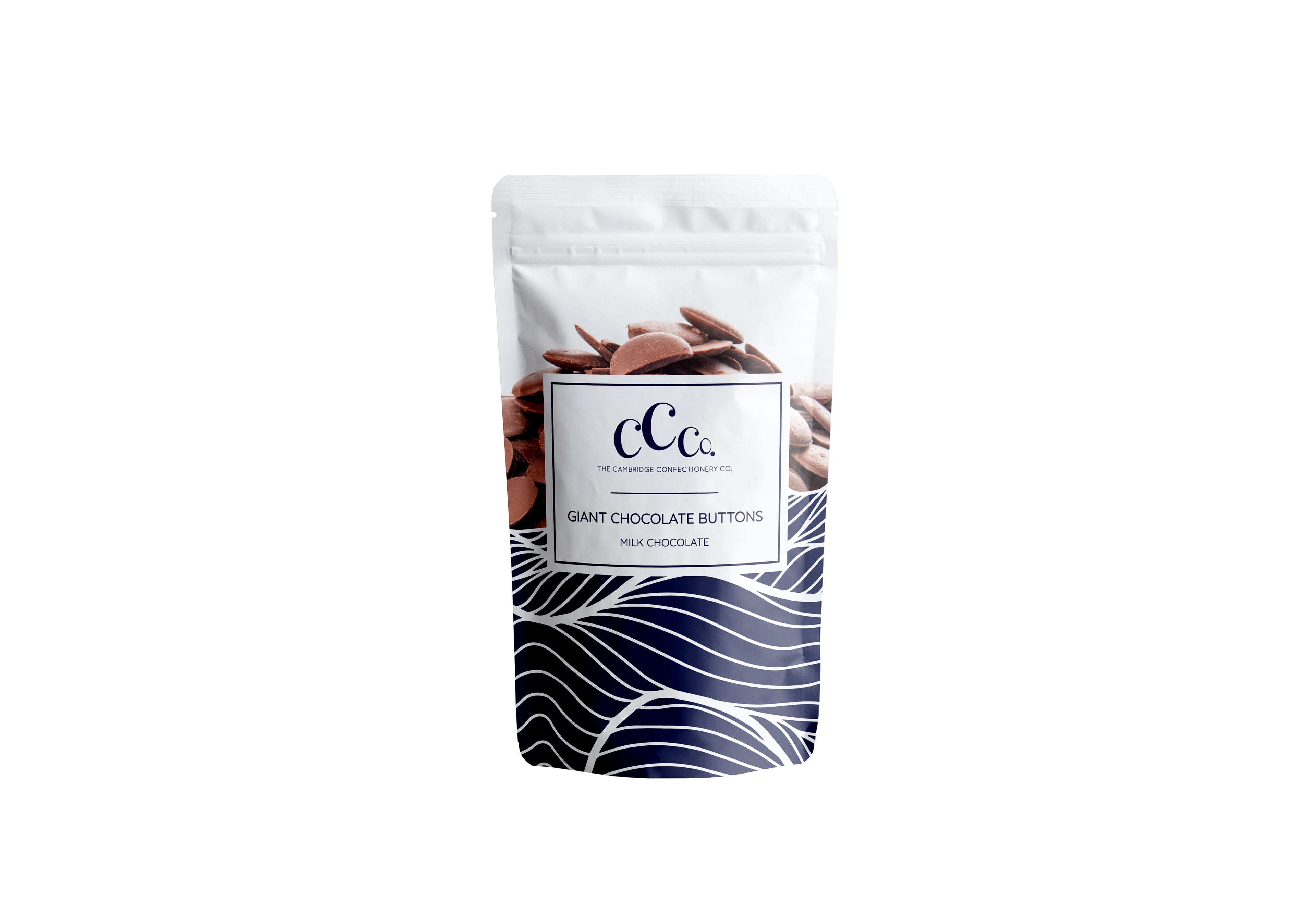
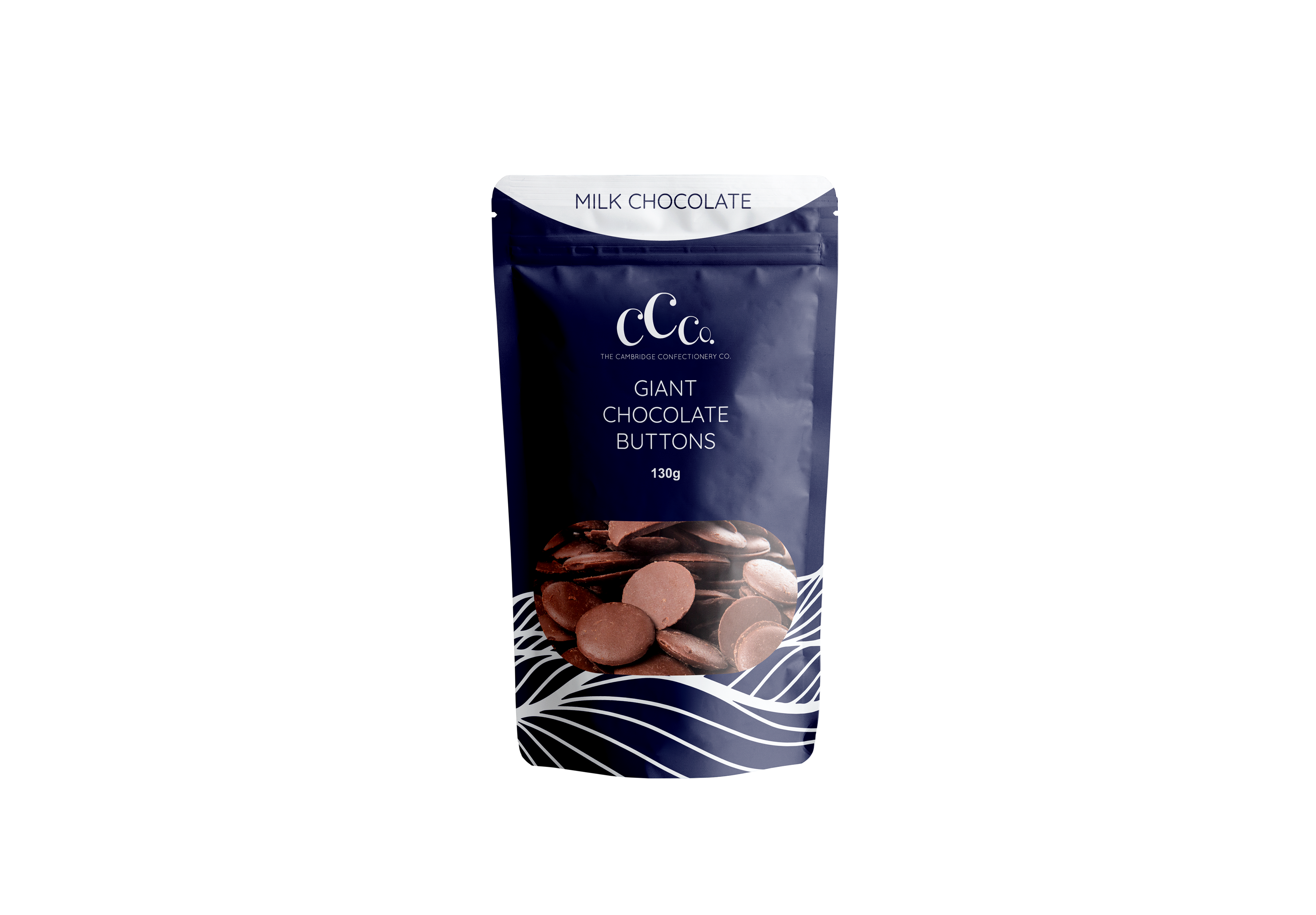
This packaging concept was developed as a redesign of the supplier’s original format for The Cambridge Confectionery Co.’s Giant Chocolate Buttons range. While the initial packaging featured bold flavour-led colour blocking and curved graphics, it lacked a unified brand story and premium finish.
Packaging Concept (Version 1)
Exploratory Design for Giant Chocolate Buttons
Exploratory Design for Giant Chocolate Buttons
This version explores a bold and playful concept for The Cambridge Confectionery Co.’s Giant Chocolate Buttons. The packaging features a rich navy background contrasted by a white chocolate drip graphic at the top—visually suggesting indulgence and flavour, while making the pouch instantly recognisable on shelves.
The lower section retains the signature wave motif used across the brand's range, reinforcing continuity and echoing the flowing form of melted chocolate. A transparent product window integrates seamlessly with the wave, balancing visual appetite appeal with brand identity.
Typography is minimal and refined, placed centrally to maintain clarity and hierarchy. This concept aims to convey quality, fun, and modernity—positioning the product as both everyday indulgence and giftable treat.
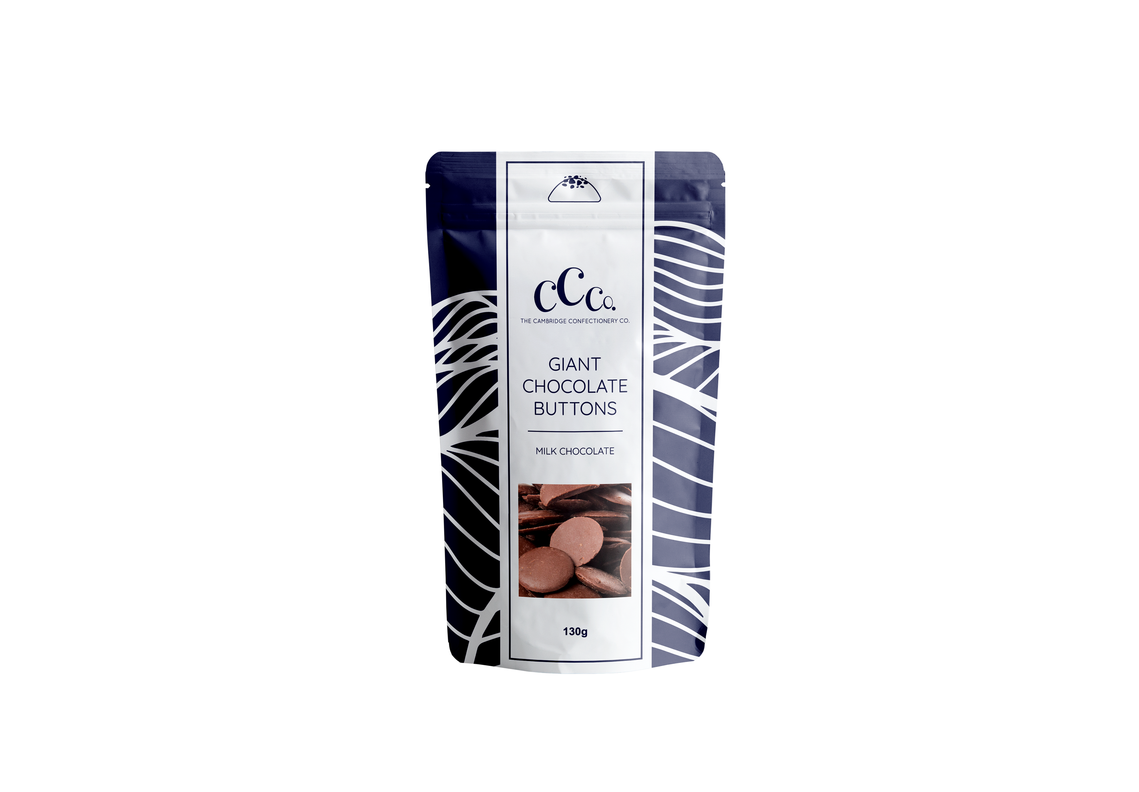
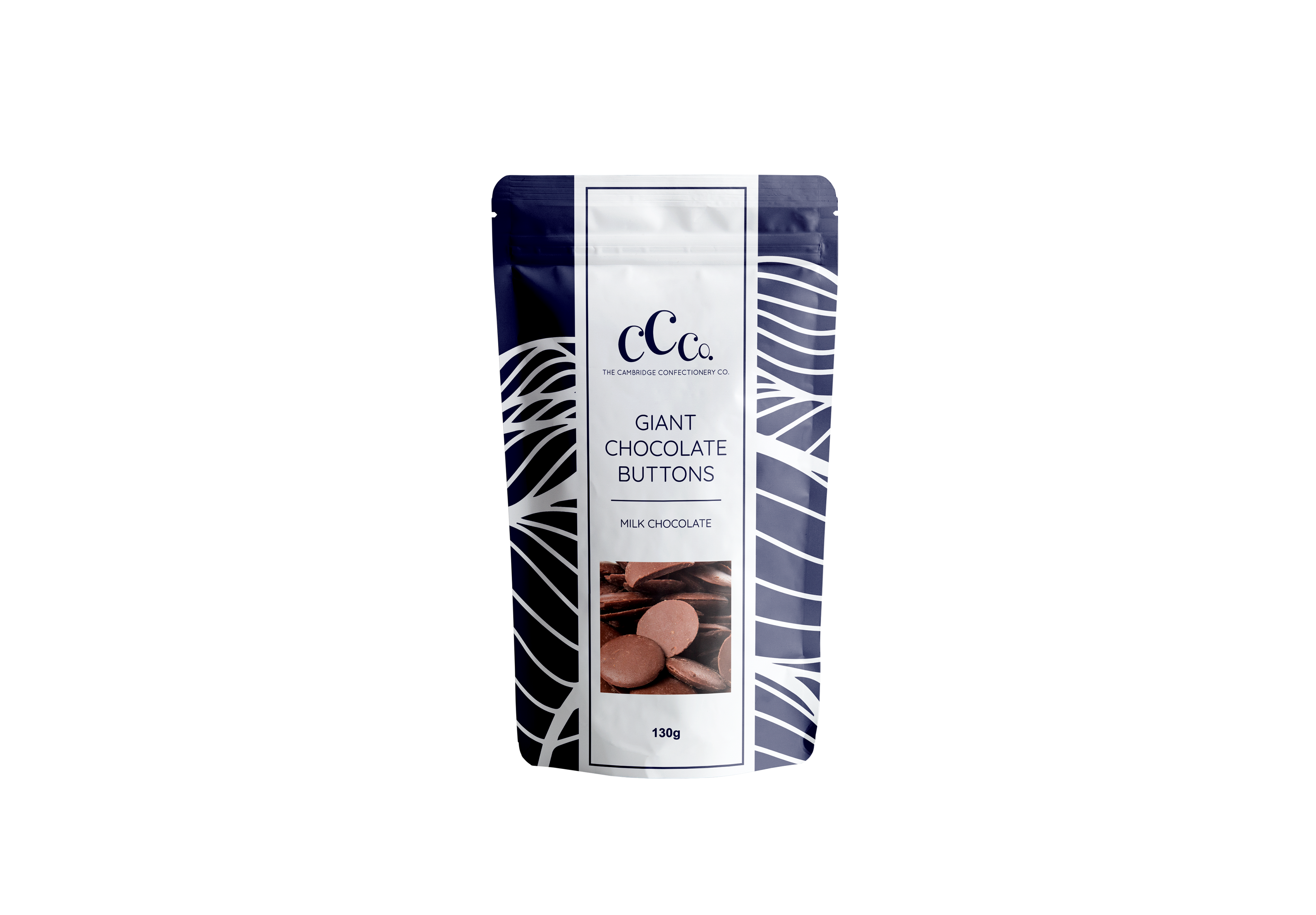

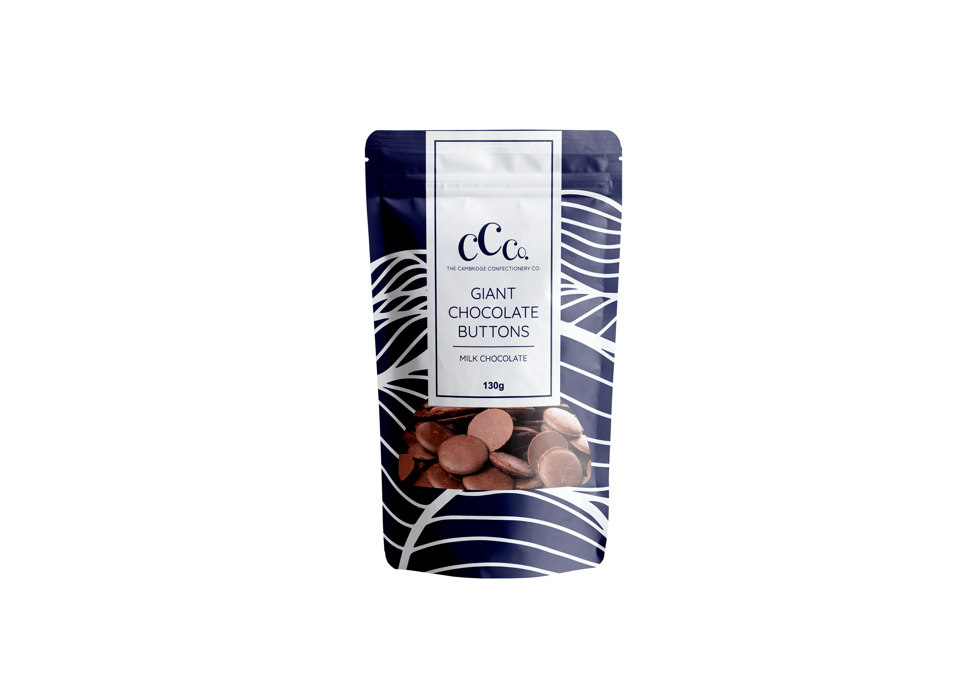
Final Version Design
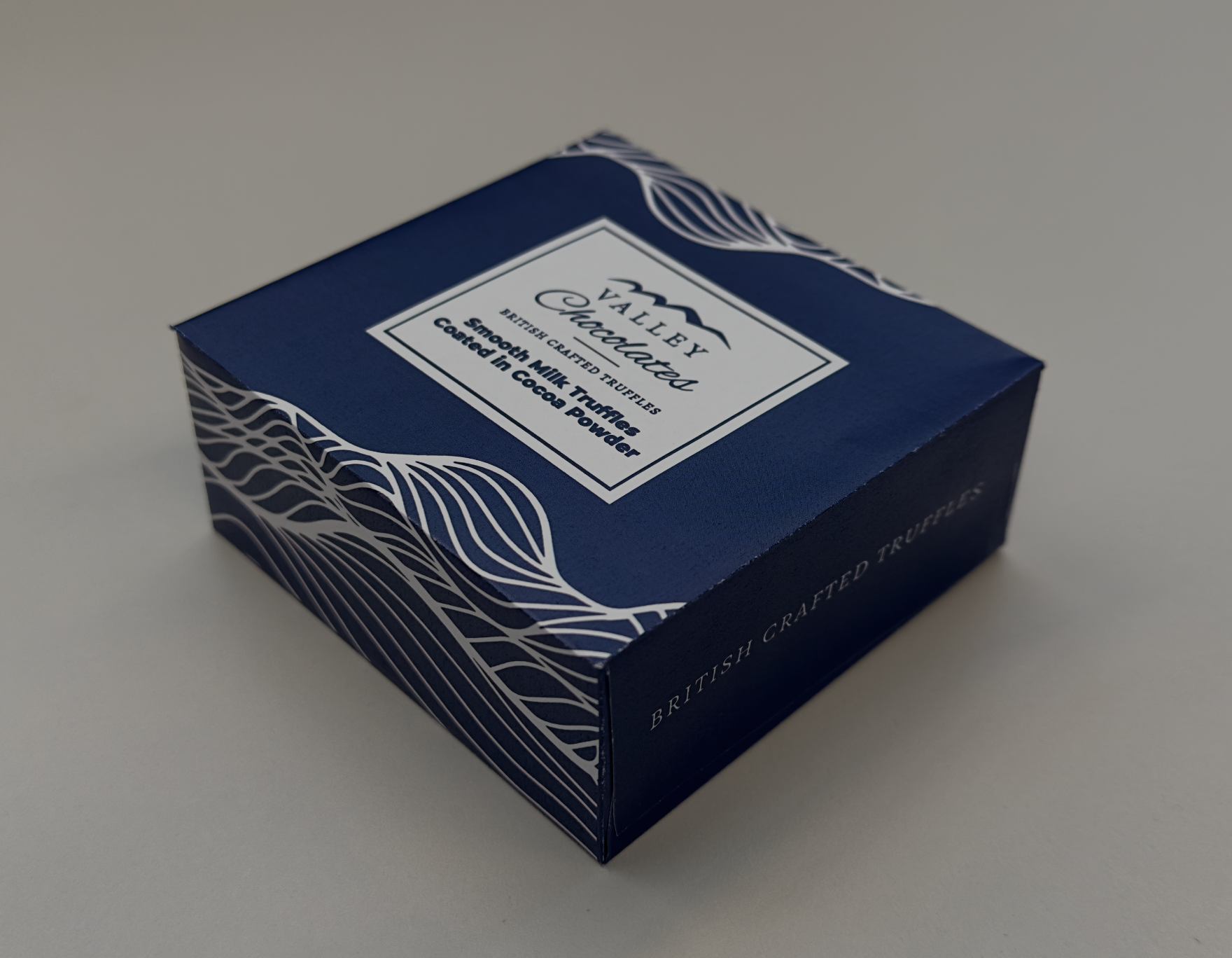
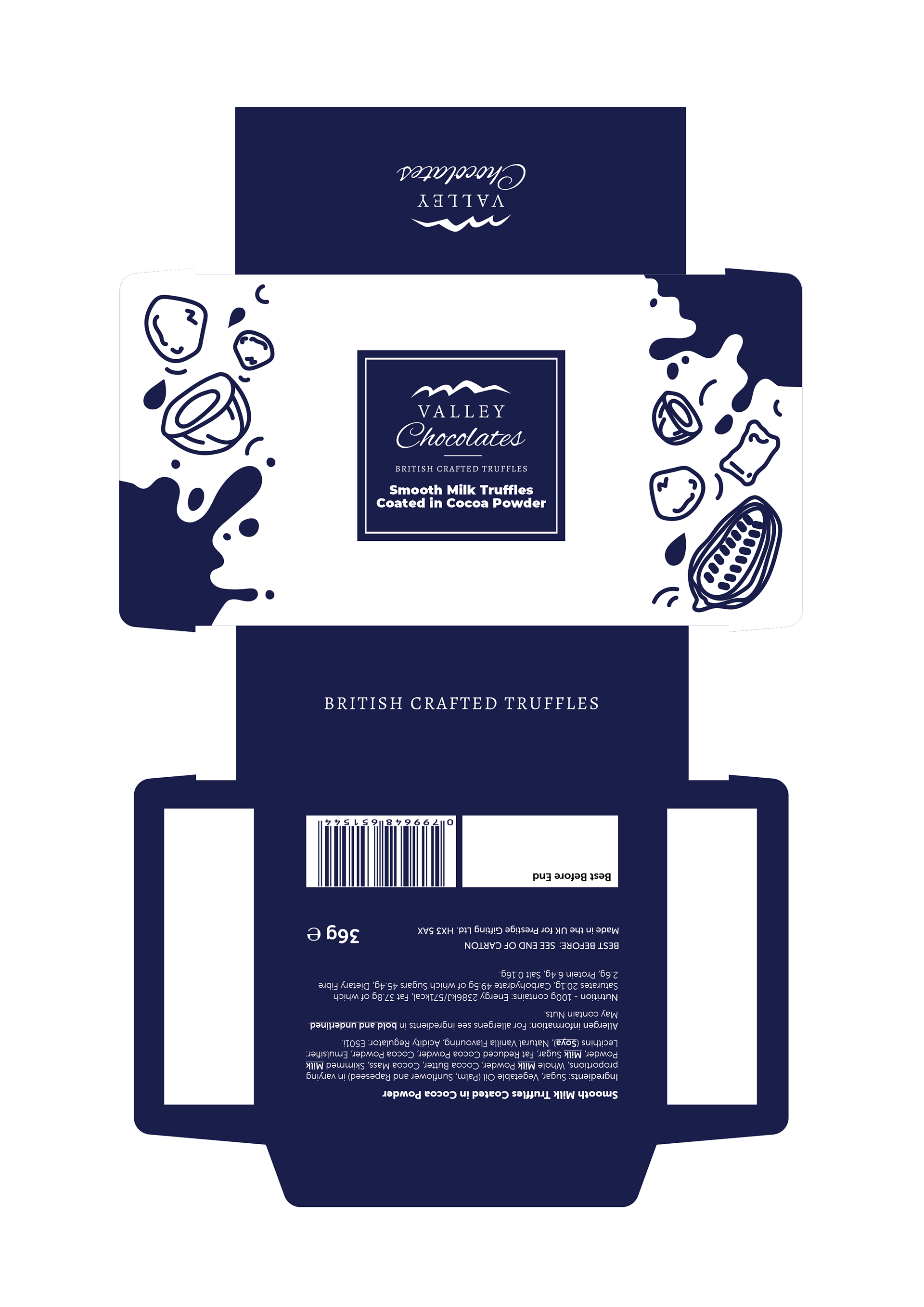
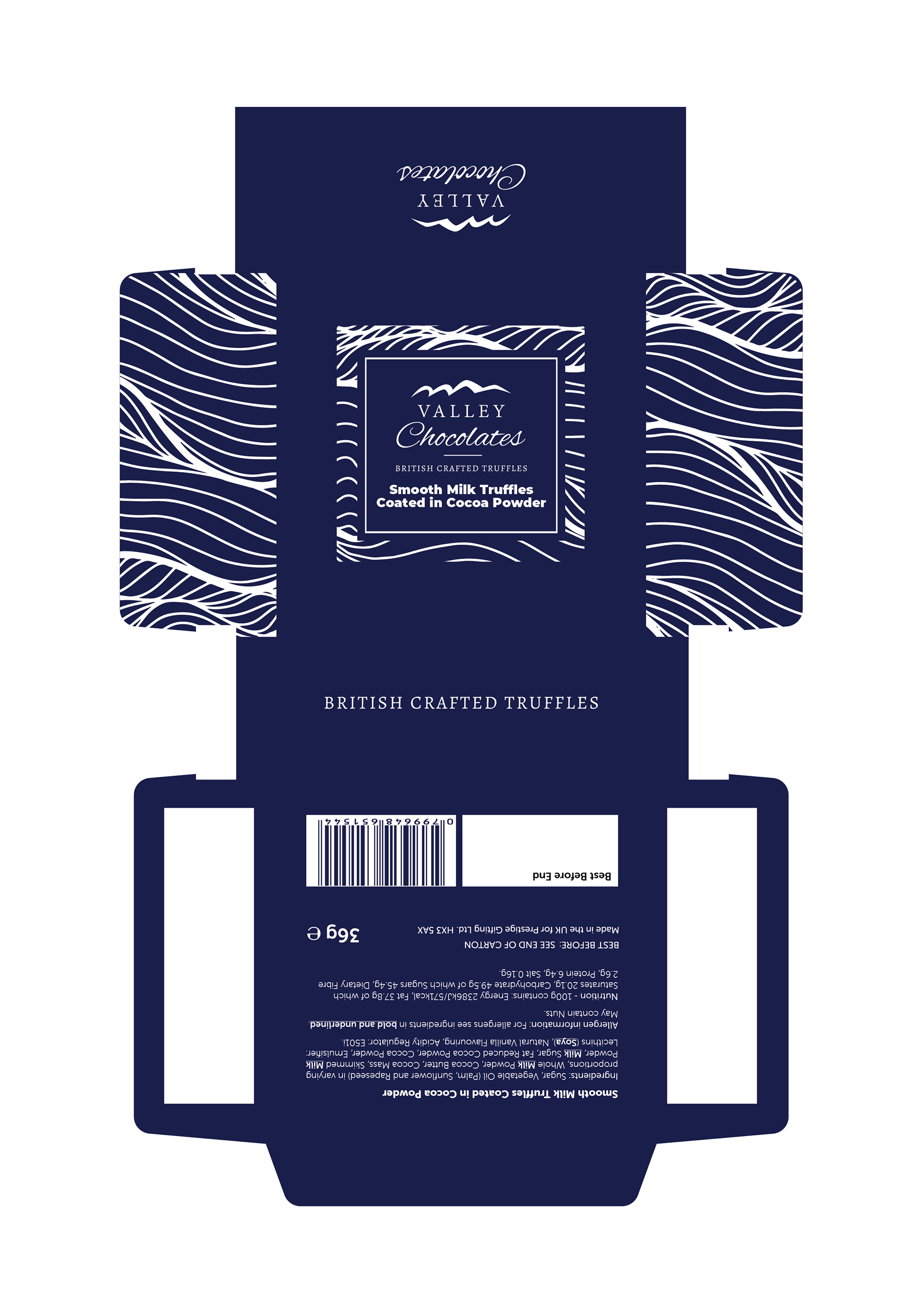
Valley Chocolates – Truffle Box Redesign
Packaging Refresh Based on Existing Format | Prestige Gifting
Packaging Refresh Based on Existing Format | Prestige Gifting
This truffle box design was created as a visual refresh for Valley Chocolates’ existing gift range. The original packaging featured a dense geometric pattern with a centered logo label. While it communicated a certain level of traditional luxury, it lacked a clear link to the overall Valley Chocolates brand identity and appeared visually disconnected from the rest of the product line.
In response, I reimagined the packaging to better align with the core brand elements. The updated design replaces the patterned background with a bold, minimalist navy tone, and introduces the signature wave motif—a key element across the brand's new packaging range, symbolising the flowing richness of chocolate and referencing the “Valley” in the brand name.
Typography and layout were simplified to enhance legibility and elegance, and the logo was placed in a more prominent, framed position to reinforce brand recognition. The result is a more modern, cohesive and giftable design that feels part of a wider family of products while still standing out on its own.
This project demonstrates my ability to evolve existing packaging by maintaining structural consistency while elevating the brand narrative through thoughtful visual storytelling.
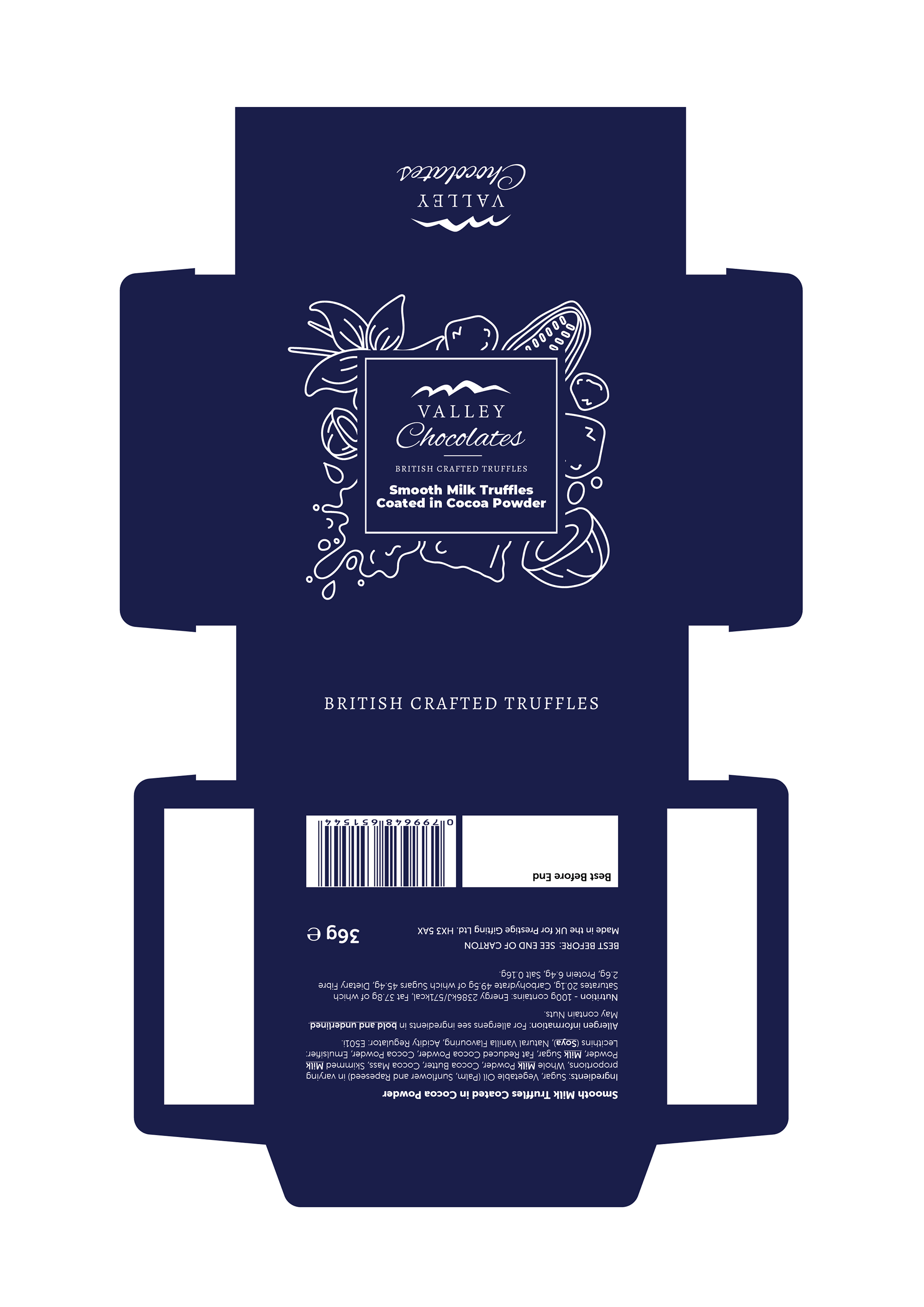
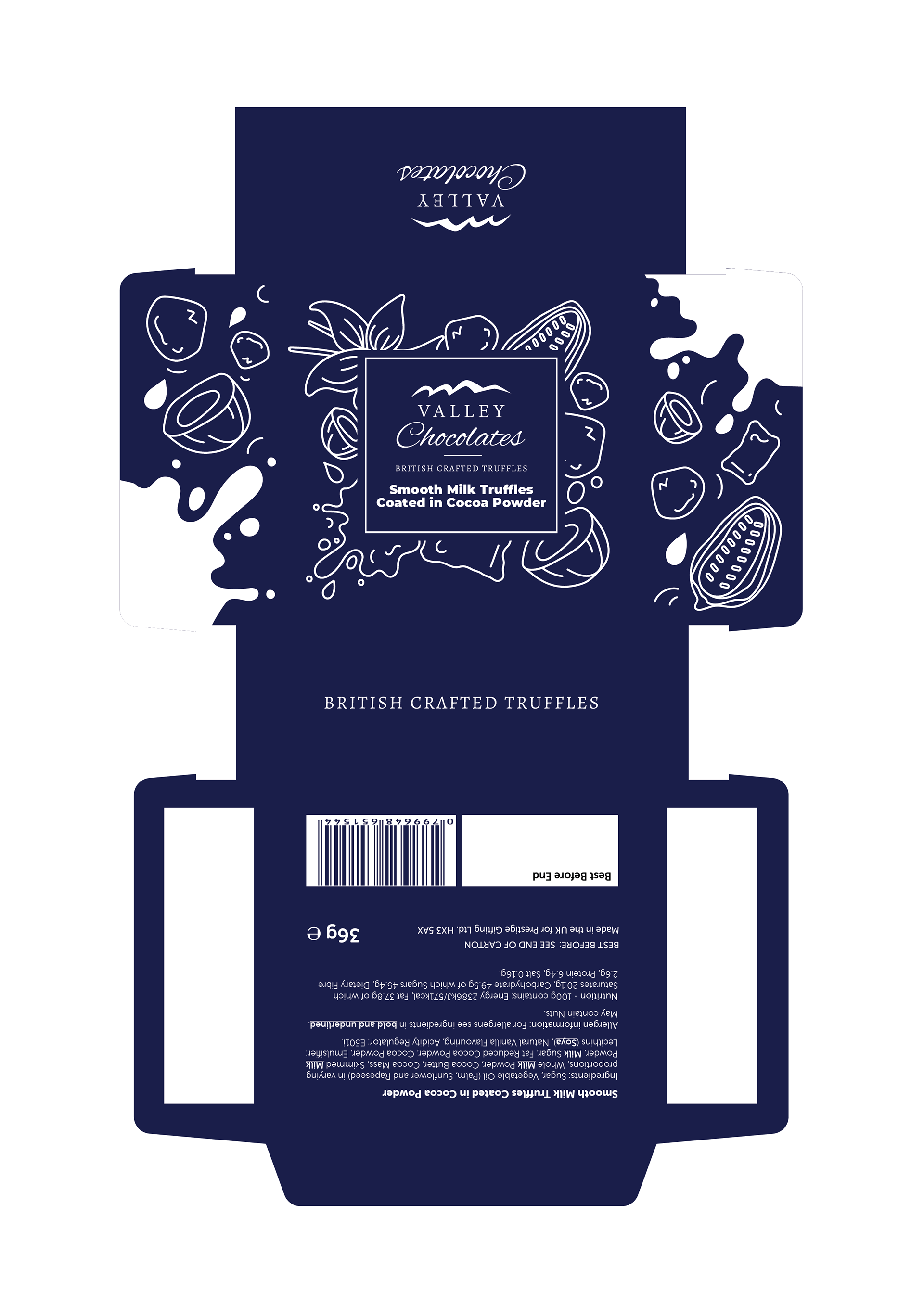
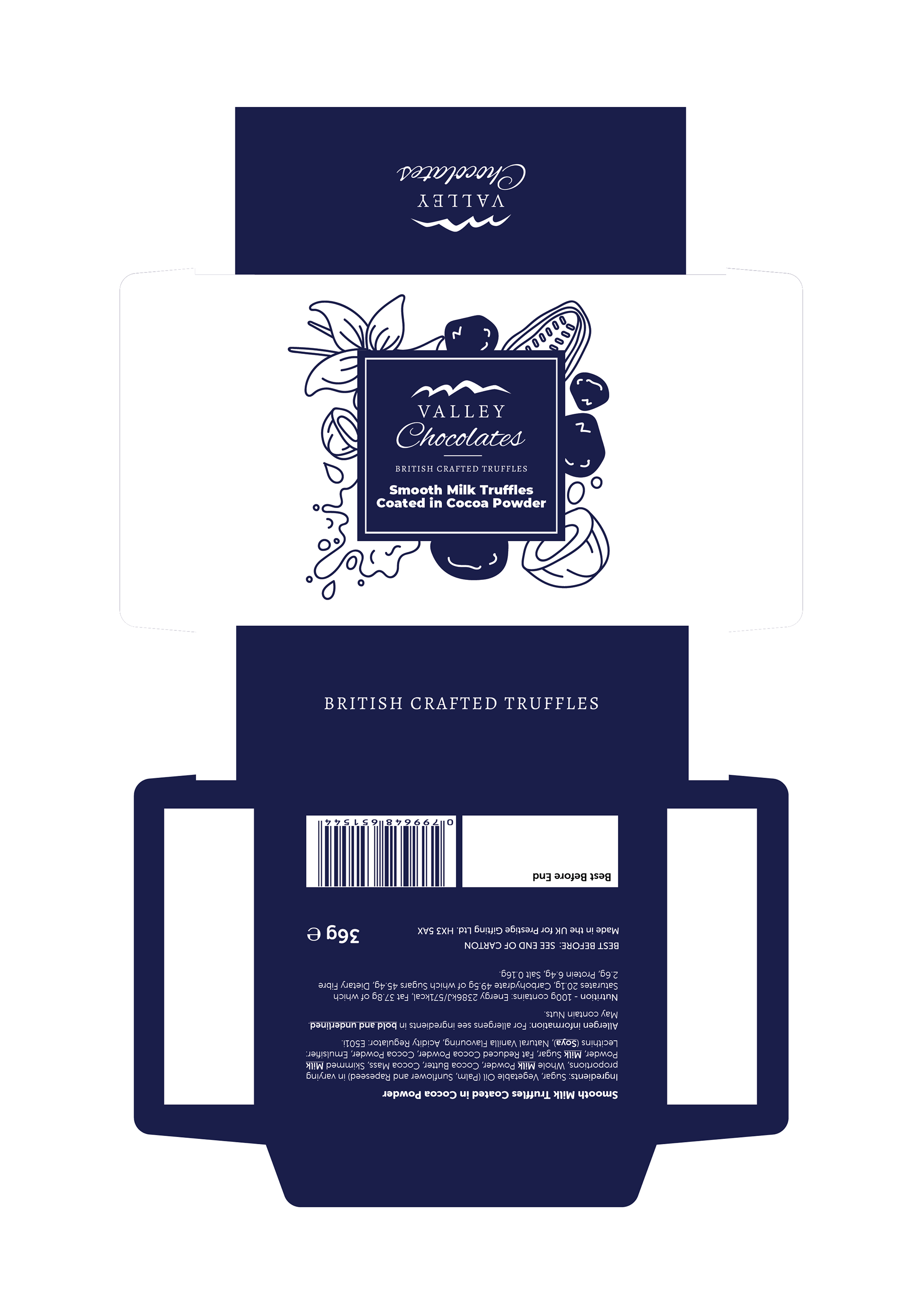
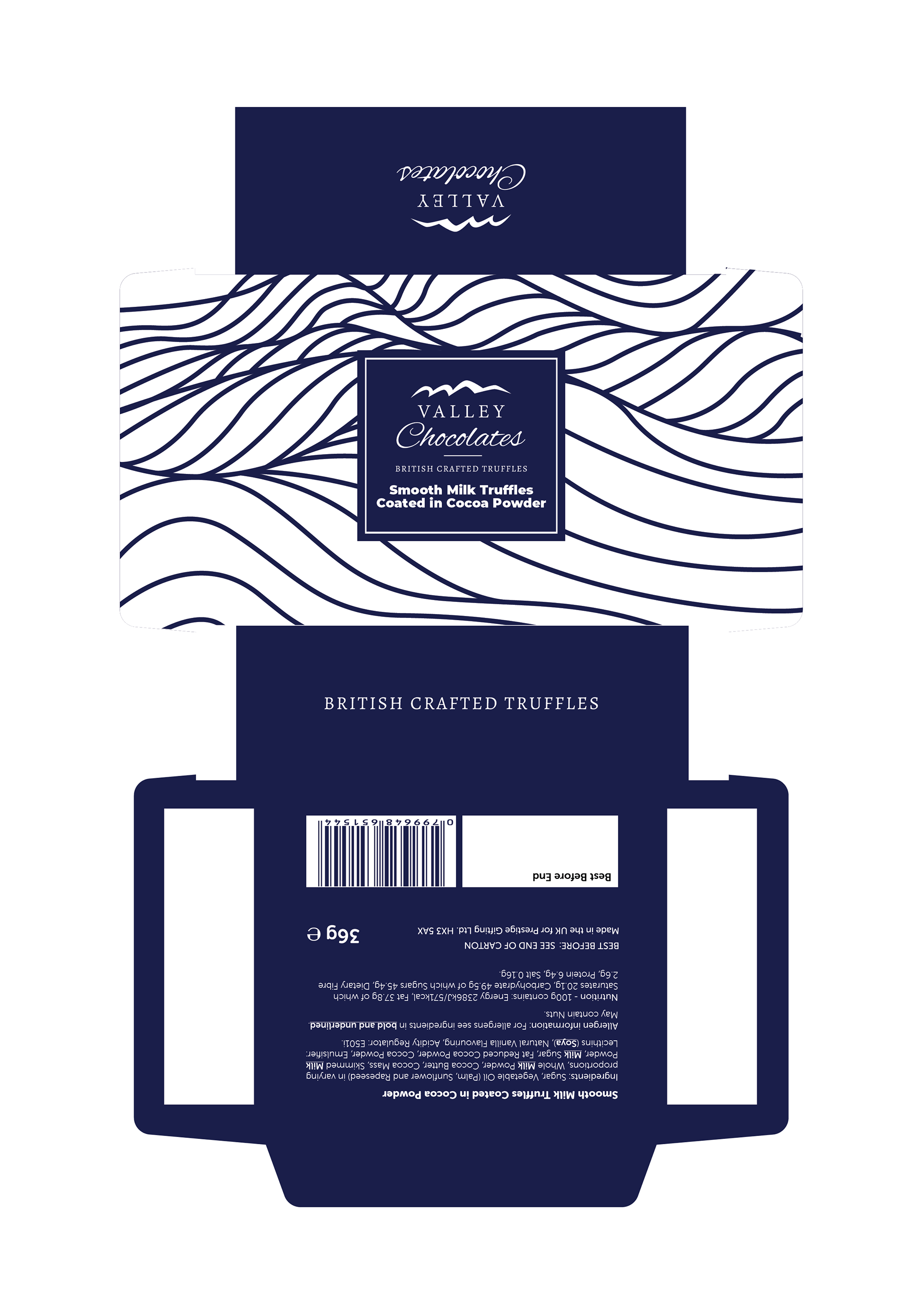
These initial concepts represent my early-stage design explorations for the Valley Chocolates Smooth Milk Truffles box. The goal was to evolve the brand's existing truffle packaging—originally geometric and traditional—into a more unified and story-driven visual identity, while maintaining elegance and shelf presence.
The visual direction in these versions experimented with chocolate-related iconography, cocoa illustrations, and splash motifs to evoke indulgence, natural ingredients, and handcrafted charm. I explored different layouts combining illustration and type, including full-bleed and framed styles, alternating between white and navy backgrounds to test contrast and legibility.
The final direction moved toward a simplified wave motif seen across the brand range, but this phase was crucial for testing visual narratives—from playful to premium. It also allowed me to gauge how far the packaging could evolve while remaining commercially viable and true to the brand’s essence.
This series showcases my process-driven approach, blending visual storytelling, strategic iteration, and packaging composition refinement across multiple variants before reaching a final design solution.
Final Version Design