This task is to produce a design for a non-fiction book about typography using the supplied extracts and artwork. The book is called: From the book to the streets: large type in public spaces. I designed the cover design and interior design (44 pages for two chapters and bibliography). This project made me better understand that editing a book is from constructing the page structure to selecting the font, then to the content page and end matter editing, and finally to the book design. In terms of editorial design, the main thing is to want this book to be read in the clearest way by readers.

BOOK COVER
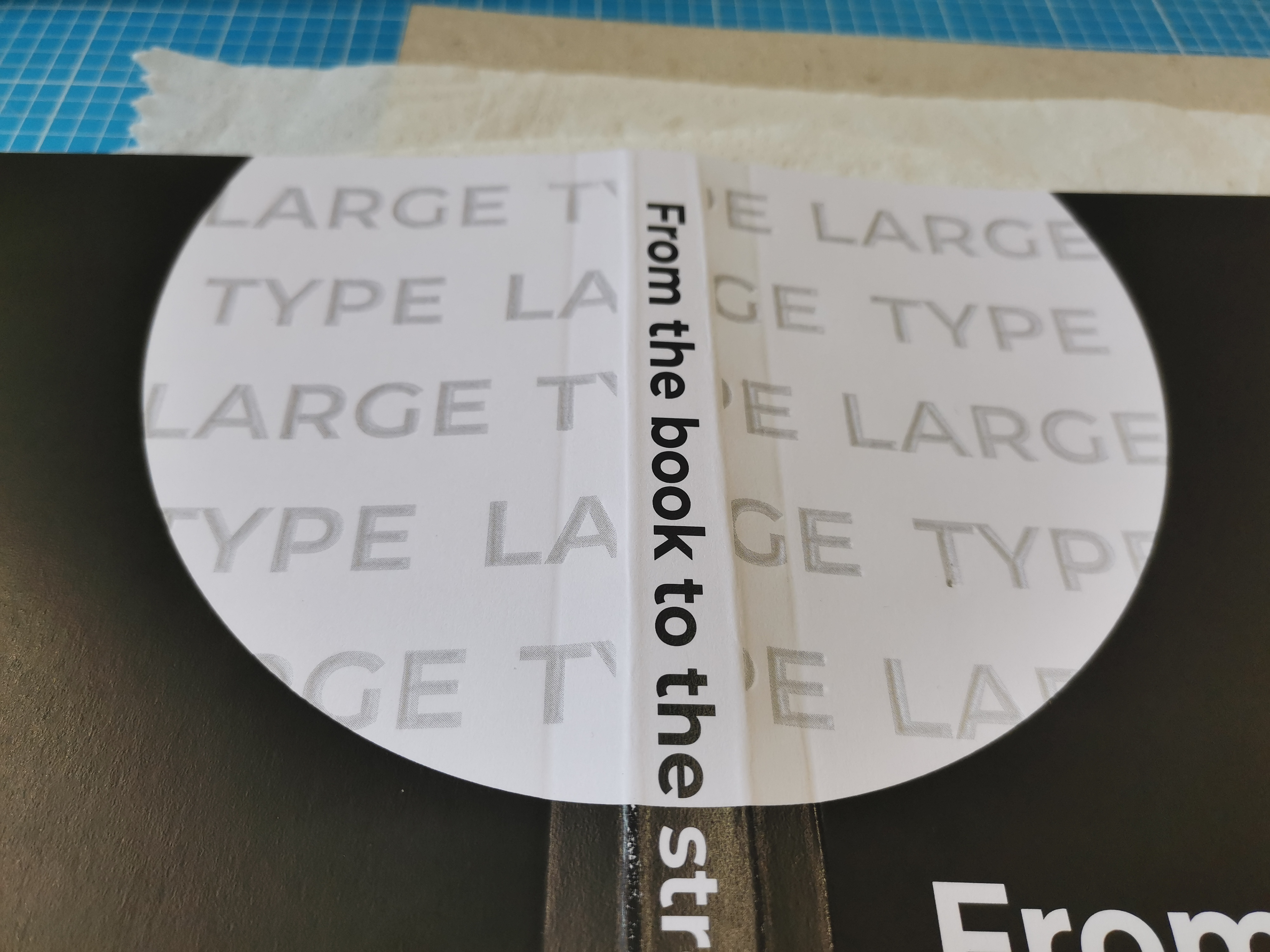
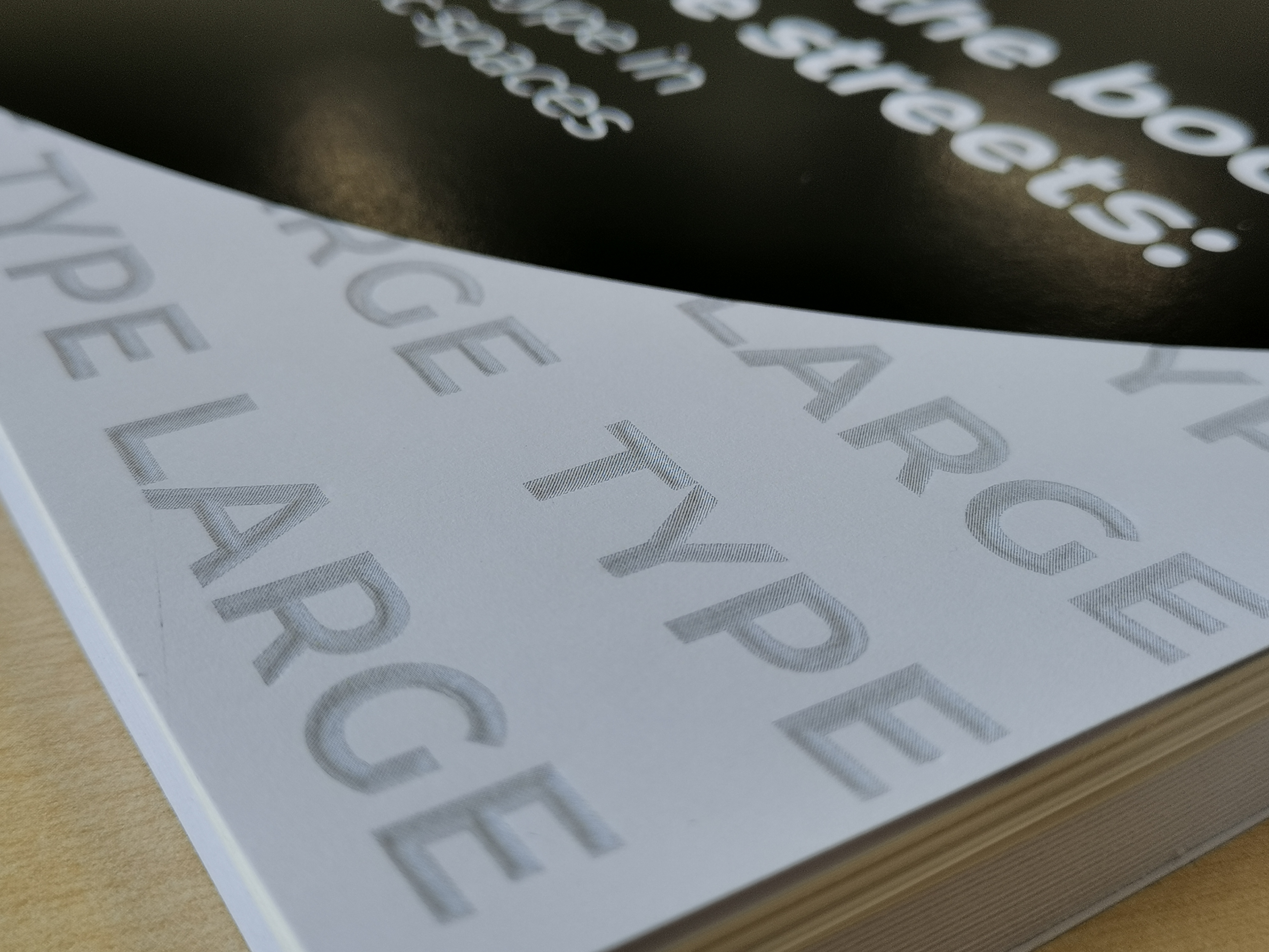
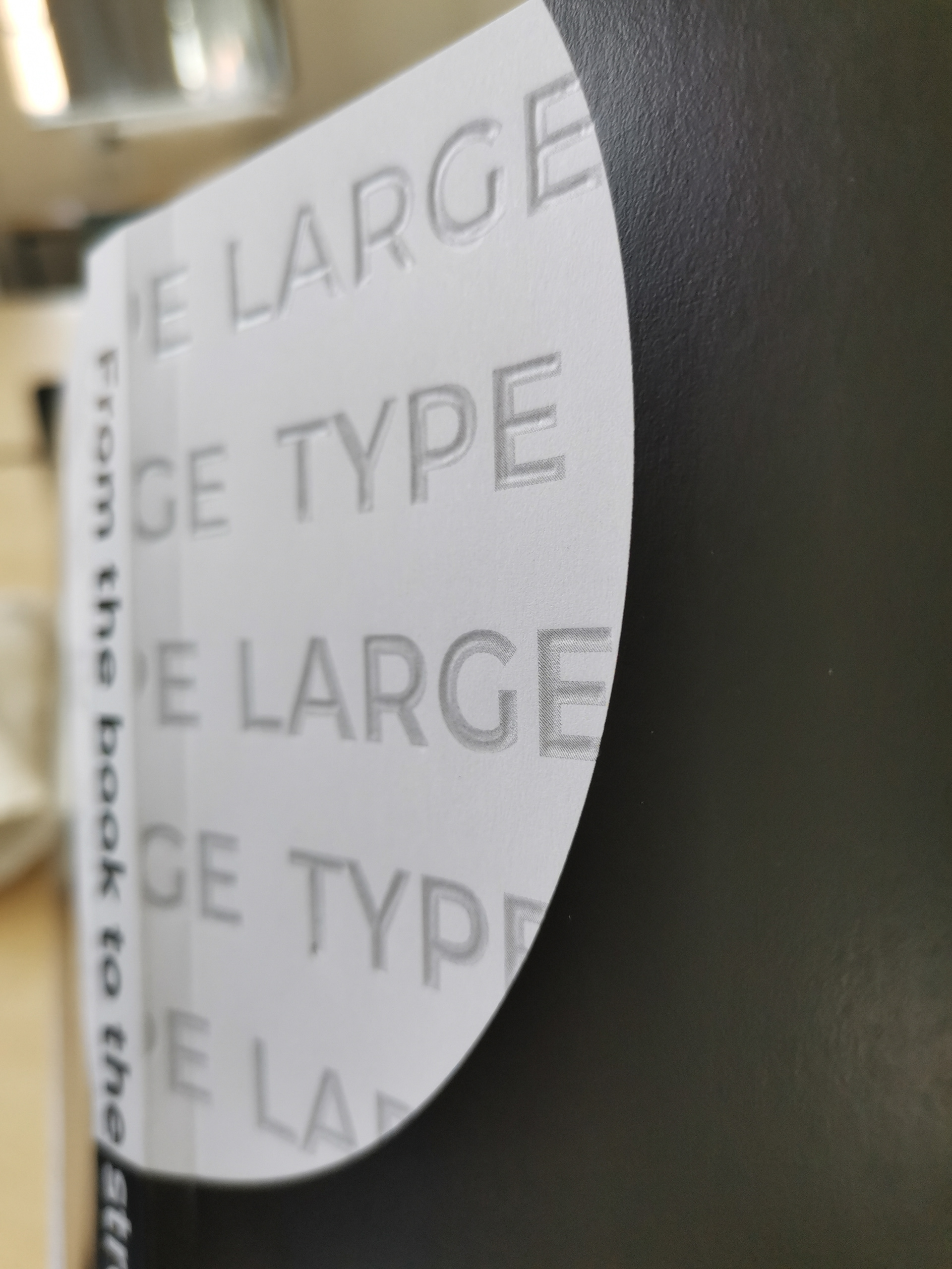
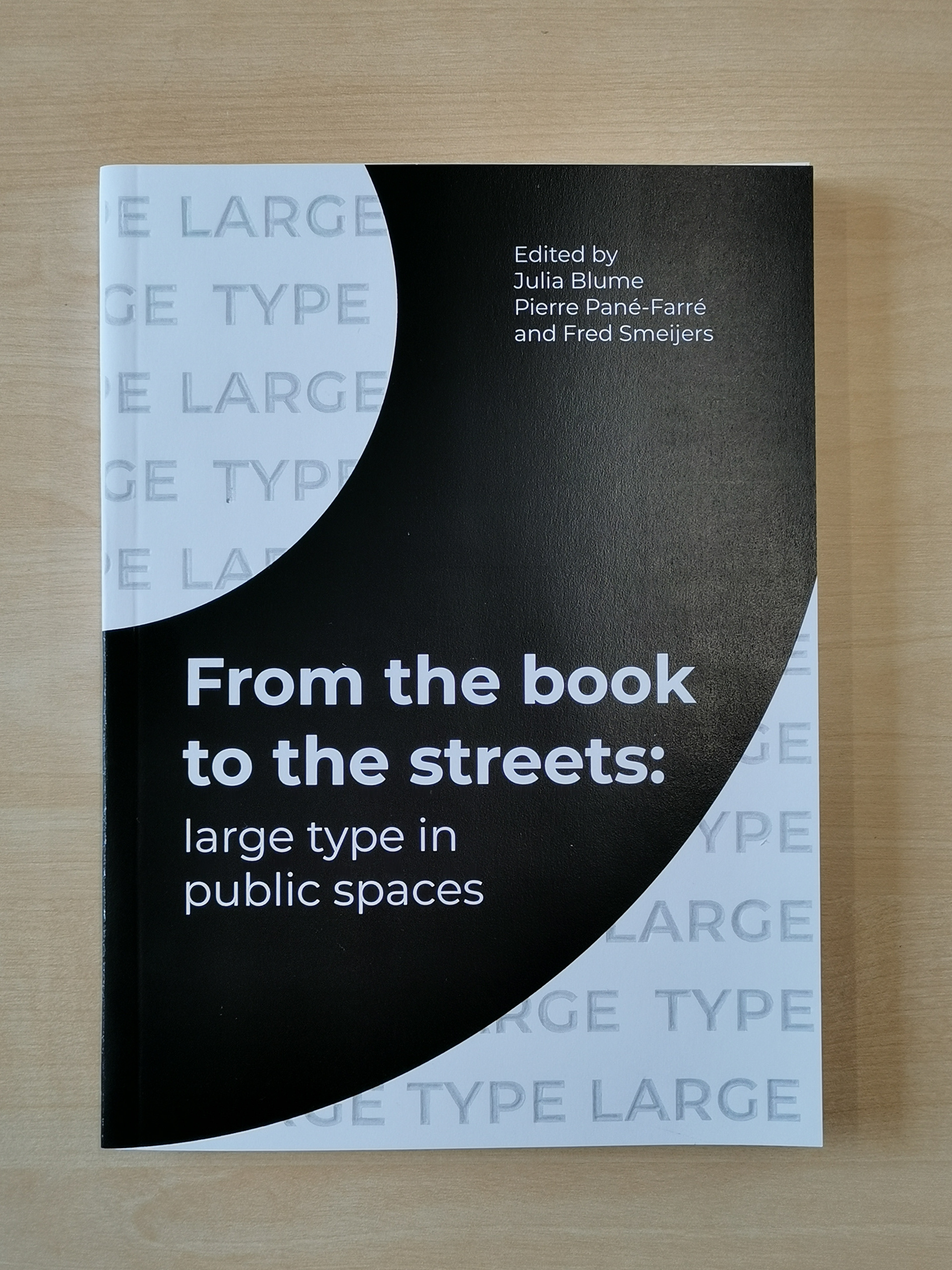
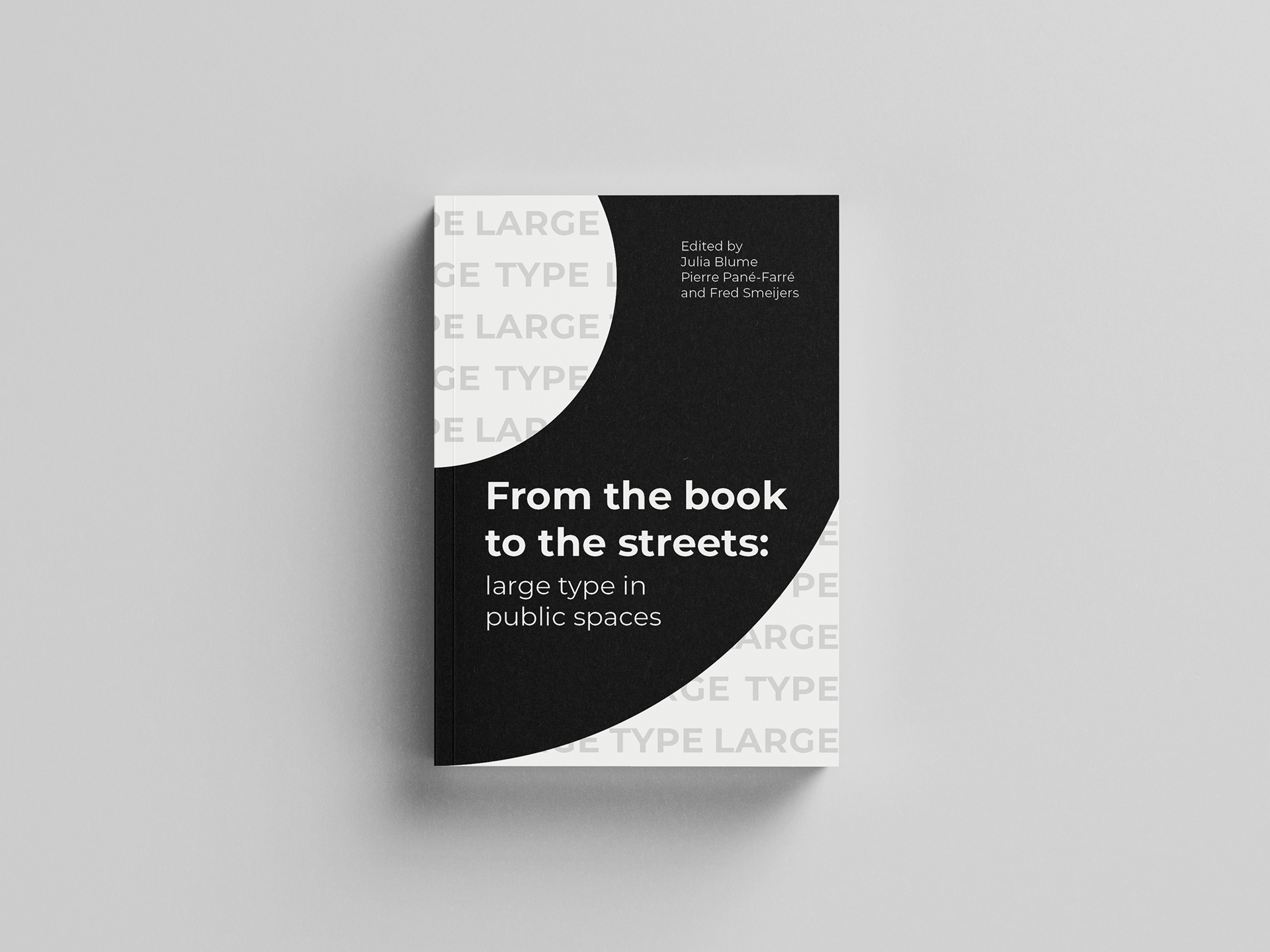
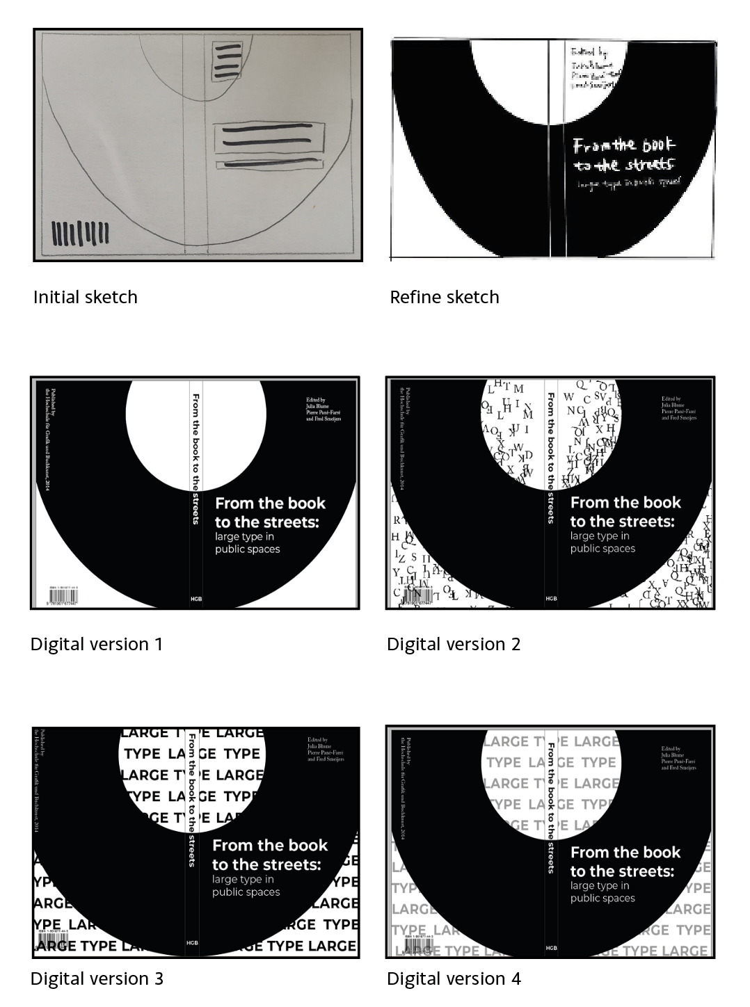
At the very first stage, it was important to try to see how the book could be found at a glance on the shelves. Choosing black and white seemed to connect best with the content of the books, which refer to history, and the photos we used to see in black and white, which also represent being historical. During the bookbinding process of the book I chose to do the embossing. The article in this book focuses on the history of printing and the idea that embossing is closely related to printing.
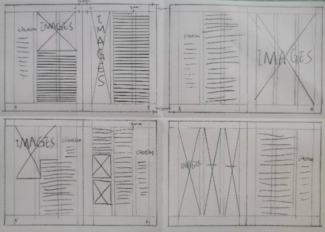
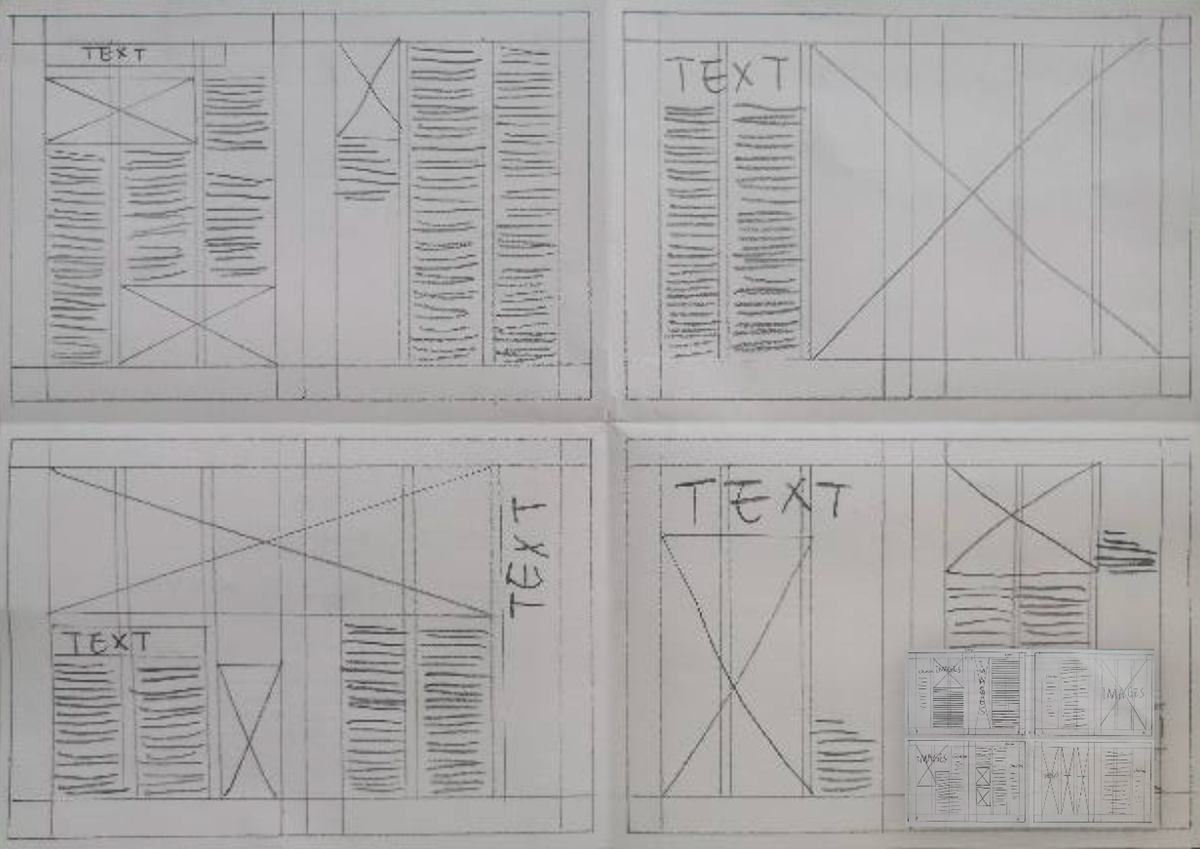
For the size of the book, I chose Royal OctavoWide: 170 mm x 234 mm. I use the form ofsketches to build my layout. I did some basicsketches for my design. I think this will be ofgreat help to my next design. I have drawn athree column grid. In my opinion, the threecolumn grid is my favorite grid among severaldifferent grid systems. The text and images inthe column grid are located after the verticaland stream lines that make up the column.Images can be placed in one column or in twoor more columns to create different visuallayouts. The spacing between columns (gutters)should be proportional and consistentthroughout the document.
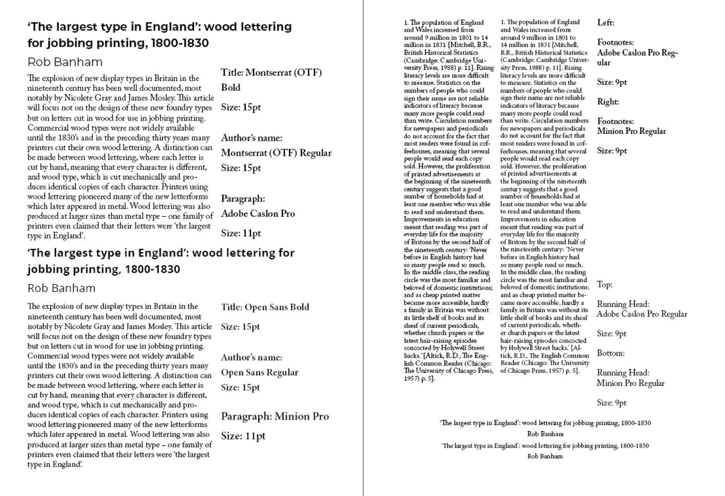
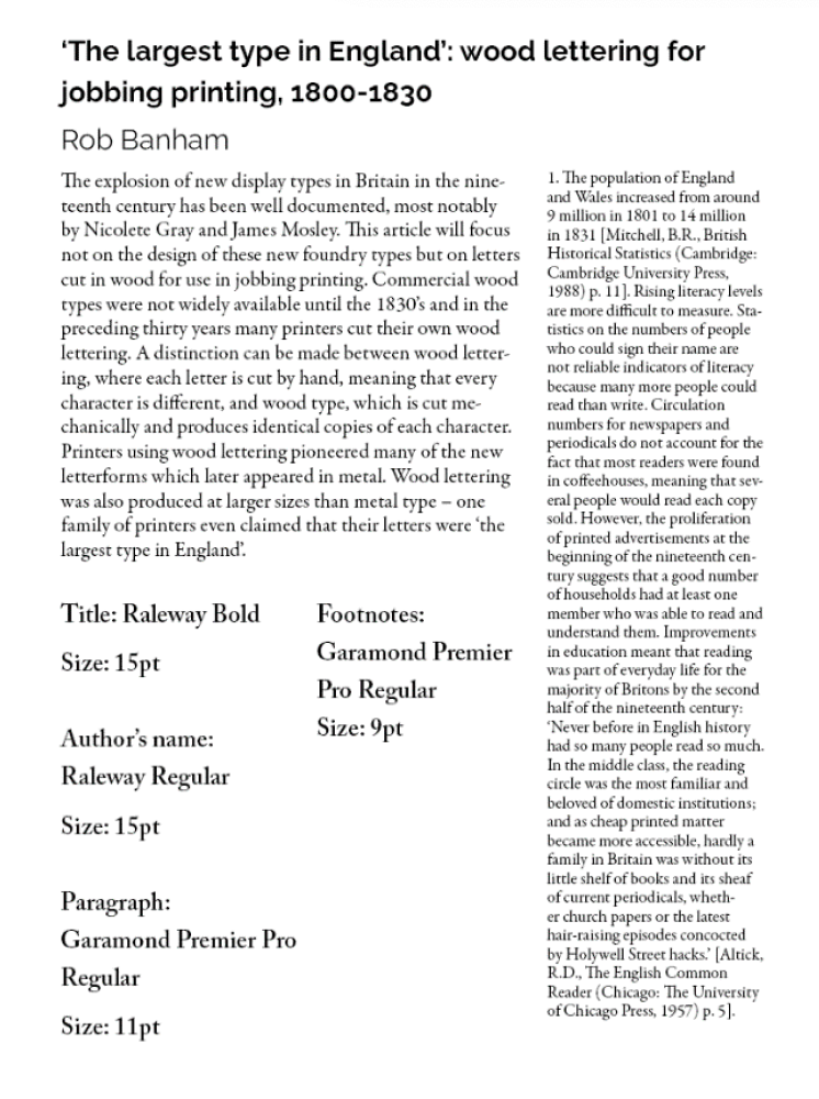
Column and Font test
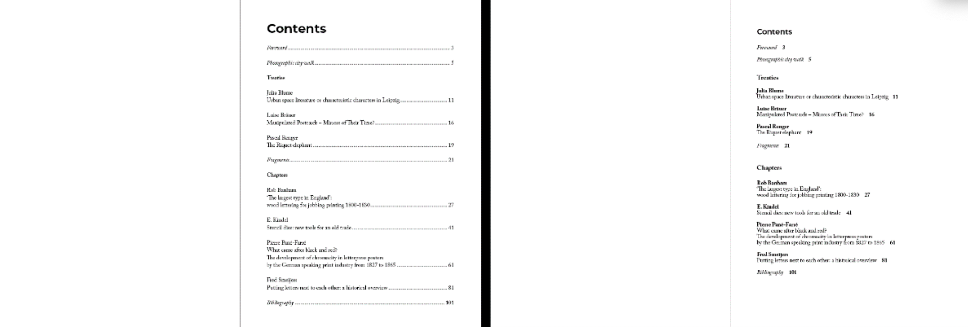
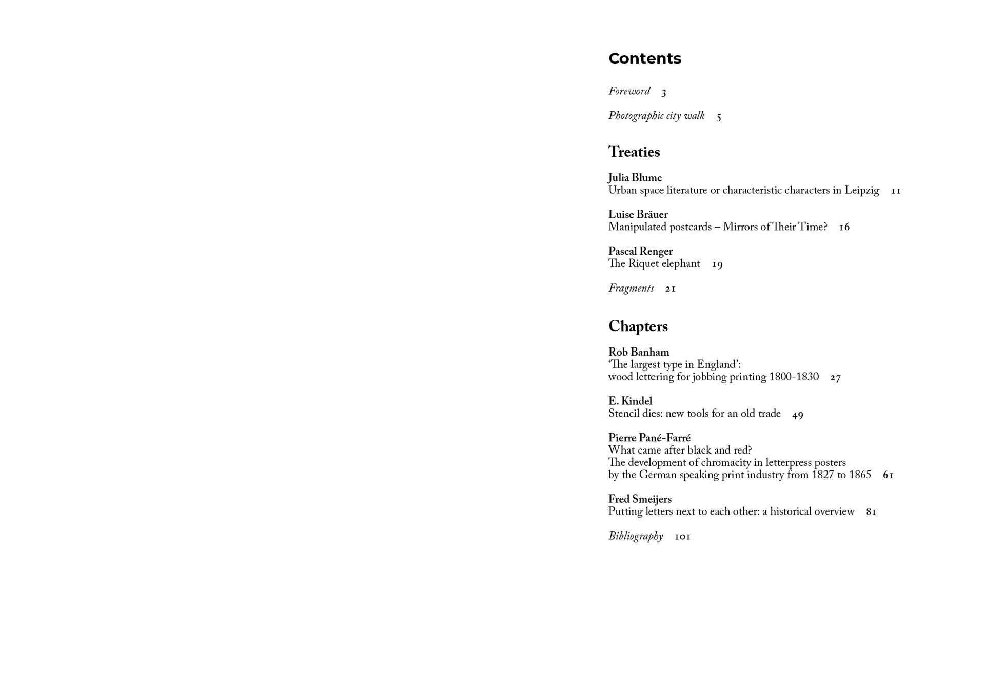
For Content page. Treaties andChapters space have to be different, so that readers can betterdistinguish between titles and articles. Page number could be next totitle, which might be more concise than my use of dashed lines. It alsolooks more modern. "Content" use same Font and size with "chaptertitle", which seems to make the title of the book consistent.
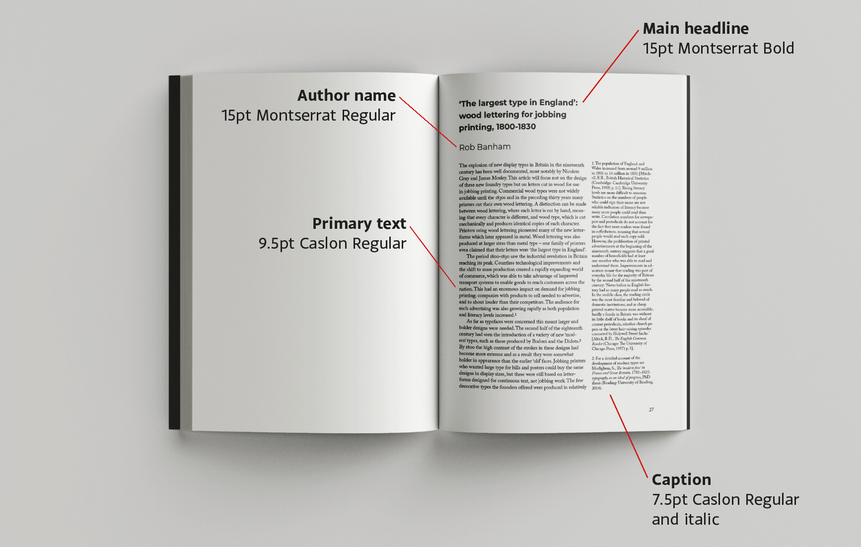
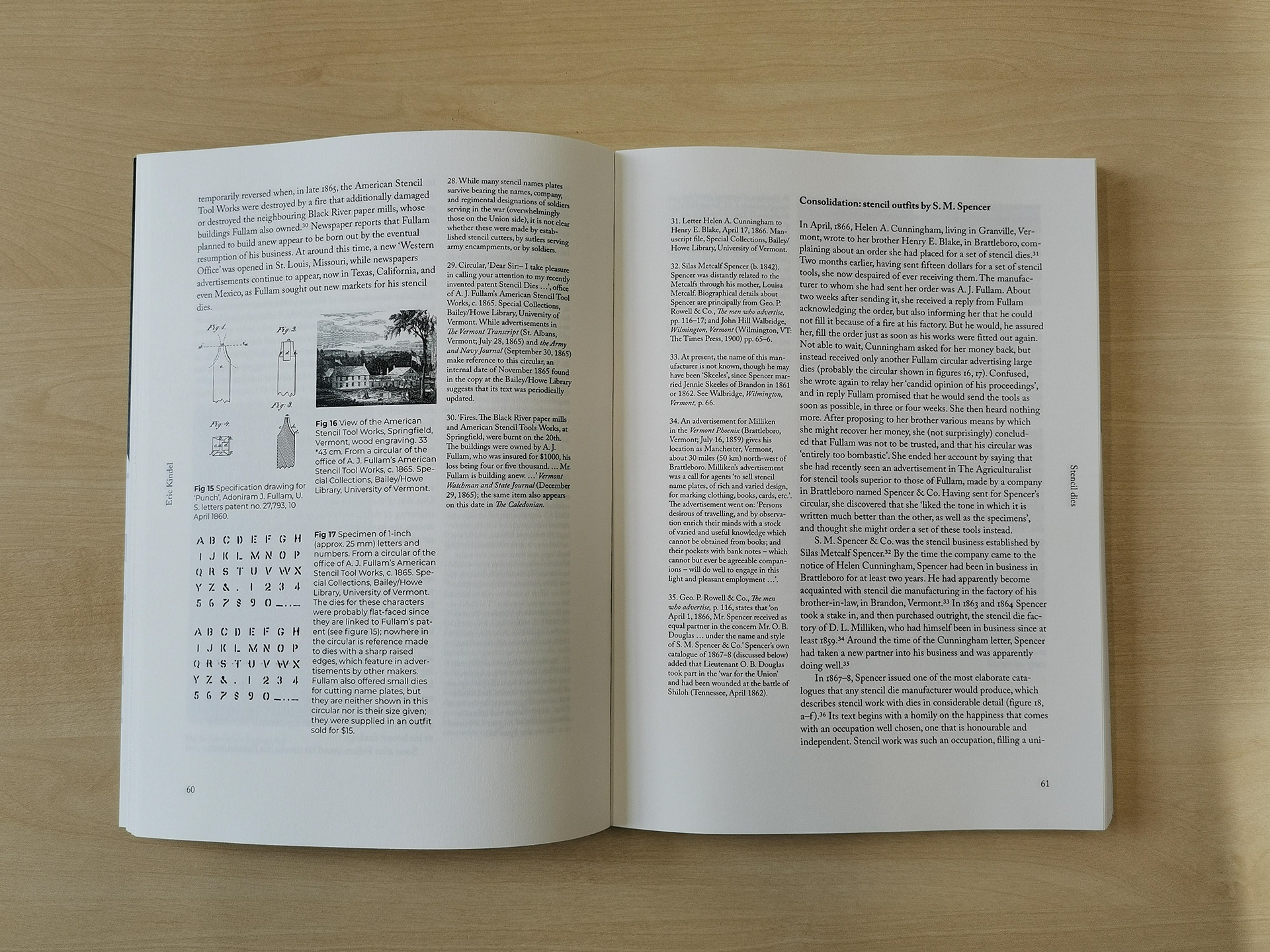
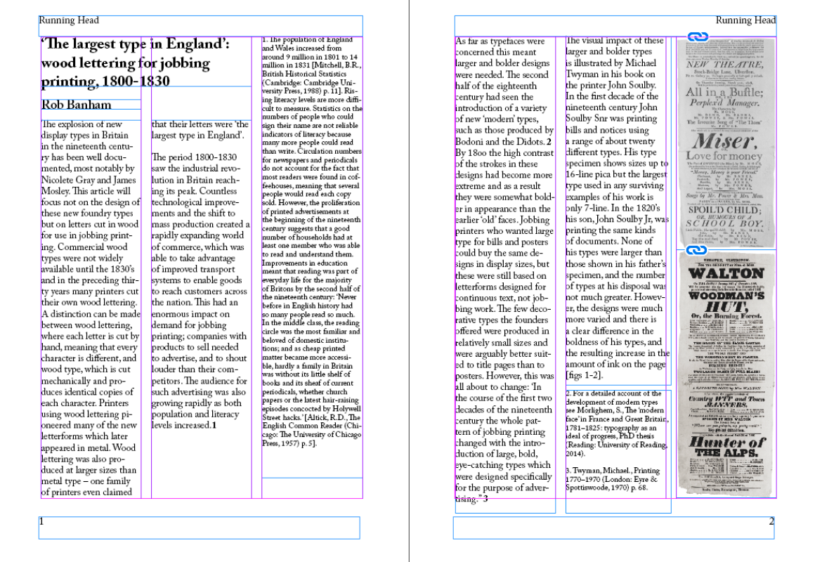
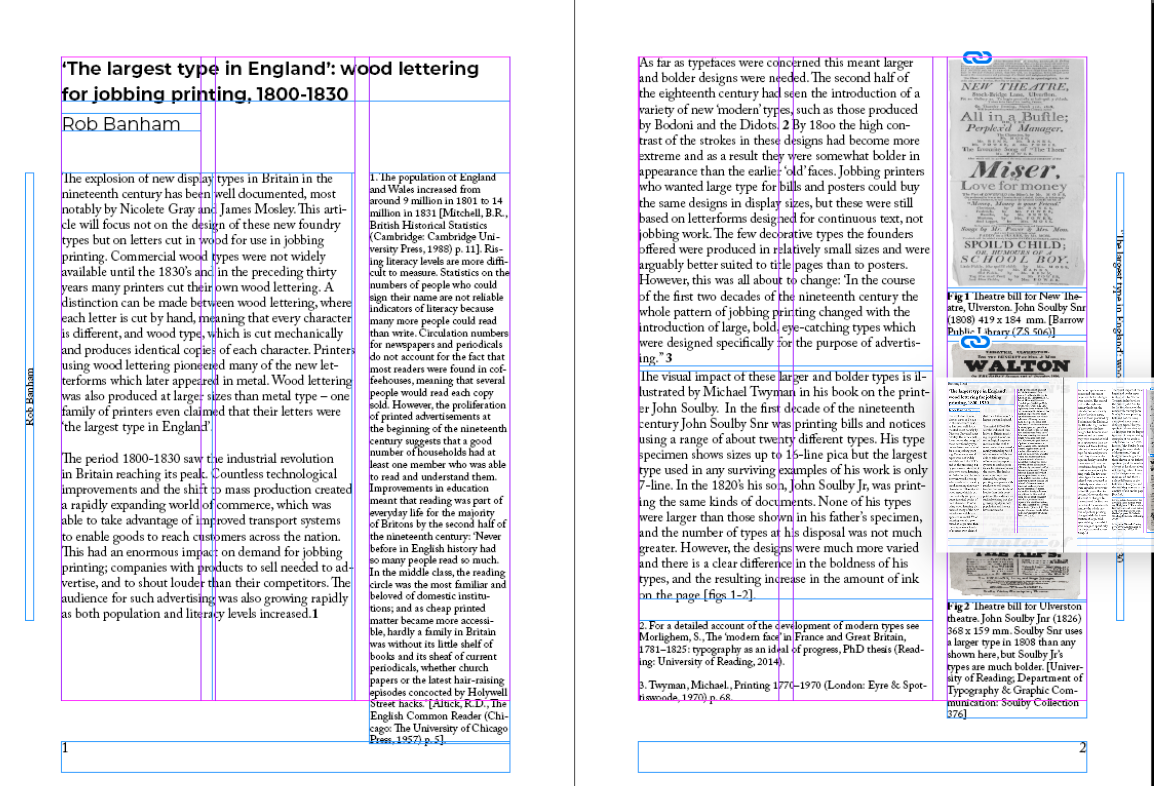
A text spread demonstrating the styling of main text, pull quotes, captions, figure numbers and footnotes.
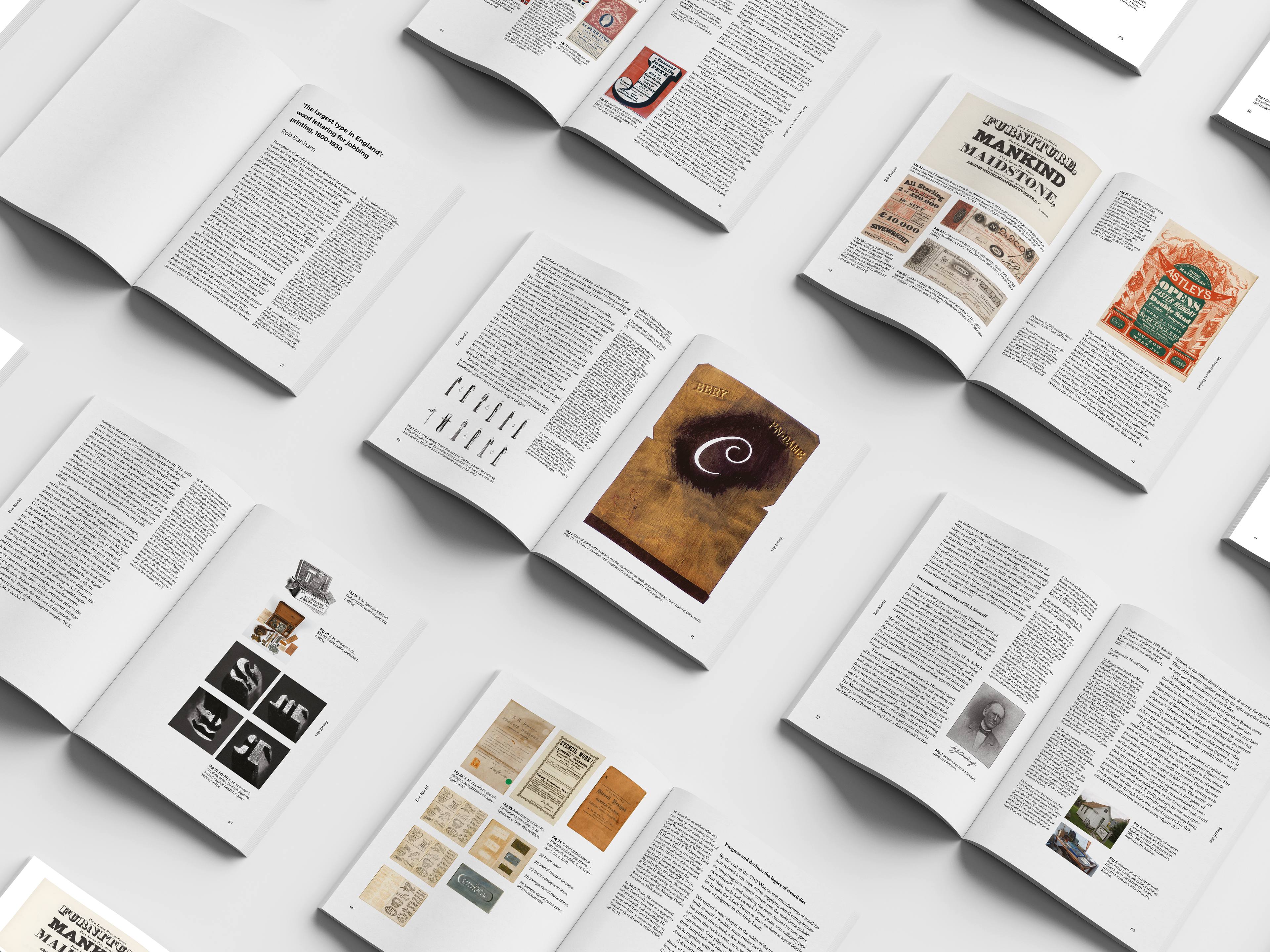
PDF of the designed inside pages:
https://indd.adobe.com/view/2722557e-7644-48c3-9eab-f75aa2f345dc
https://indd.adobe.com/view/2722557e-7644-48c3-9eab-f75aa2f345dc