Introduction
As part of my professional experience with Prestige Gifting, I led the rebranding initiative for Bargain Blooms, an online delivery florist shop. This project involved a comprehensive brand refresh to elevate its market presence and better align it with modern customer expectations.
As part of my professional experience with Prestige Gifting, I led the rebranding initiative for Bargain Blooms, an online delivery florist shop. This project involved a comprehensive brand refresh to elevate its market presence and better align it with modern customer expectations.
The rebranding process encompassed:
Logo Design: Crafting a fresh, visually appealing logo that captures the essence of the brand.
Brand Identity: Developing a cohesive branding framework, including typography, colour palette, and tone of voice, to enhance recognition and consistency.
Website Revamp: Designing a user-friendly, visually engaging website to improve the customer journey and overall digital experience.
Social Media Strategy: Establishing a vibrant and appealing presence across social media platforms to drive engagement and attract a broader audience.
The result is a modern, cohesive, and customer-centric brand identity that reflects Bargain Blooms’ dedication to delivering quality, affordable floral arrangements to its customers. This project showcases my ability to manage end-to-end brand transformation, combining creativity with strategic thinking to achieve impactful results.
Original Branding
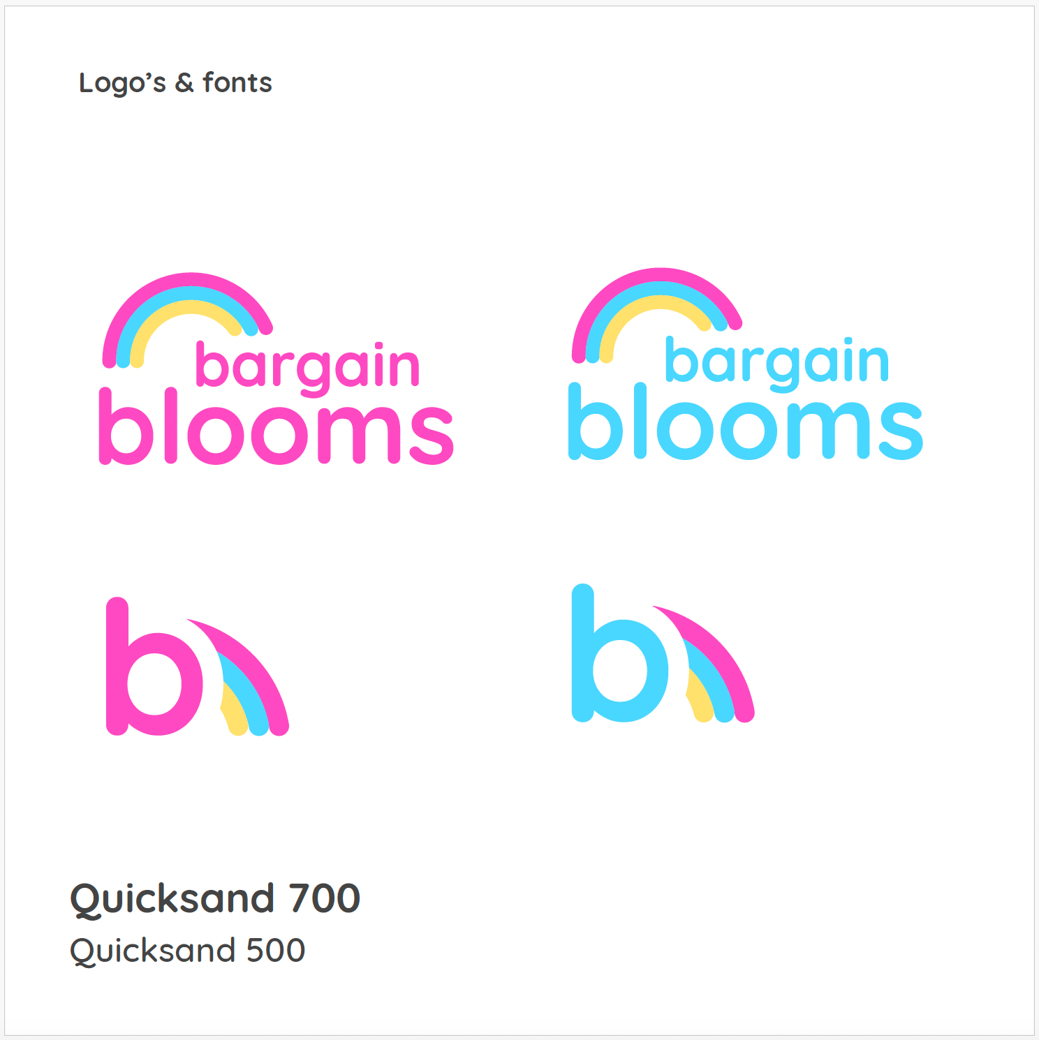
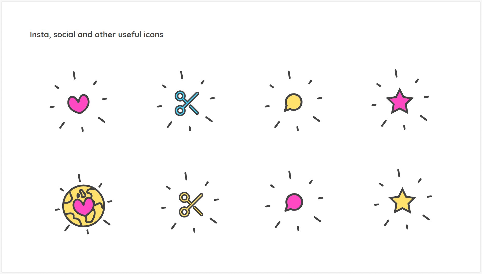
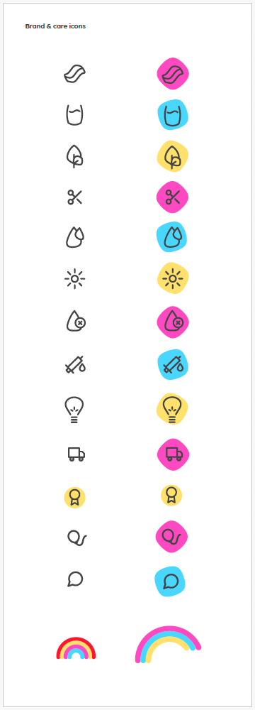
The existing Bargain Blooms brand features a playful and approachable identity, anchored by the Quicksand font and a clean logo design. Icons, inspired by the vibrant arcs of a rainbow, symbolize the stunning beauty and variety of the brand’s flowers. Eco-themed symbols further highlight its connection to nature, while the tagline “all kinds of loveliness inside” evokes warmth and delight. While effective, the rebranding aims to elevate emotional impact and modernize the visual appeal while retaining the brand’s core values of affordability and quality.
The existing Bargain Blooms brand features a playful and approachable identity, anchored by the Quicksand font and a clean logo design. Icons, inspired by the vibrant arcs of a rainbow, symbolize the stunning beauty and variety of the brand’s flowers. Eco-themed symbols further highlight its connection to nature, while the tagline “all kinds of loveliness inside” evokes warmth and delight. While effective, the rebranding aims to elevate emotional impact and modernize the visual appeal while retaining the brand’s core values of affordability and quality.

Market Research & Brand Positioning
To develop a refreshed and competitive identity for Bargain Blooms, I conducted research on key players in the UK online florist industry and explored modern branding trends to position the brand effectively.
Competitor Analysis
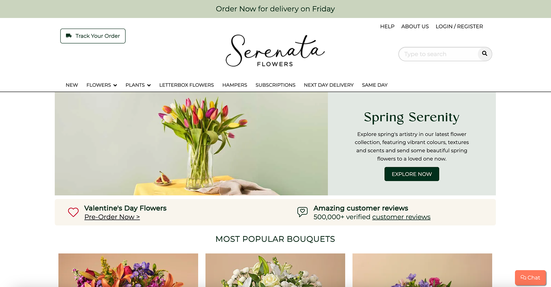
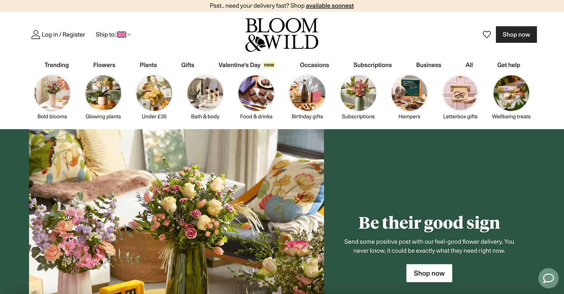
The UK online florist market is diverse, with established brands offering unique services:
- Serenata Flowers – Known for affordable, high-quality arrangements and reliable delivery.
- Interflora – A well-established brand delivering handcrafted bouquets through a vast florist network.
- Bloom & Wild – Innovators of letterbox flowers, emphasizing convenience and sustainability.
- Eflorist – Offers fast, same-day flower delivery with added gifts.
Bargain Blooms aims to carve a niche in this competitive space by offering affordable yet stylish floral arrangements that cater to modern, budget-conscious consumers looking for vibrant, highquality flowers with a fresh and creative brand identity.


Branding Inspirations & Design Trends
To align the brand with contemporary aesthetics while maintaining its core values, I explored the following design elements:
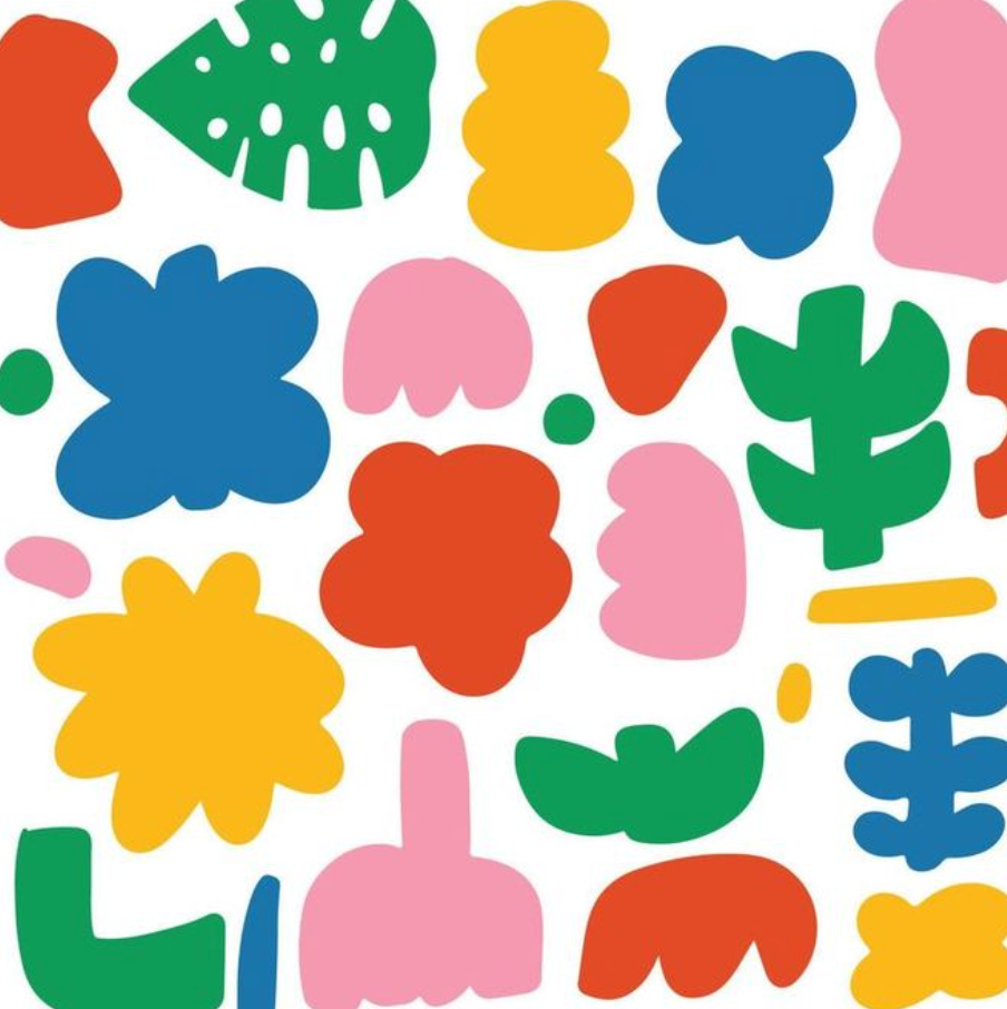
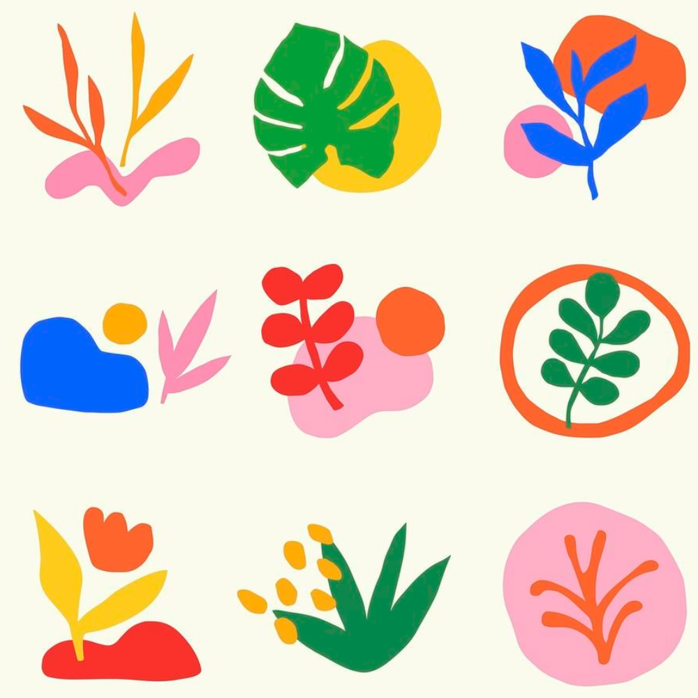
- Hand-Drawn Illustrations – Infusing artistic, hand-drawn floral elements throughout the branding creates a personal and authentic feel, echoing the uniqueness of every bouquet.
- Minimalist Aesthetics – A clean and modern layout enhances visual clarity, ensuring a premium yet approachable look.
- Earthy & Vibrant Colour Palettes – A balance between natural tones and lively hues reflects the fresh and joyful experience of receiving flowers.
This research informed the strategic decisions behind Bargain Blooms’ brand refresh, ensuring a visually appealing, contemporary, and customer-focused identity that differentiates it within the UK florist market.


Exploring Concepts
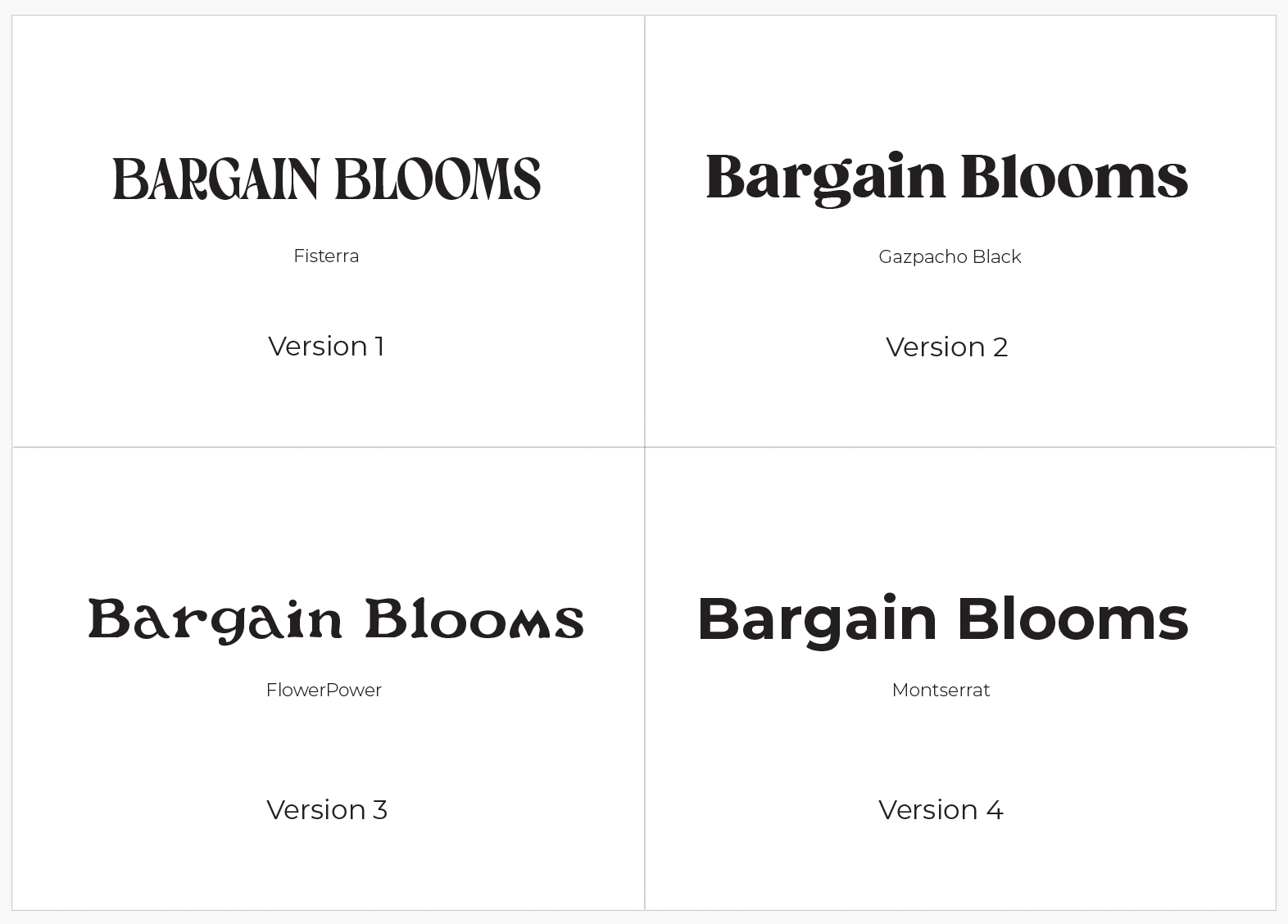
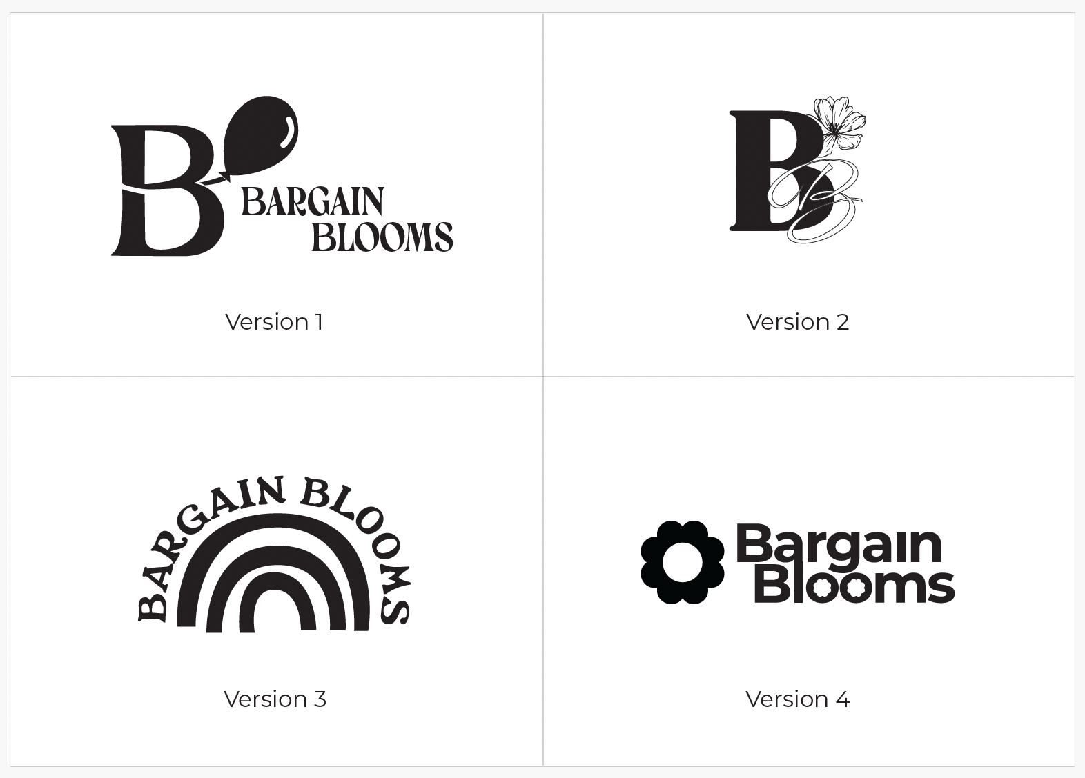
As part of the rebranding process for Bargain Blooms, I explored four distinct branding directions to redefine the brand’s identity while maintaining its approachable and vibrant essence. Each concept incorporates unique design elements that reflect the personality of Bargain Blooms.
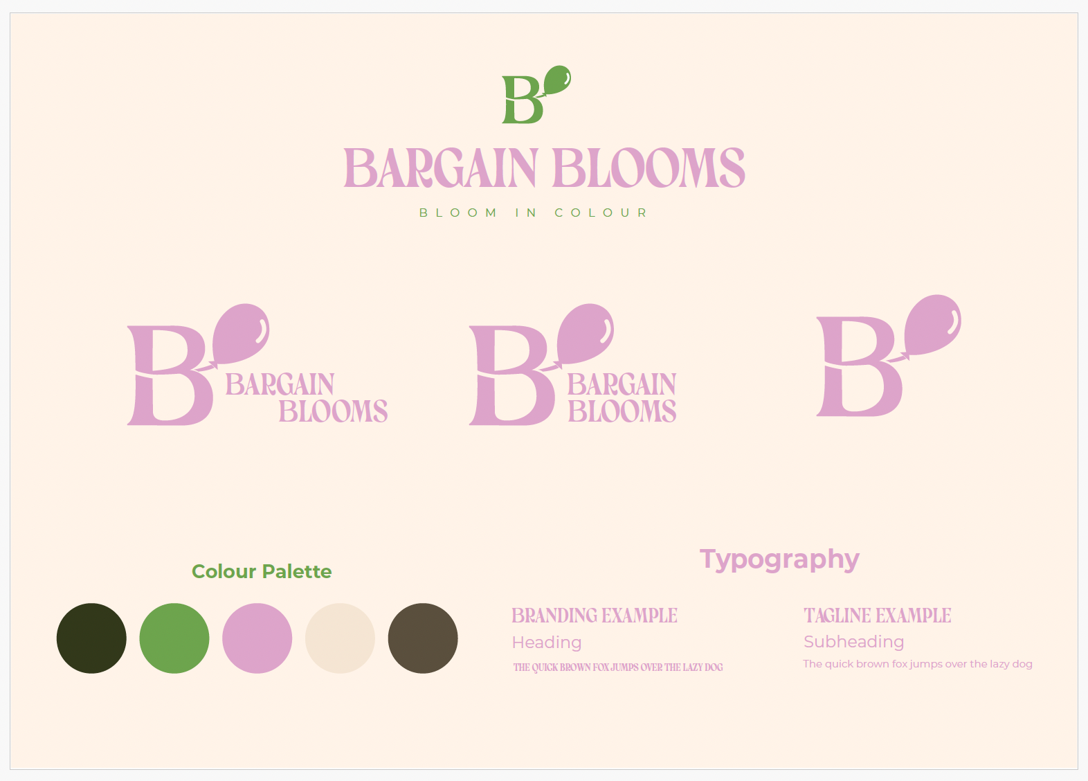
Version 1: Playful Elegance
Using the Fisterra font and a balloon icon, this concept merges whimsical and classic elements. The rounded shapes in the logo and earthy green tones suggest an approachable yet elegant identity, perfect for a budget-friendly florist with a touch of charm.
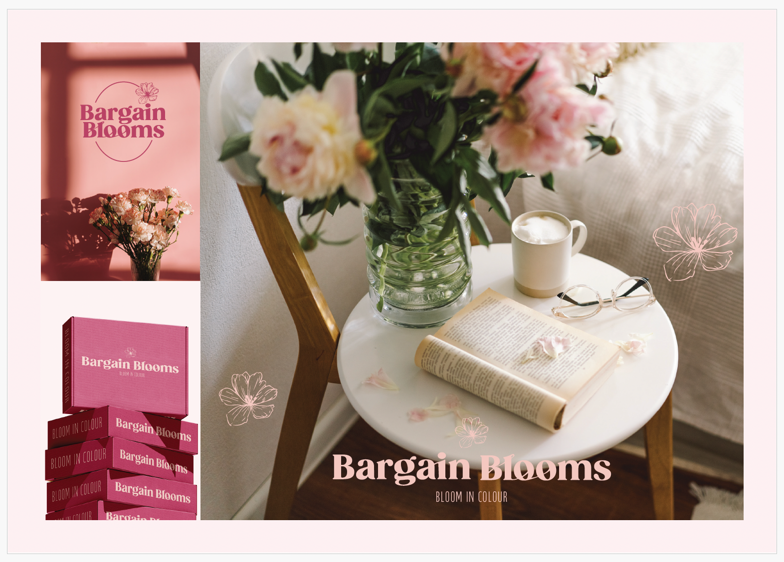
Version 2: Sophisticated Floral Motif
The Gazpacho Black font paired with a floral illustration creates a refined and traditional feel. This direction emphasizes timeless beauty and subtle luxury, appealing to customers who value a more classic presentation.
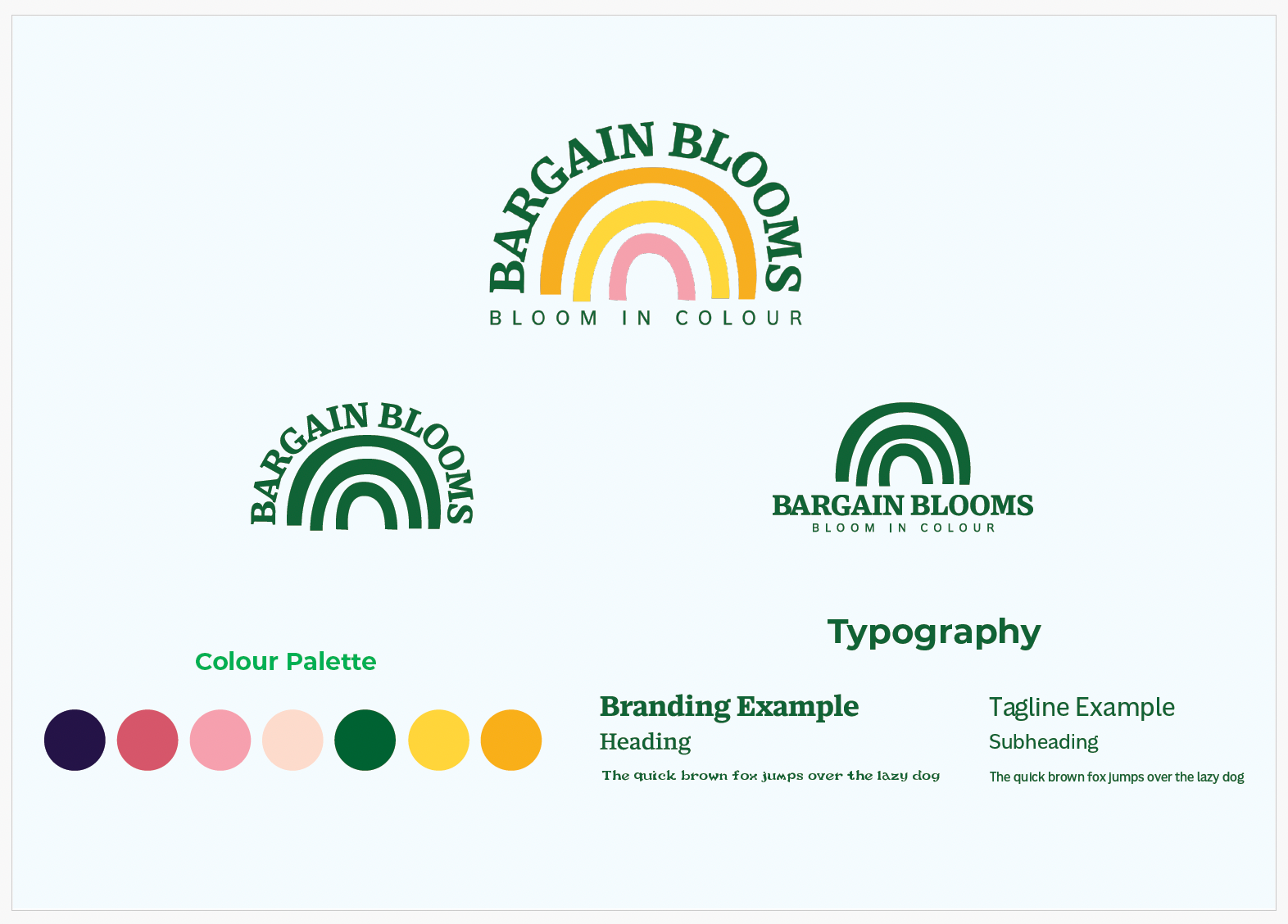
Version 3: Retro Whimsy
This version utilizes the FlowerPower font and a rainbow icon to evoke a retro aesthetic with playful energy. Vibrant, cheerful colours represent joy and creativity, targeting a younger, trend-conscious demographic seeking affordability without sacrificing style.
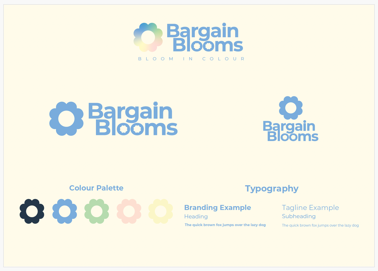
Version 4: Modern Minimalism
Built on the Montserrat font and a clean, geometric flower icon, this concept takes a minimalist approach. The pastel colour palette and structured design offer a contemporary, professional look, ensuring broad appeal while emphasizing clarity and trustworthiness.

Evolving the Vision
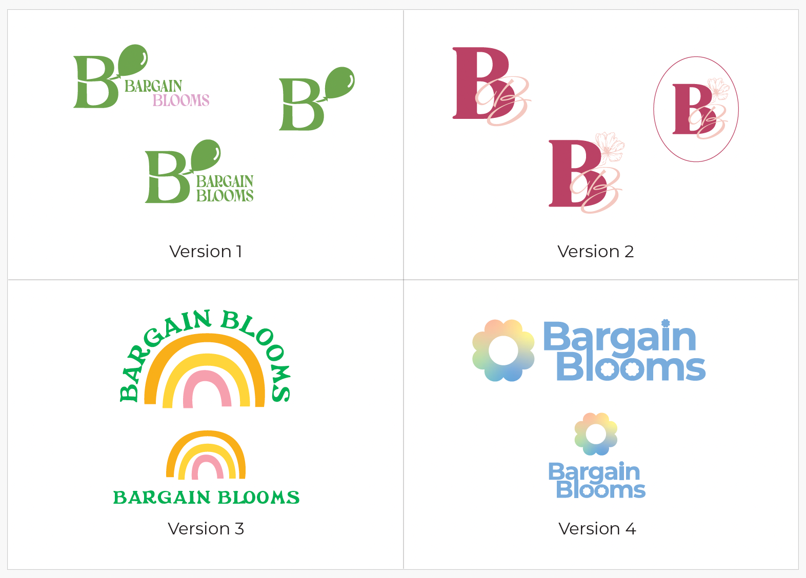
Following the initial concept phase, I refined and expanded the branding for Bargain Blooms, creating a cohesive visual identity with a vibrant colour palette and comprehensive mockups to showcase the brand in real-world contexts.
Core Elements:
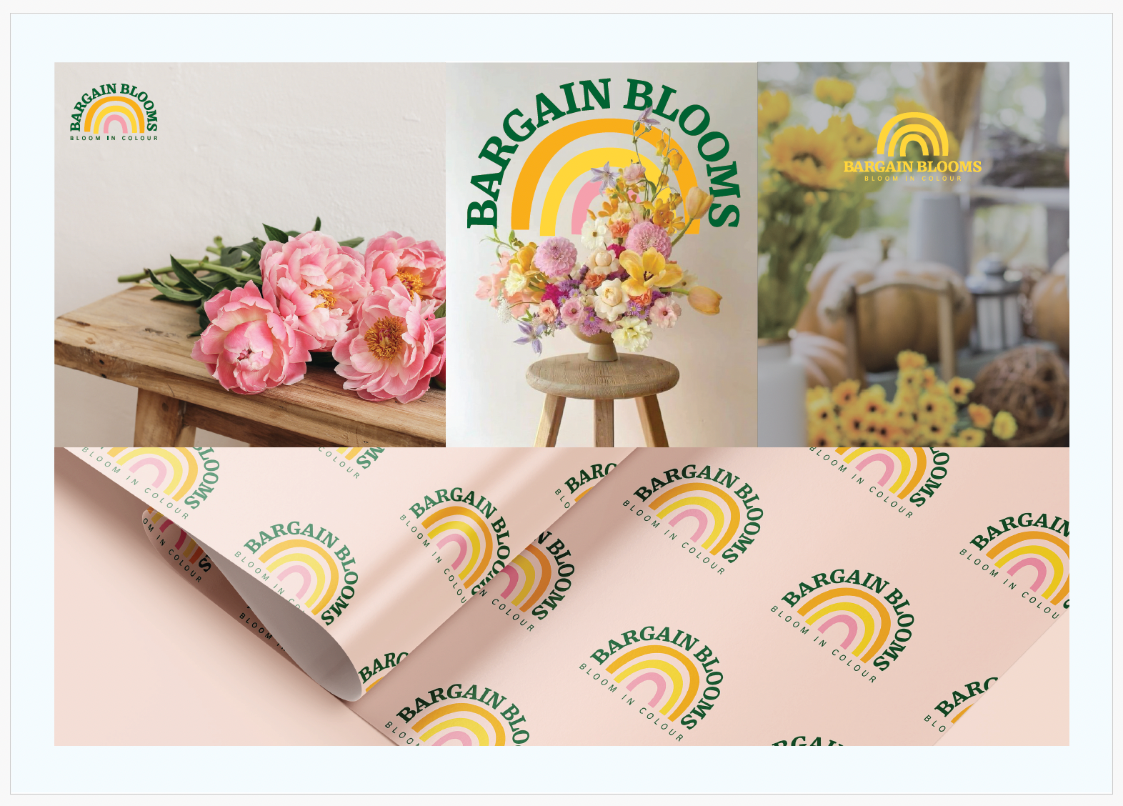
1. Logo Design: The finalised logo integrates playful and approachable elements, paired with the tagline “Bloom in Colour,” emphasizing the brand’s vibrant and budget-friendly nature.
2. Colour Palette: Soft pastels combined with earthy and natural tones evoke feelings of freshness, affordability, and joy, perfectly reflecting the brand’s floral essence.
3. Typography: A blend of elegant serif fonts for headers and clean sans-serif fonts for body text maintains readability while exuding sophistication.
Mockups:
- Stationery & Packaging: Loyalty cards and packaging feature delicate branding elements to reinforce customer recognition.
- Retail & Online Displays: The visual identity adapts seamlessly across print and digital platforms, ensuring a consistent experience for customers.
- Lifestyle Imagery: Contextual visuals, such as floral arrangements and bouquets, align with the brand’s uplifting tone and emphasize the connection to natural beauty.
This phase of the project highlights the development of a unified, vibrant, and customer-centric brand identity, ready to position Bargain Blooms as an approachable and stylish floral delivery service.



The Final Identity
The refreshed branding for Bargain Blooms represents a modern, vibrant, and cohesive identity that enhances the brand’s appeal while staying true to its core values of affordability and quality.
Key Highlights:
- Colour Palette: A lively and harmonious selection of colours reflects the natural beauty and variety of flowers, creating a fresh and engaging visual experience.
- Typography: A clean and contemporary typeface ensures readability and elegance, with tailored pairings for headings and body text to maintain consistency.
- Icons: Redesigned eco-friendly and unique selling point icons emphasise the brand’s commitment to sustainability and customer satisfaction.
- Tagline: The refreshed tagline, “Bloom in Colour,” encapsulates the vibrant and joyful spirit of Bargain Blooms. It highlights the brand’s commitment to delivering stunning, colourful floral arrangements that bring life and happiness to every occasion.
- Illustration Style: All illustrations, including the brand logo, are crafted in a hand-drawn style, reinforcing the brand’s authenticity, warmth, and approachable personality. This artisanal touch adds a unique, personal feel to the overall identity.
This rebrand elevates Bargain Blooms’ identity, blending creative innovation with functionality to deliver a compelling and consistent message across all platforms.
Bringing the Brand to Life
The final phase of the Bargain Blooms rebrand brings the refreshed identity to life through a redesigned website and a revitalised Instagram presence.
The final phase of the Bargain Blooms rebrand brings the refreshed identity to life through a redesigned website and a revitalised Instagram presence.
The redesigned website provides a seamless shopping experience with an engaging layout, enhanced navigation, and an intuitive filtering system to help customers find the perfect blooms. Playful hand-drawn elements, vibrant colours, and clear messaging reinforce the brand’s joyful and inviting identity.
Social Media Revamp: The updated Instagram strategy showcases the brand’s new visual identity, featuring curated content, fresh product photography, and interactive elements to drive engagement and community building.
This transformation ensures Bargain Blooms stands out in the competitive online florist market, delivering an enhanced digital experience that aligns with its refreshed brand identity.
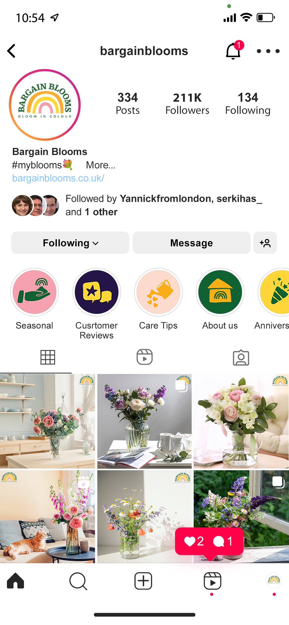
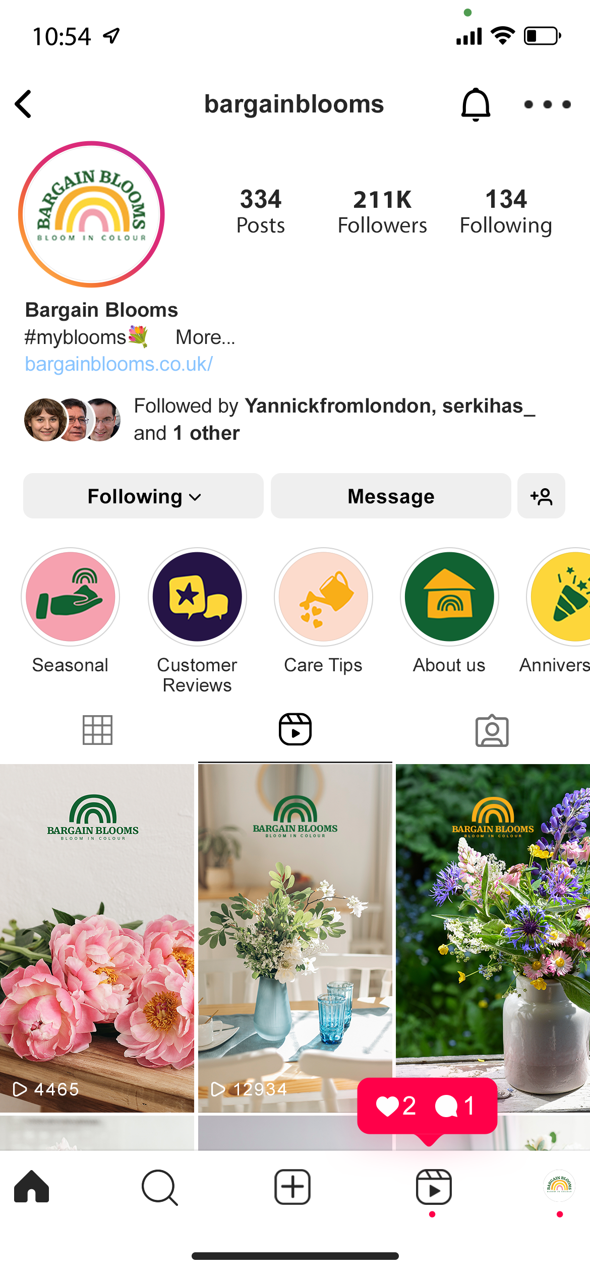

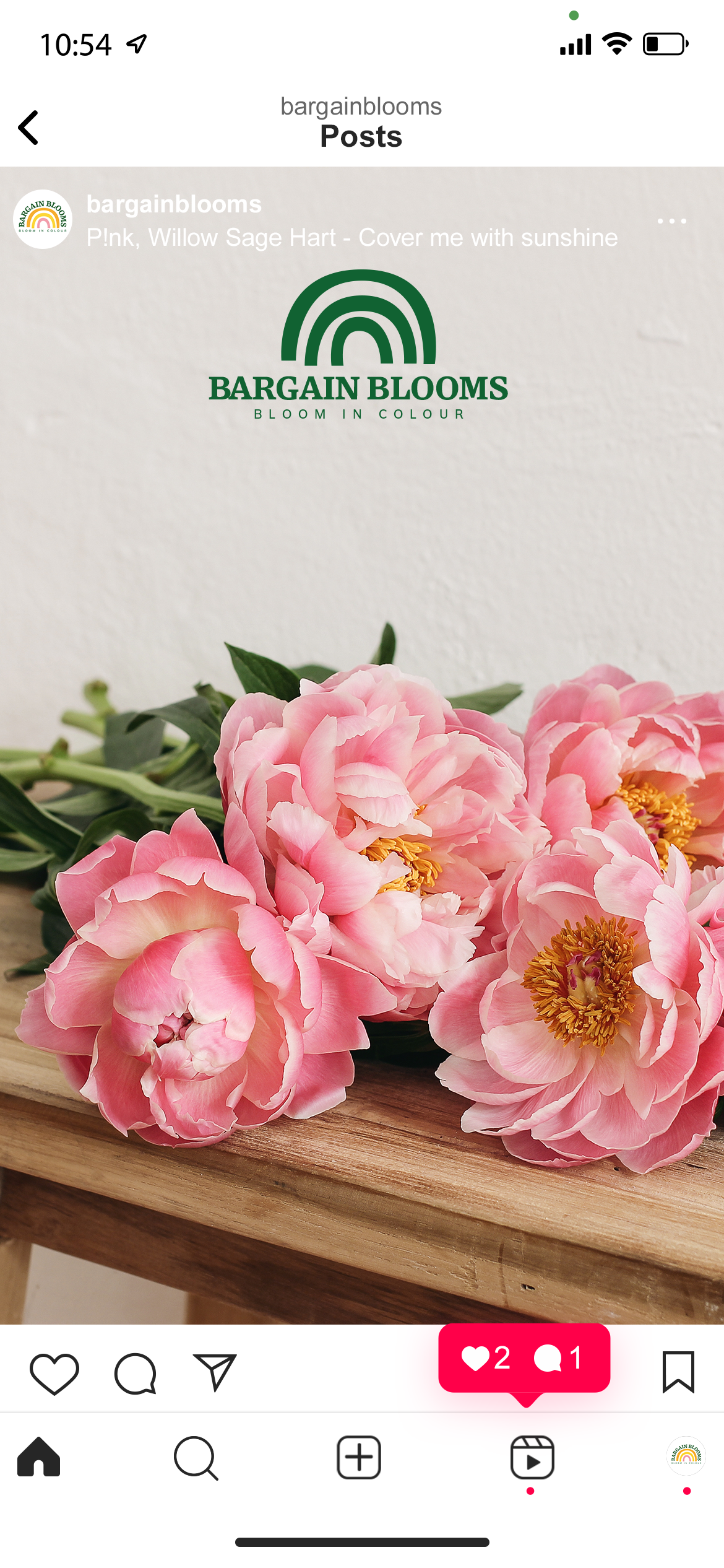
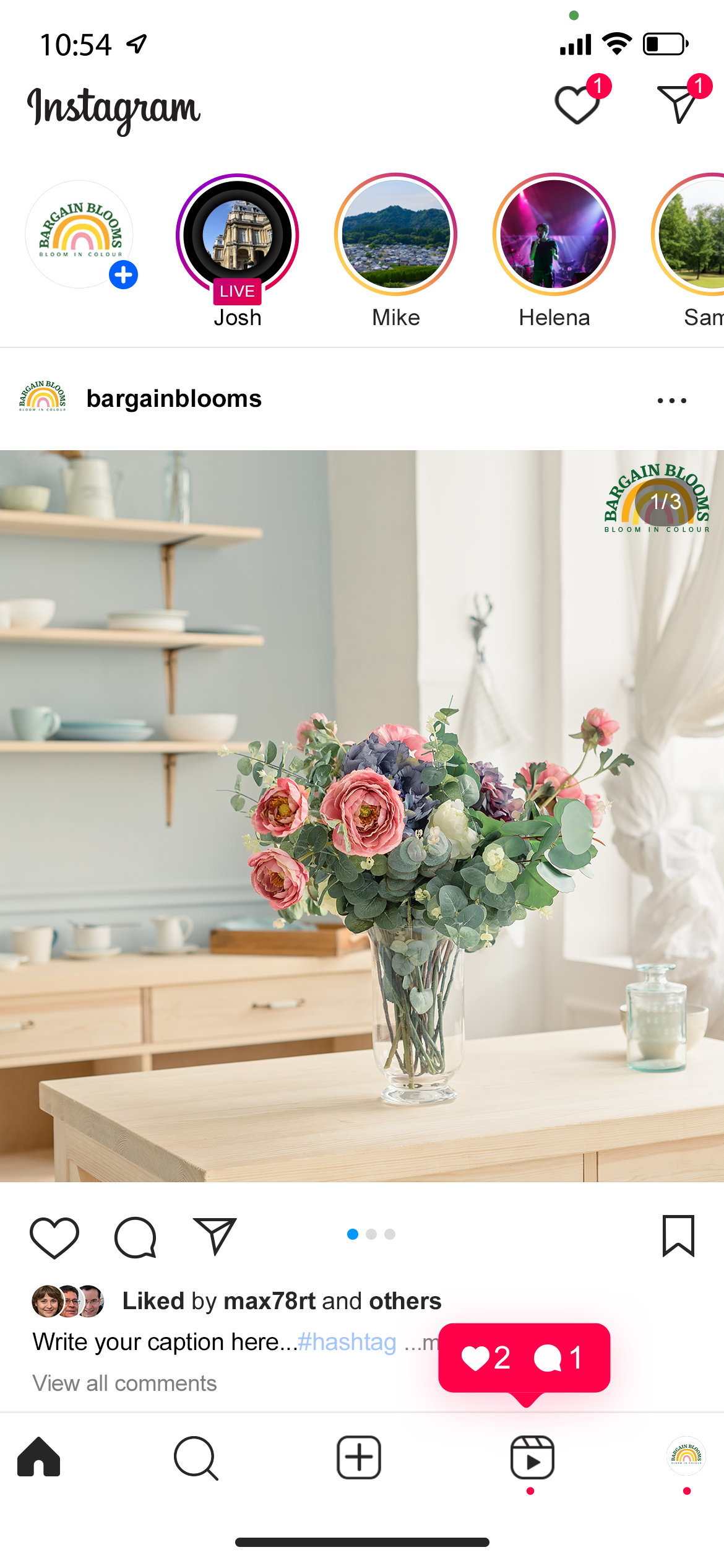
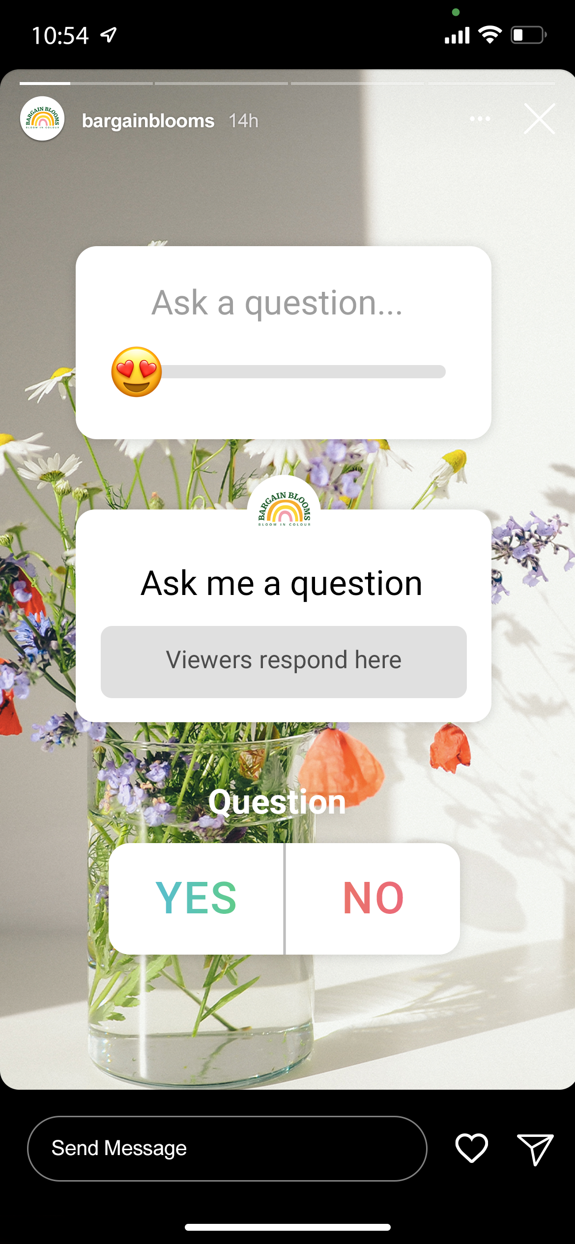
Social Media Mockup
Bargain Blooms New Website Design

