Finding roots is A MicroGarden subscription for balconies and small spaces. They deliver plant-ready containers to customers’ doors every season. Each MicroGarden is delivered every 3 months which equates to 4 a year. The subscription by first selecting the height and colour of the planter. Next you are able to choose the MicroGarden you want to have in your home.
The target audience are people who are enthusiastic about plants and have higher disposable income. It is open to people who don’t have a garden or the space to grow plants. Their goal is for people to have the opportunity as well as educate and grasp their attention towards its benefits.
The aim of this project was to create a fresh modern brand look. Our client initially requested the creation of an effective logo, the appropriate use of colour and typography and the creation of a seasonal flyer template. But following discussions, after discussion we were able to address the following deliverables which we felt would allow us to be more successful in achieving both functionality and aesthetics:
1. Branding guidelines
2. Four seasonal colours
3. Four seasonal leaflet templates
4. Business cards
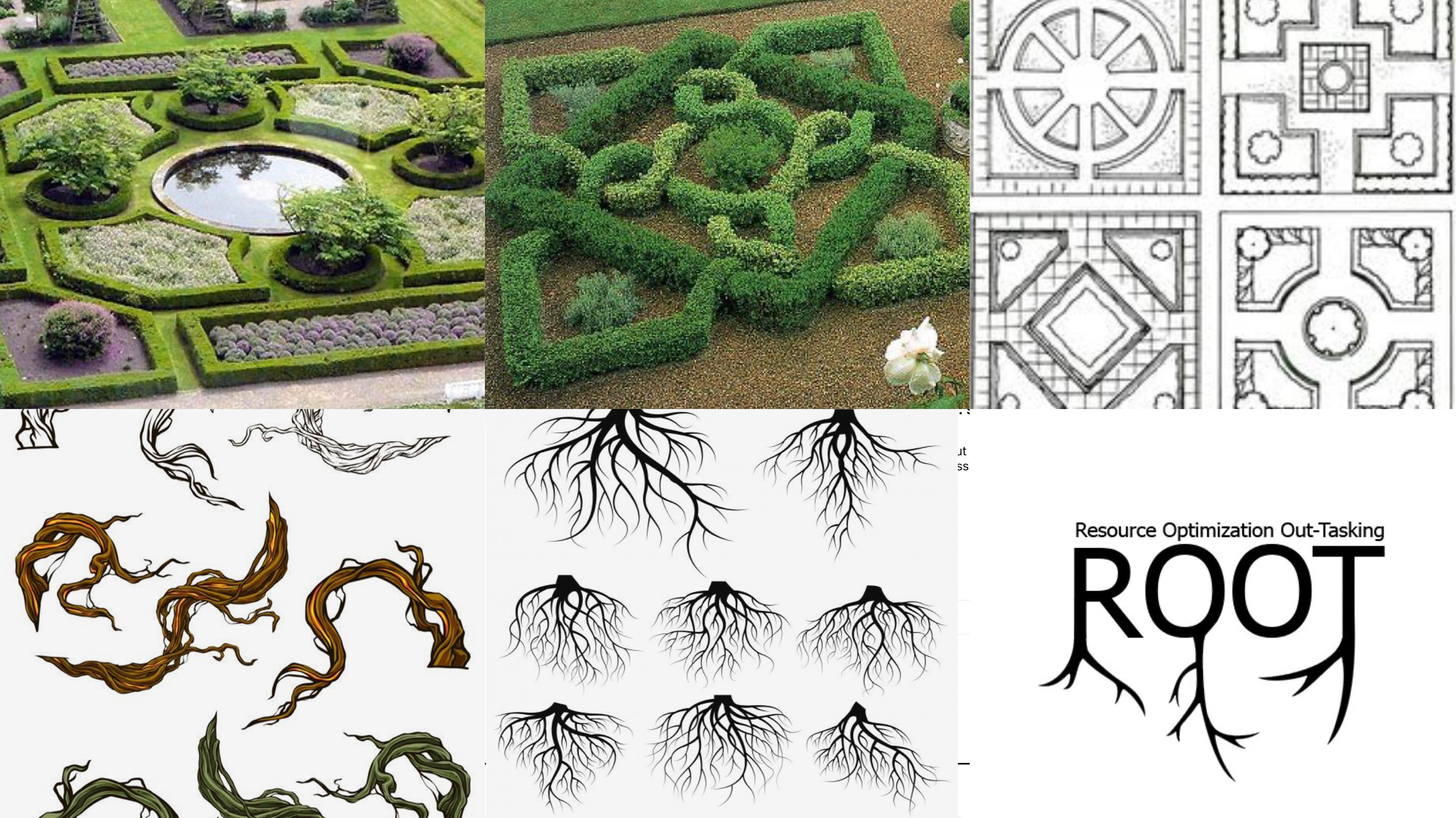
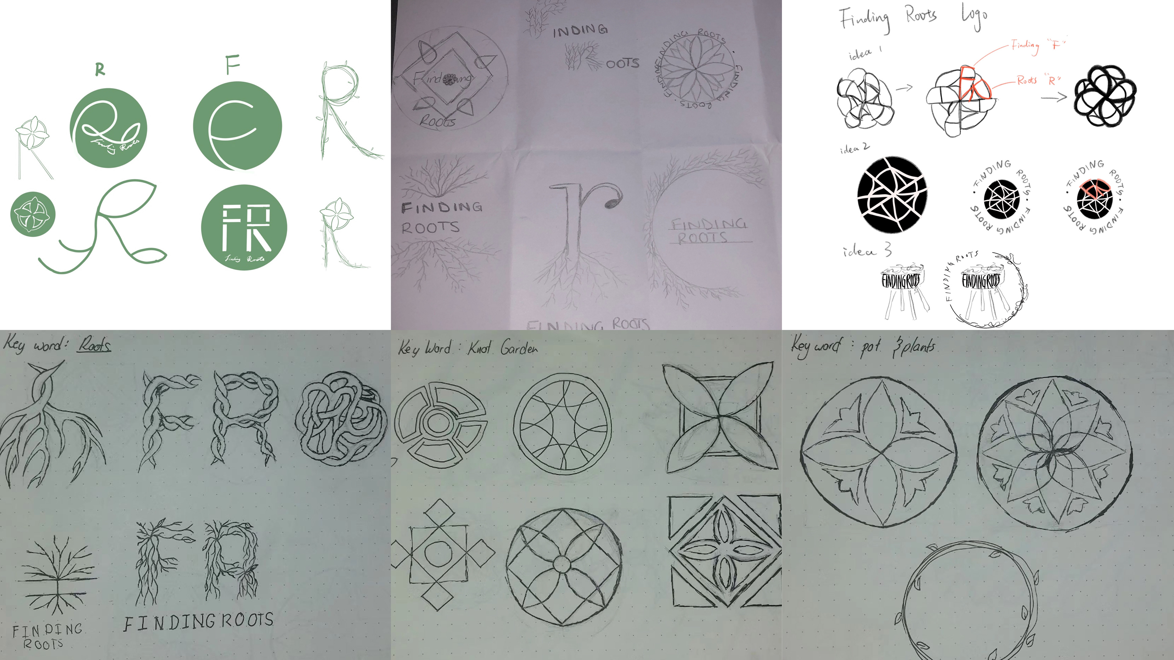

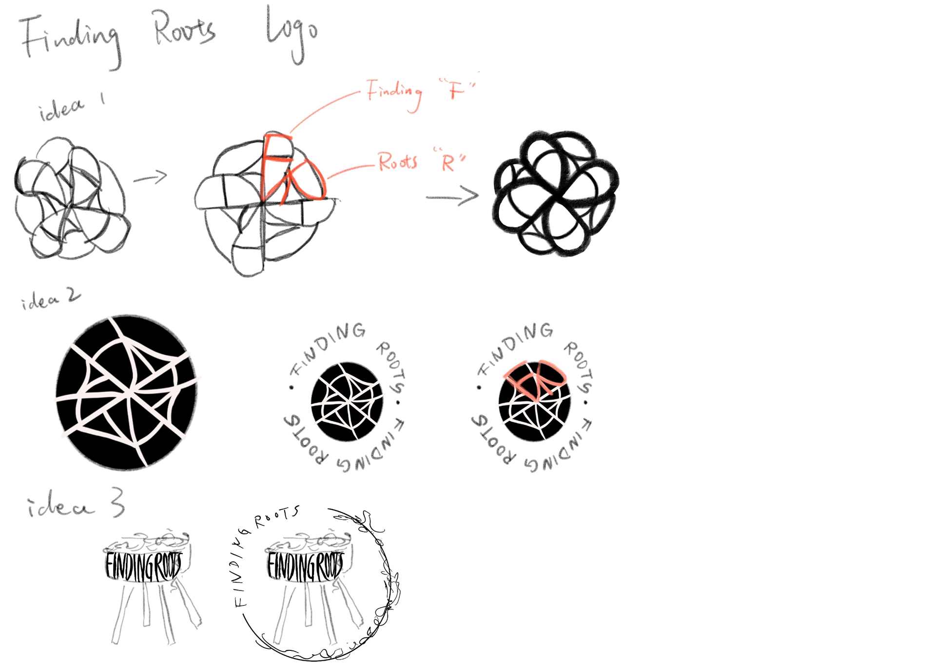

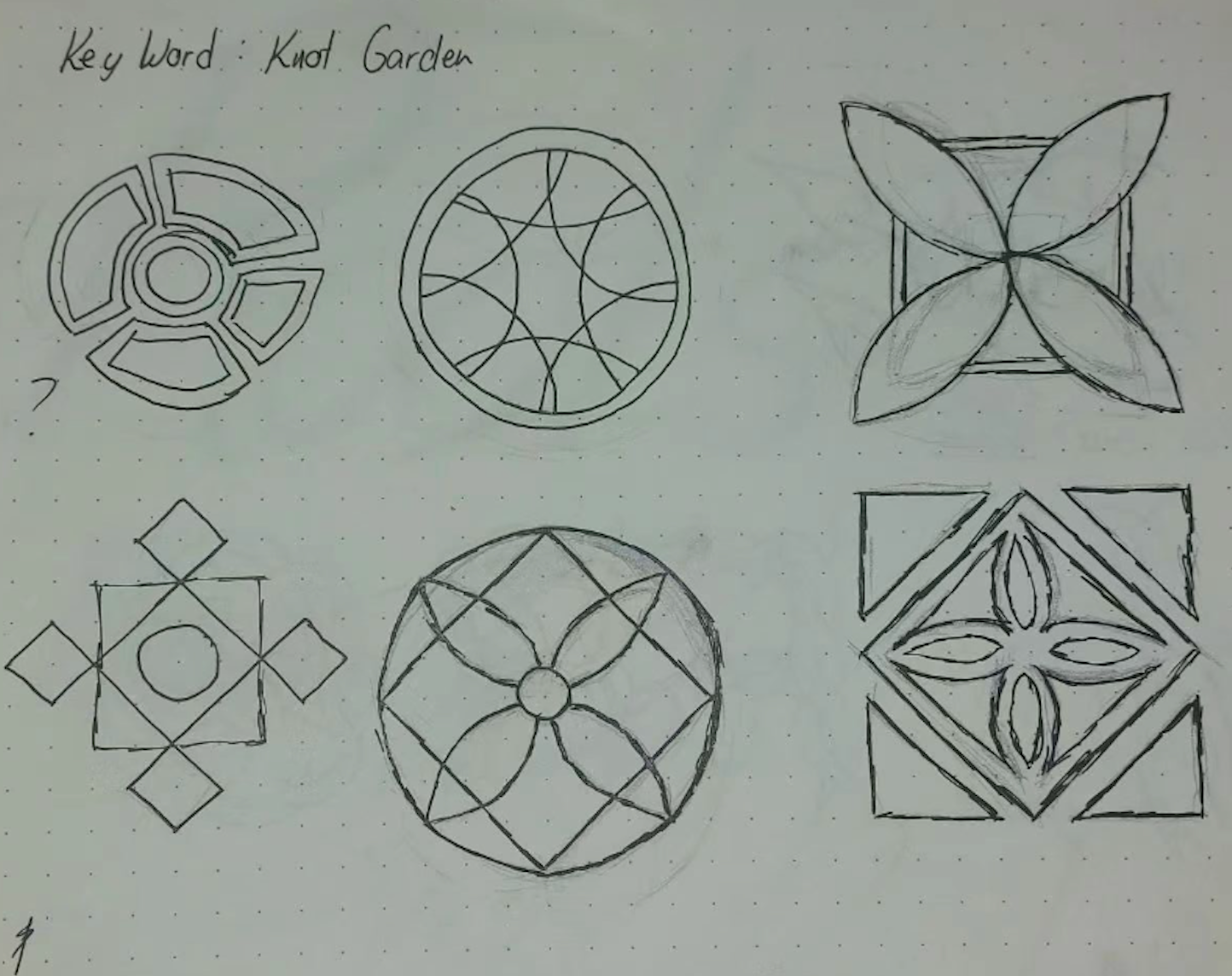

Based on research and communication with the client, the images below are initial sketches, the client wanted us to combine our research with Knot Garden, which is a particularly neatly trimmed shape. The client wanted logo to be shaped like the knot garden. So each of us worked on several designs for this idea.
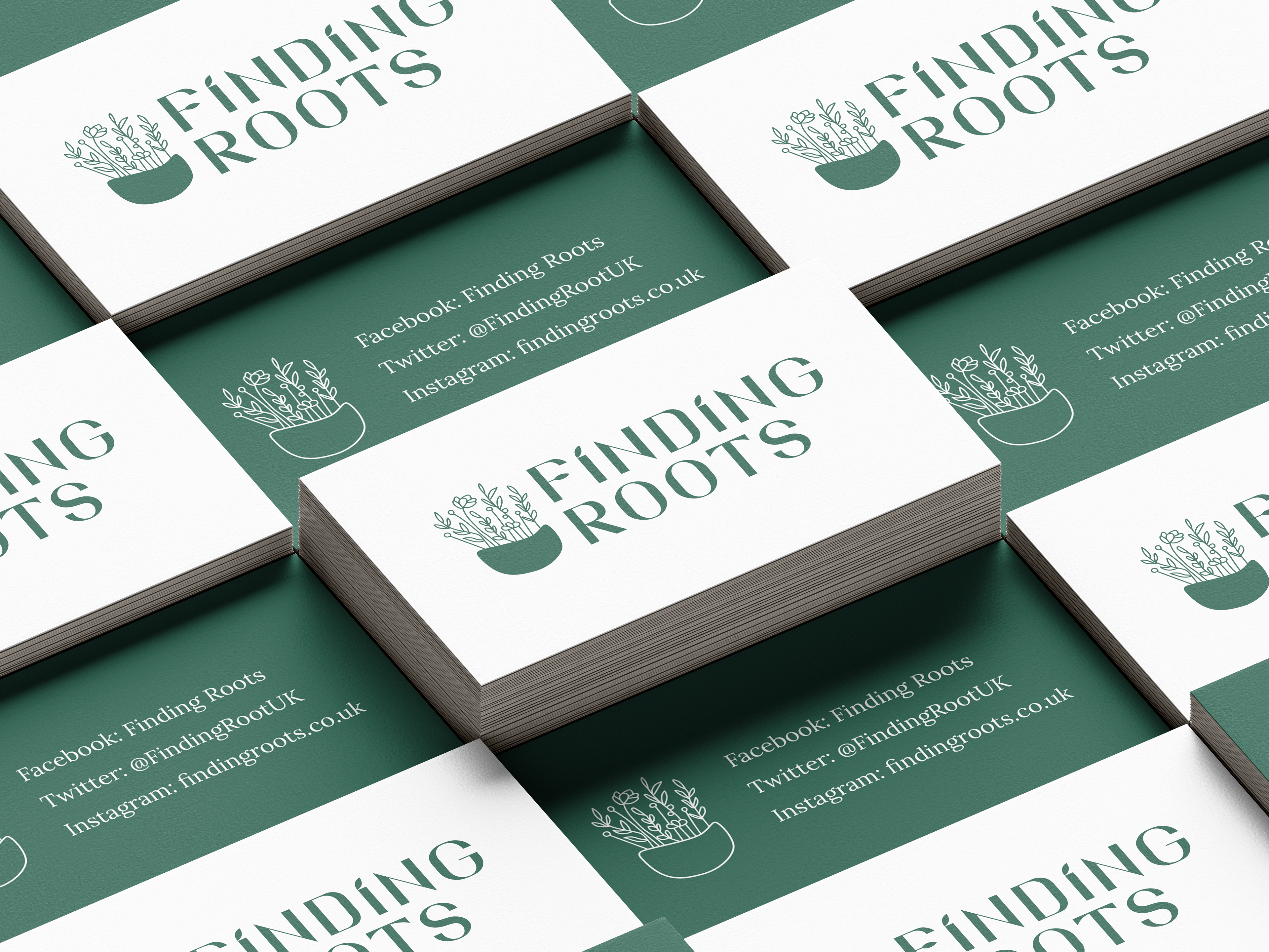
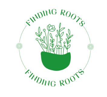
But in our research there was no florist's logo that was similar to the idea she had presented to us, and it wasn't a particularly good idea so we all made some changes based on our ideas for the florist. After analysing, reading and discussing as a group, we decided to create a design based on the original logo of a plant with roots, leaves or Finding Roots (a potted plant).
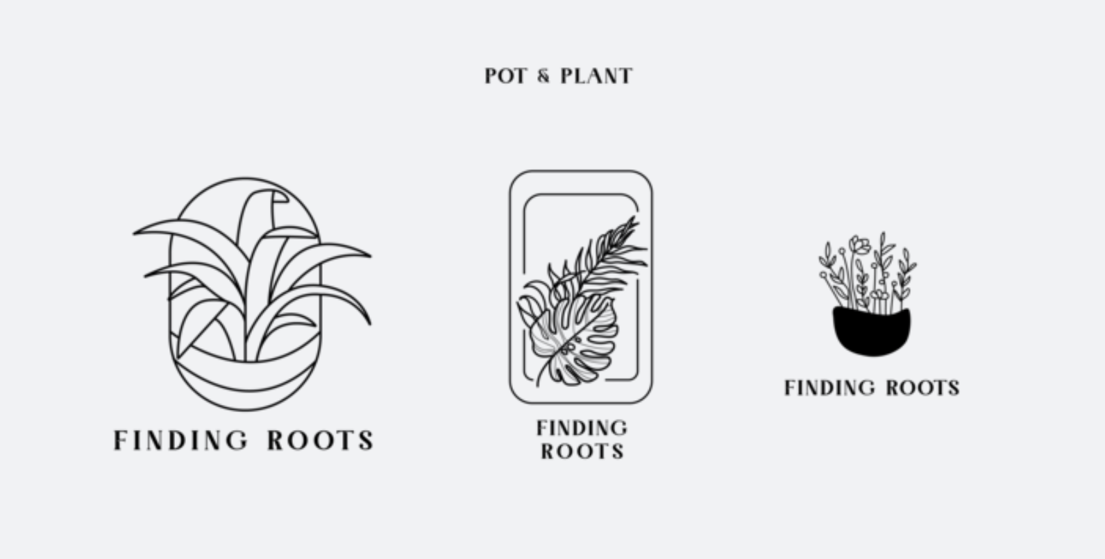


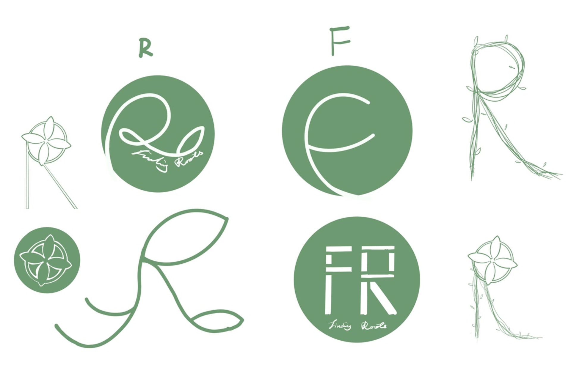
I focused on Pot & Plant, drawing different digital versions with lines, graphics and fonts respectively. In the first version the client chose a third version with the graphic as the flower pot and the lines as the flowers. This was followed by several different versions. While working on the logo, I also experimented with different typfaces for the branding, the client mentioned that she wanted the pot and plant to be combined with the knot garden and tried four different layouts.
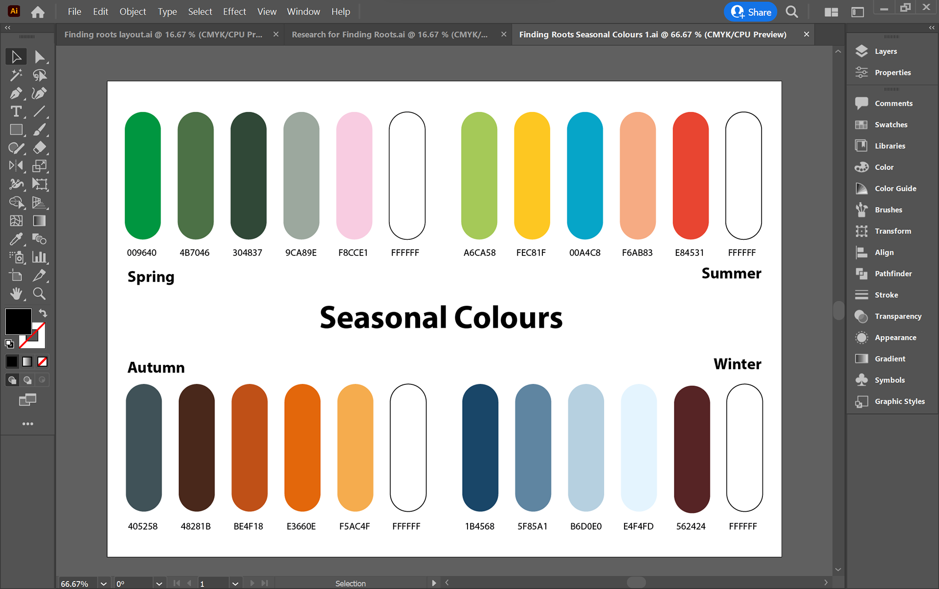
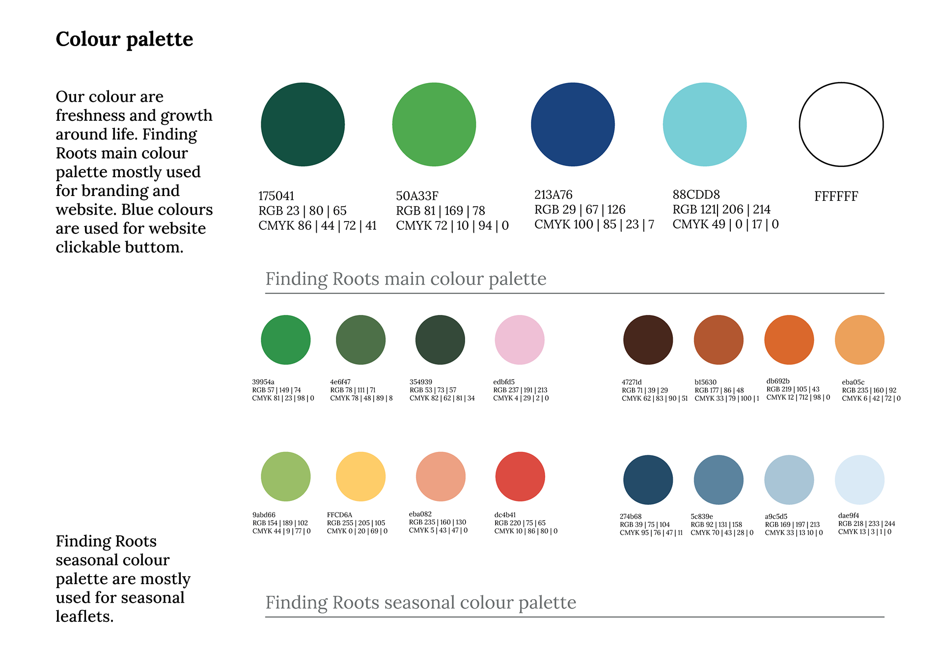
We created four colours for each season as well as a main colour palette for the client to use across their website and within the leaflet deliverables or for any other deliverables which the client needed in the future.
For the colour palette the colours that the client originally had shown in the first image which was dark and didn’t have a variety of colours that could not be used for seasonal branding and action buttons across the website. We created colour palettes for four seasons Autumn, Winter, Spring and Summer, each season is represented by four colours. After meetings with our supervisor and refining the leaflet we found that these colours did not complement each other well and that we could not find the accurate representation for each colour. Which led us to create a simpler colour palette using one colour to represent each season.


In the font selection section we decided on two fonts for the brand. One for headlines and branding, and one that needed to be clear and easy to read for the body phase. First we chose these fonts for the headlines. These fonts are very elegant and the letters are very legible. The most branded headlines are very suitable. The two fonts below are the ones we chose after our first discussion; Philosopher is used as a headline and Lora is used as a body paragraph font; Philosopher is very creative as a headline and it presents the same mood as our idea for Finding Roots. After discussing with our supervisor and communicating our choice of font we have made a few adjustments to the font choice; the font Philosopher is a little awkward to use. This is because there are some trims on the corners of the letters. This resulted in the whole font not looking like a serif or a sans serif. So we decided to replace philosopher with Alexandria.

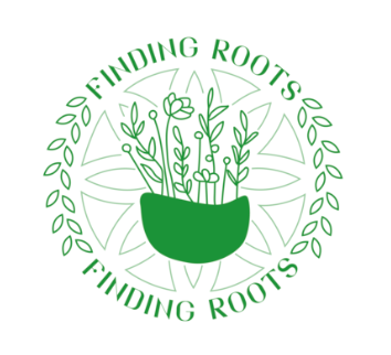
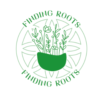
The main logo we chose at the end is a combination of an icon and text. The icon depicts plants sold by their roots. We have shown some variations of the main logo to ensure that the logo and logo elements are used in a workable manner. The logo icon should only be used in situations where space is severely limited, for example: websites or social media platforms.
This project was the first time that I had to work with a client on my own, including the design. I was able to talk to the client and to discuss their views and suggestions during the process of completing the work. The client had a lot of ideas of her own during the design process. We also had a lot of inspiration. We filtered our inspirations to optimise them and then talked to the client, listening to the comments and ideas she gave us, and then blending our inspirations to improve the design. Then we followed to the client's comments and ideas and refined them to make our work more in line with the client's needs. I was basically responsible for the brand guideline this time. I had a lot of communication with the client about the logo. After we had created the logo for the client, the client came up with a new idea. In order to meet the client's needs, we worked hard to integrate the client's needs and at the same time ensure that we kept the original logo intact. We worked together to improve the whole aspect so that both parties were happy with the final result. Due to our tight schedule of our modules, we were not able to meet the client's schedule, which led to a lack of communication with the client. We often missed many opportunities to talk to each other due to scheduling issues. The lack of communication also resulted in a lot of information not being verified. There was no way to get accurate texts from the client. The inability to get accurate information from the client resulted in us not being able to produce an accurate leaflet template. As a result, we were not able to complete our leaflet in time. I learnt how to communicate better with the client, how to integrate my work with the client's views and how to deal with any problems that may arise during the project.
Our Blog post: http://typography.network/?p=29913&preview=true