The project aims to design a series of branding materials for the Future Film Forum 2022. This includes a poster, as well as a flyer and animation program explaining the program of the event that will be used at the conference. My design elements are derived from the stills of the eight films mentioned by the festival as the main elements. I used human silhouettes for these stills. What I want to express is that movies come from life, and life is closely related to people, so I chose to use humanoid silhouettes that do not represent any gender as the main element of this exhibition.

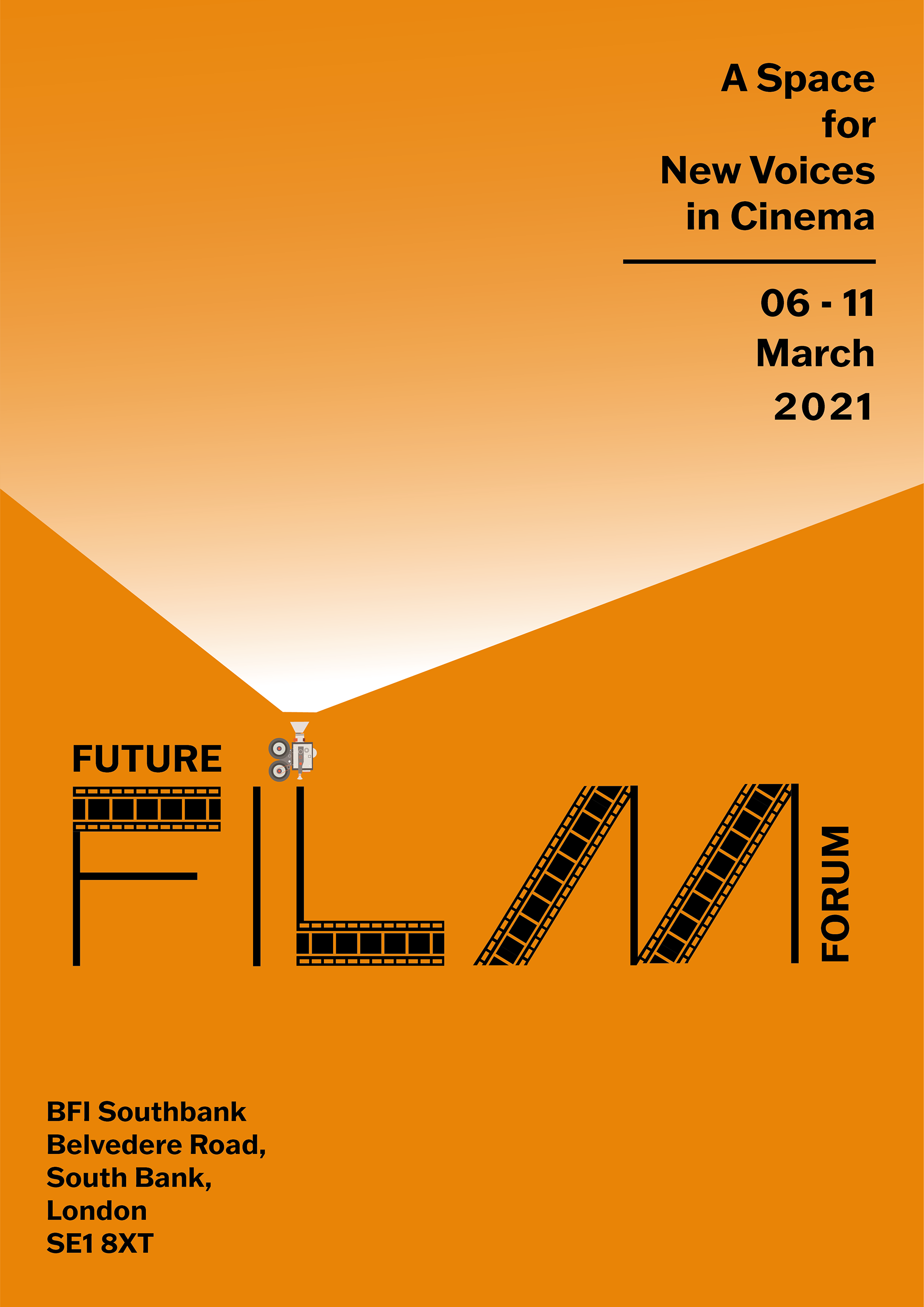
The primary poster design for Future Film Forum 2022
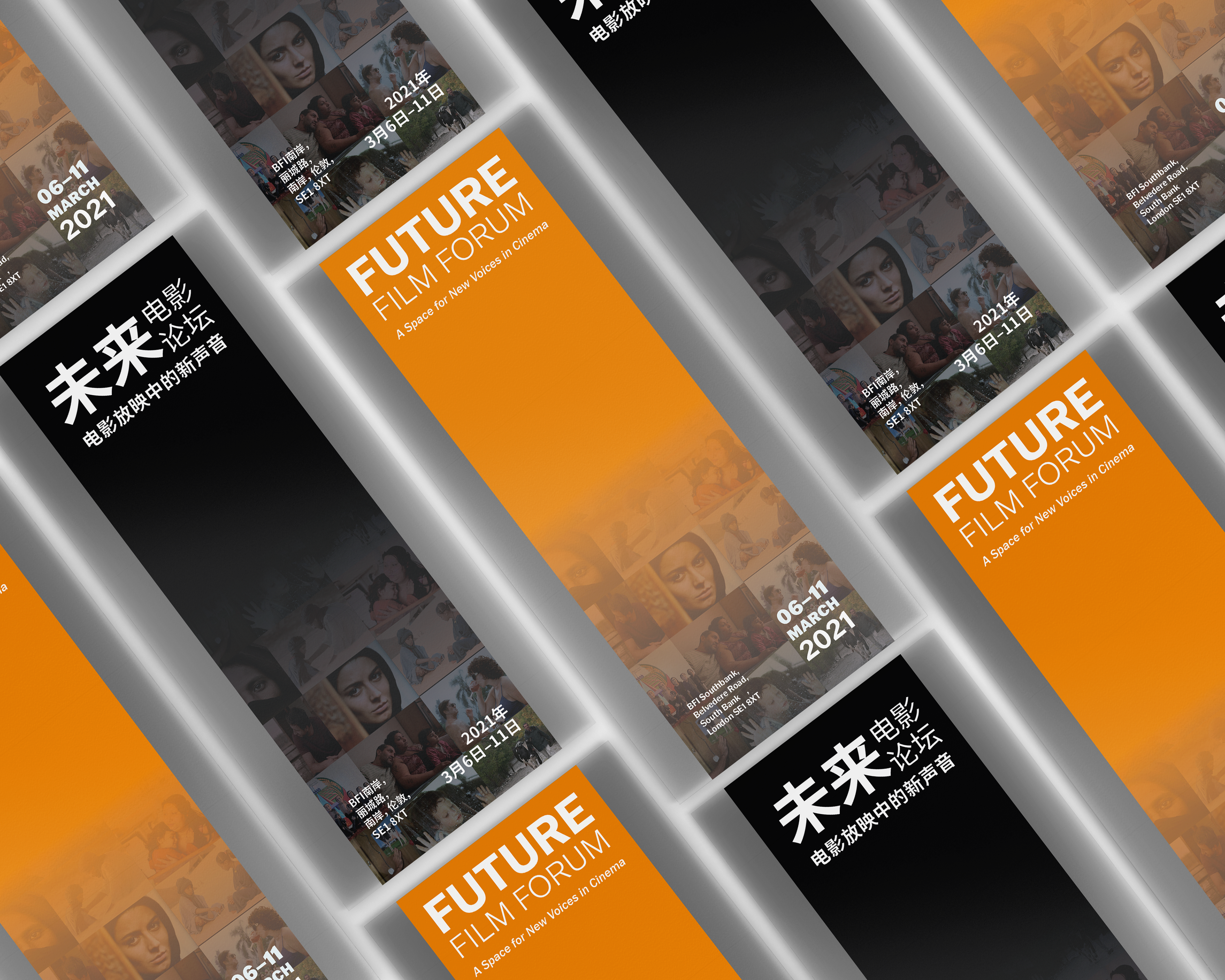
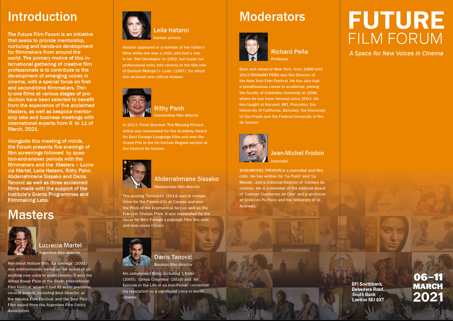
The leaflet is bilingual in Chinese and English and contains a timeline of the entire festival, as well as a concise overview of the speakers and introduction to the film.
The programme for Future Film Forum 2022

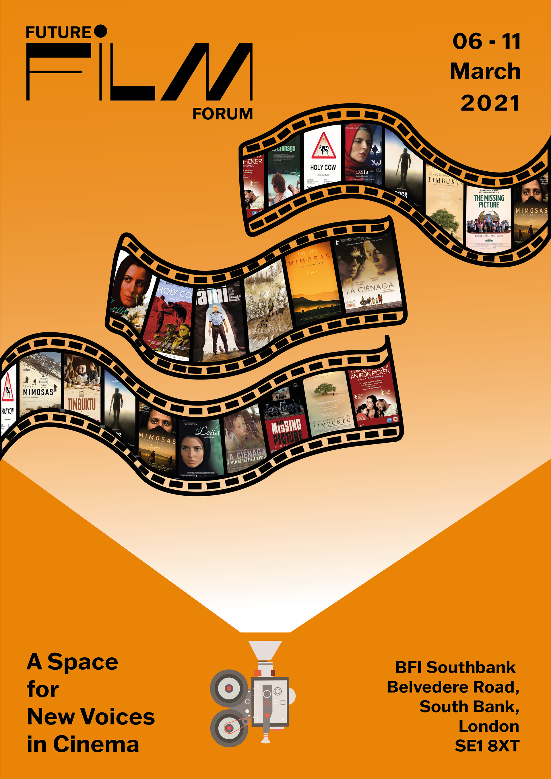
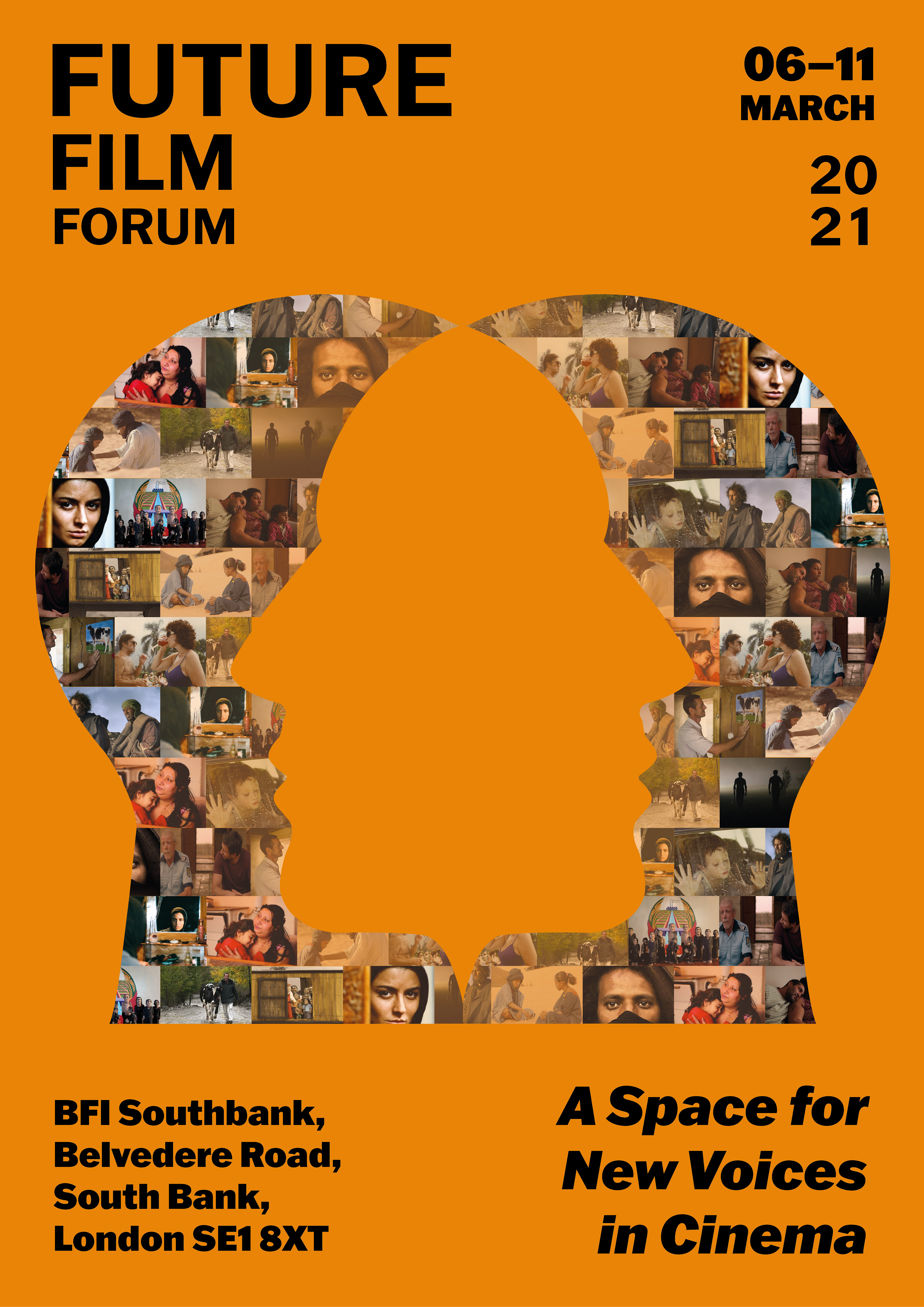
Digital poster version 1
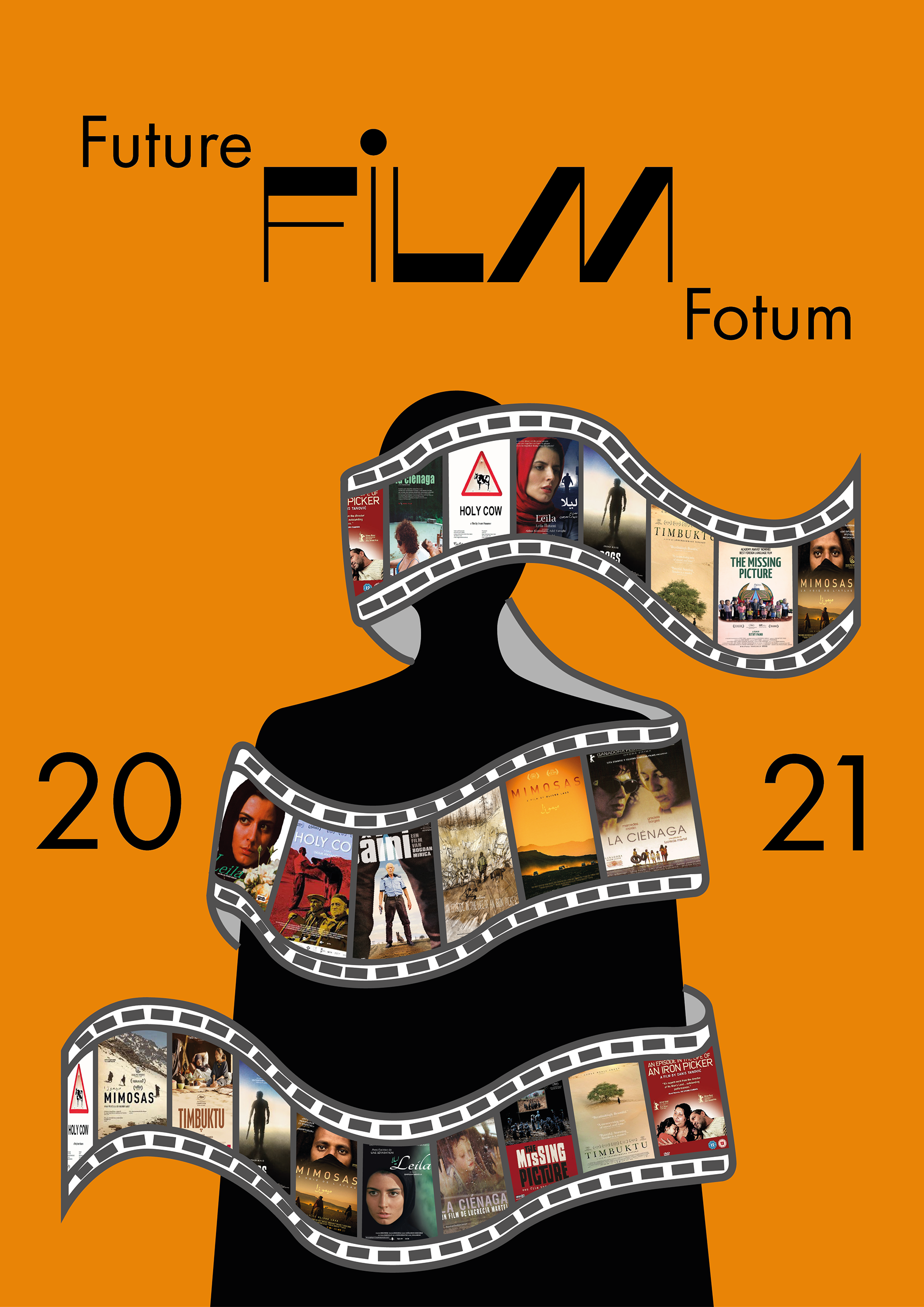
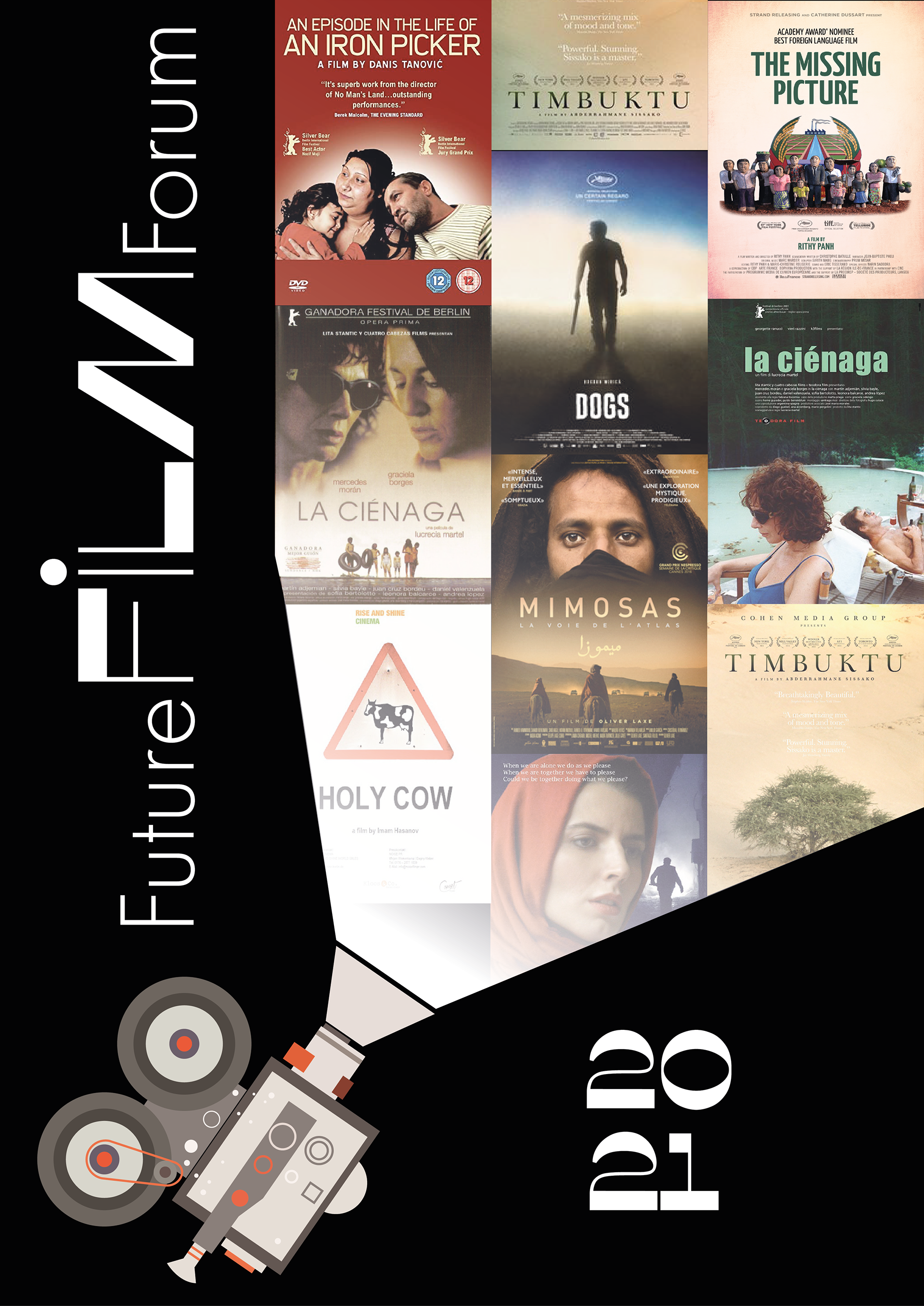
I chose two of my sketches as my final thoughts. For the first poster, I will use Assault the surface as the main idea for this poster. I want to divide the poster into two layers, the first layer is the illustration and title. The second layer uses a darker colour as the bottom layer. I will use flames to burn the first layer to achieve the final effect. I also like the second poster very much. My idea for this poster is to use cut and paste. Get a poster through cut and paste. I drew a video camera. I want the light emitted by the video camera as a main element. Place the poster in the light source.


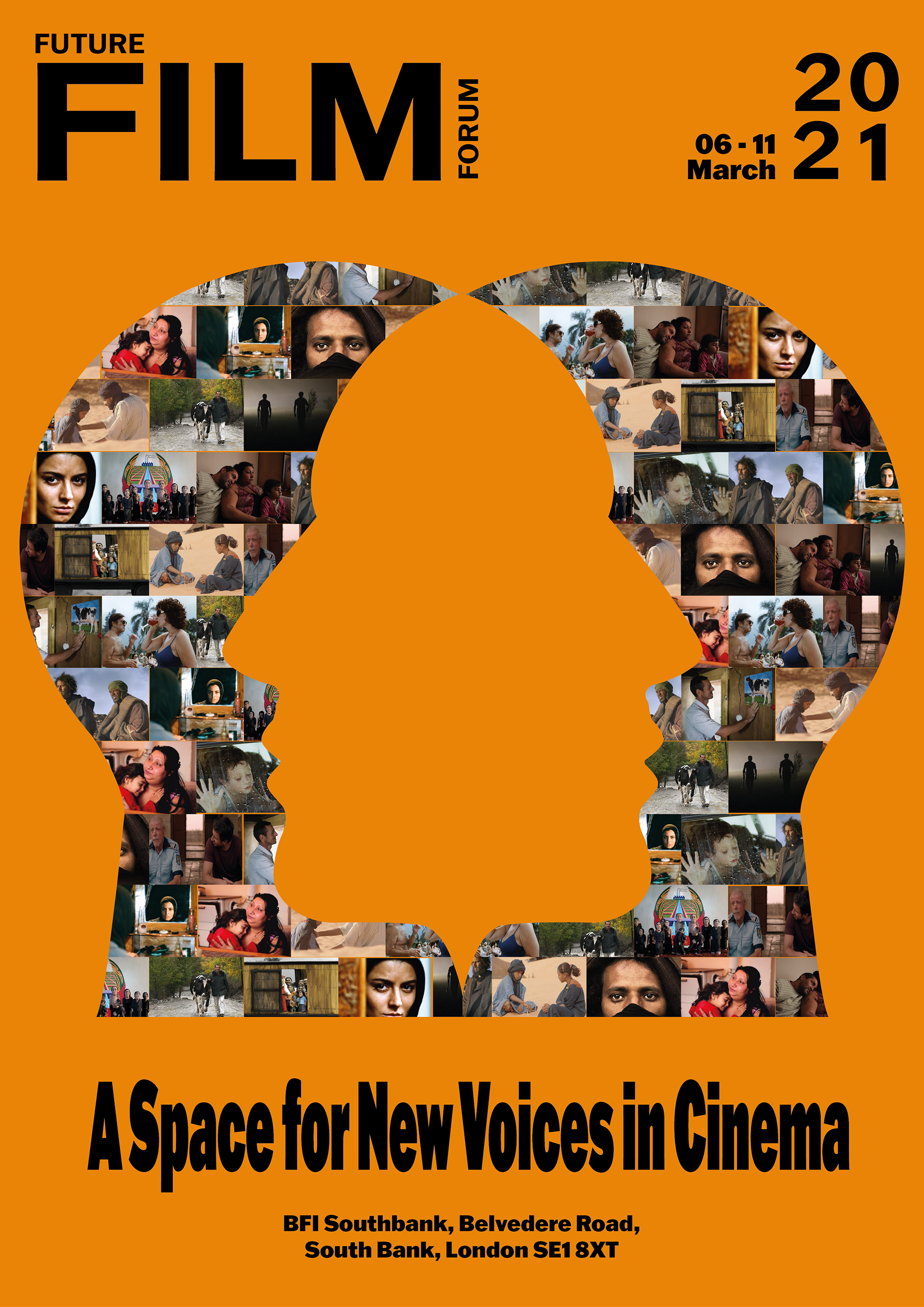


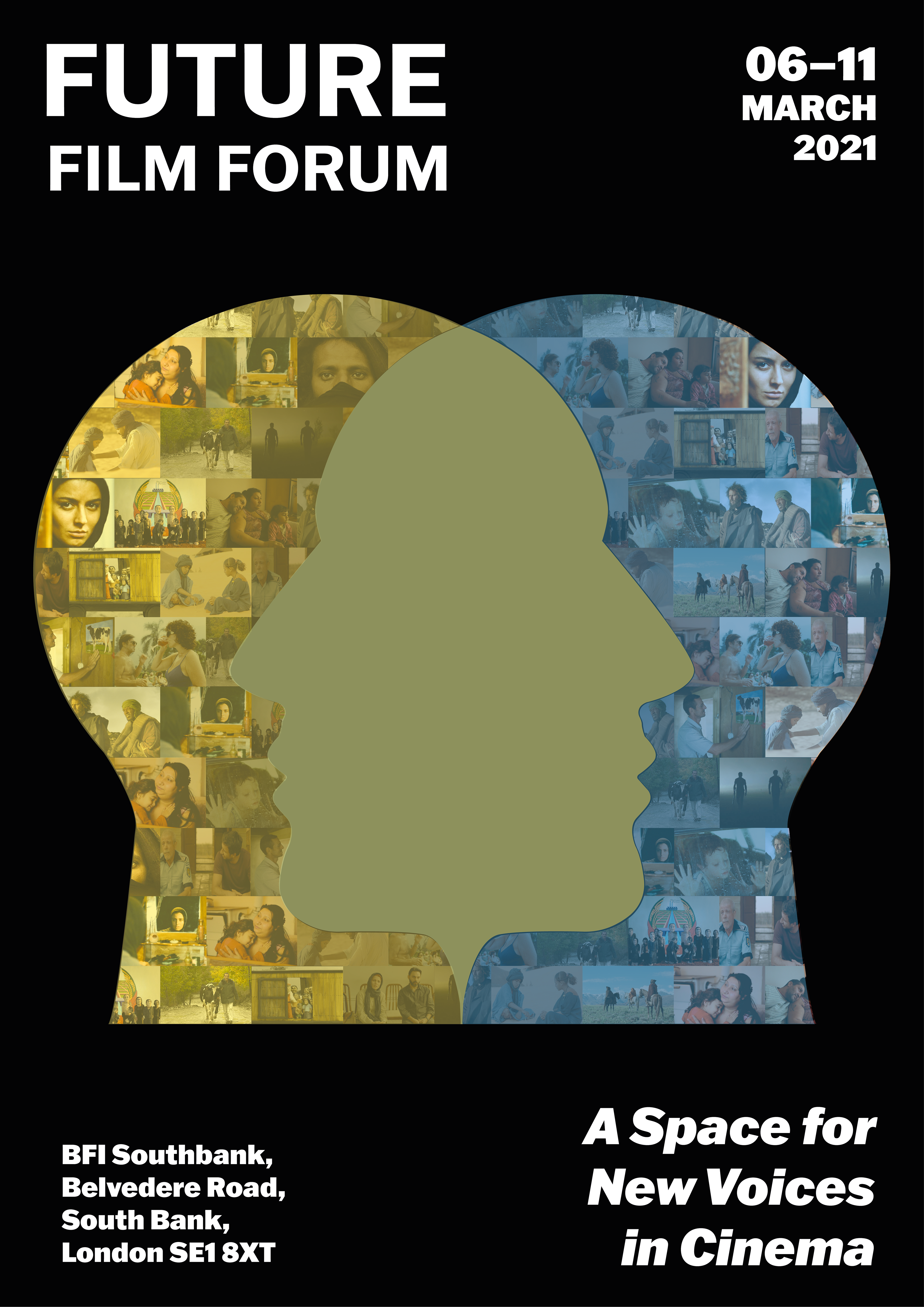
Digital poster version 2
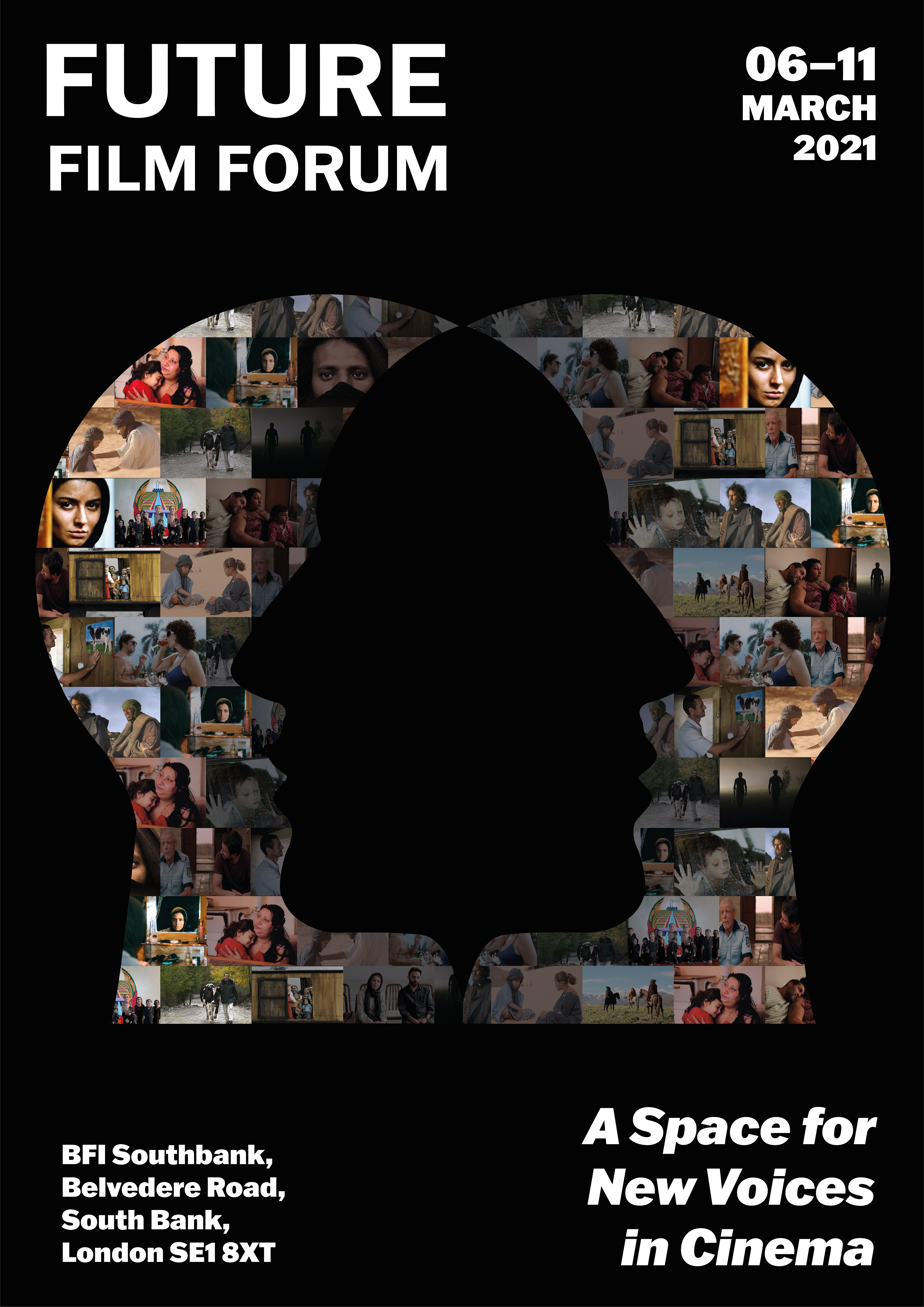
I try to use elements that areeasier to understand. I try to use silhouette. I replaced the filmposters with film stills. I repainted a new version.


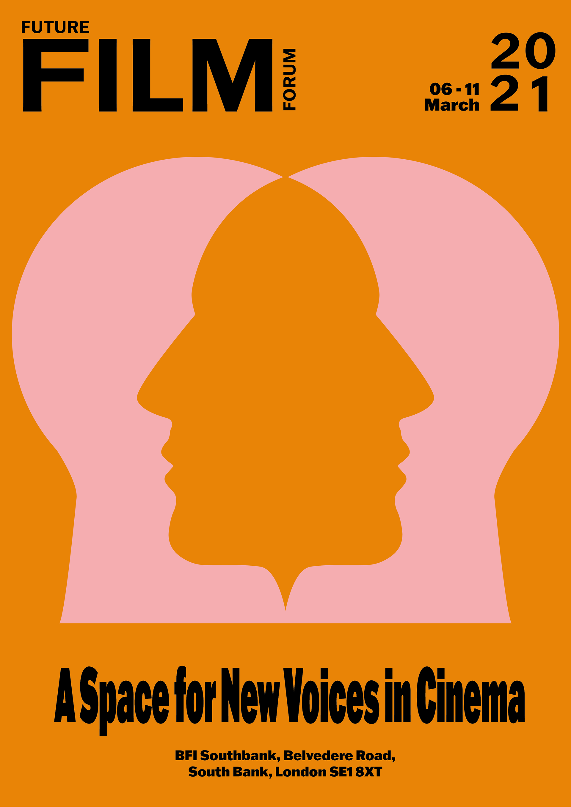
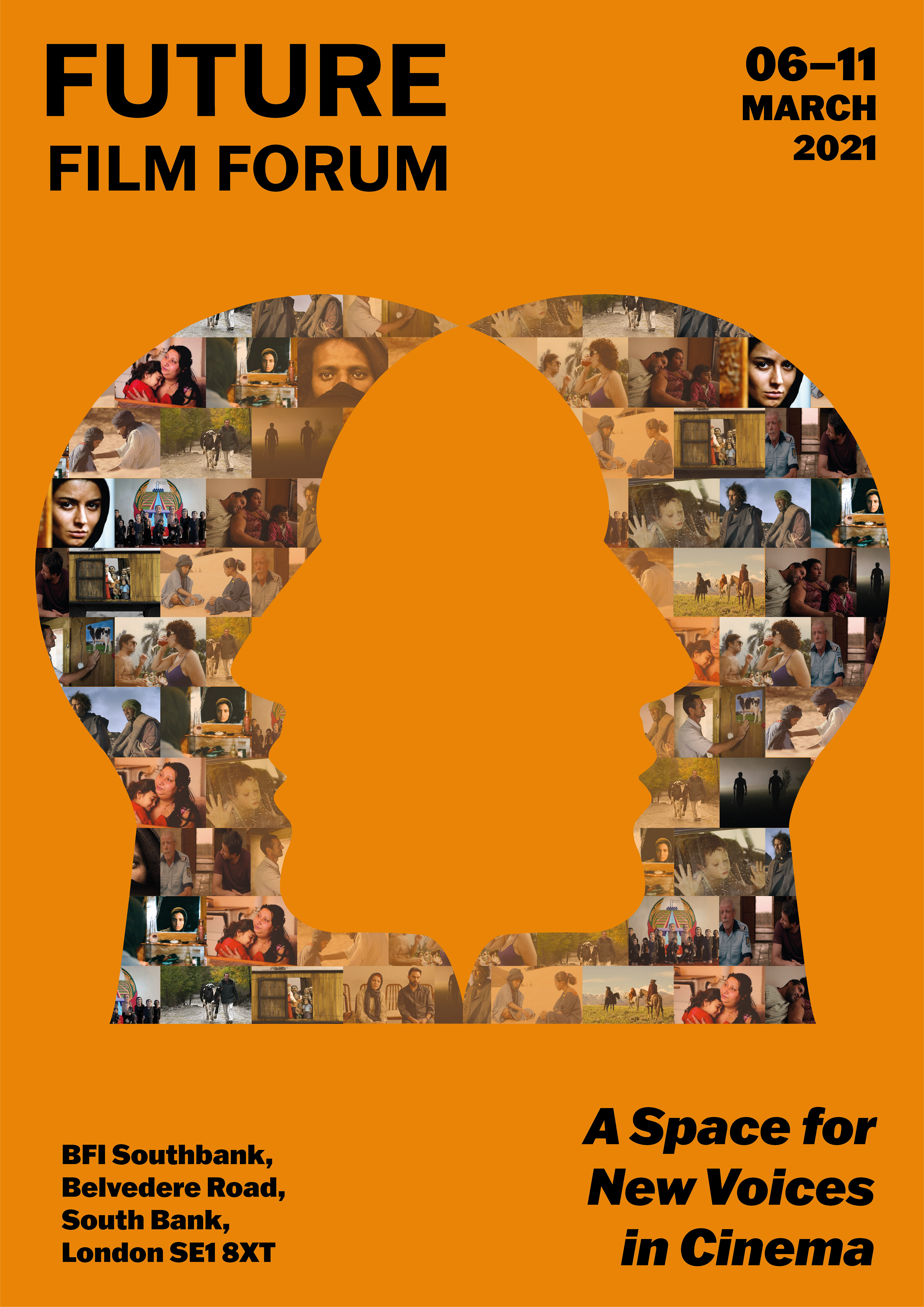
Digital poster version 3
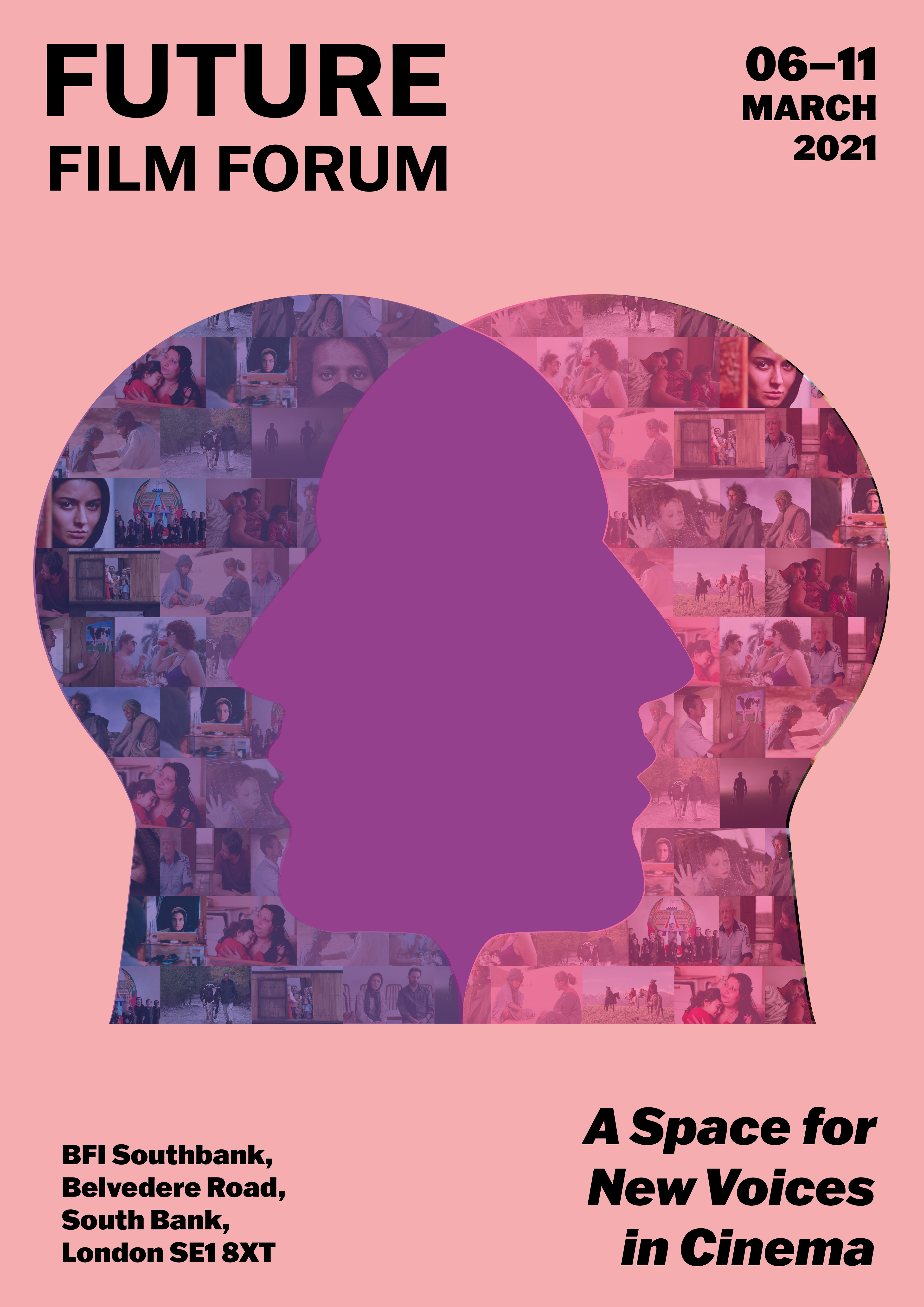
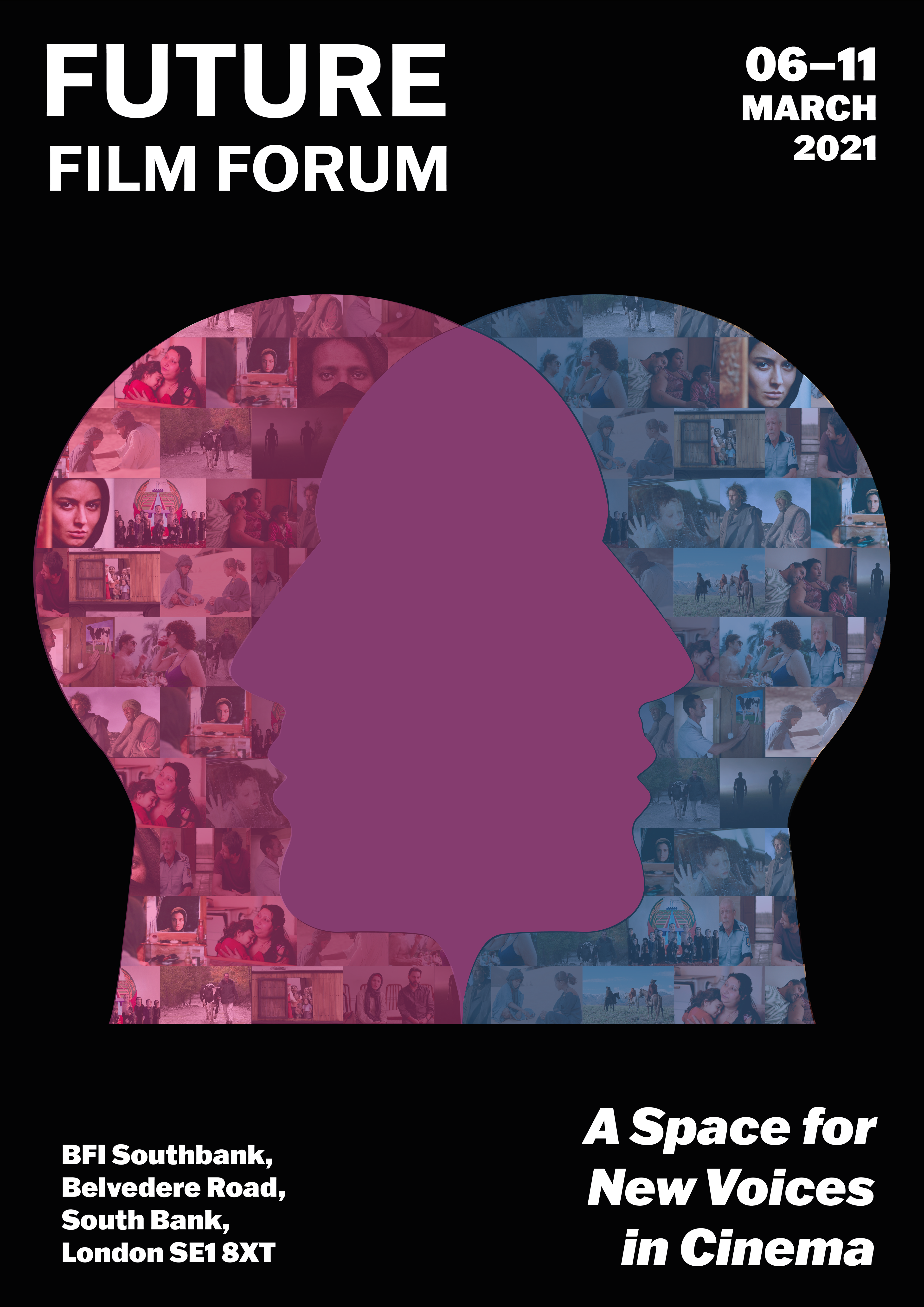
I tried some methods that can better highlight the contours of the two head shapes. I tried to use the overlap method by using two different colours to overlap, so that overlapping colours appeared in the middle. I used dark blue and magenta, yellow and blue. Not only did I try to change the collage, I also tried to change the background of the poster.


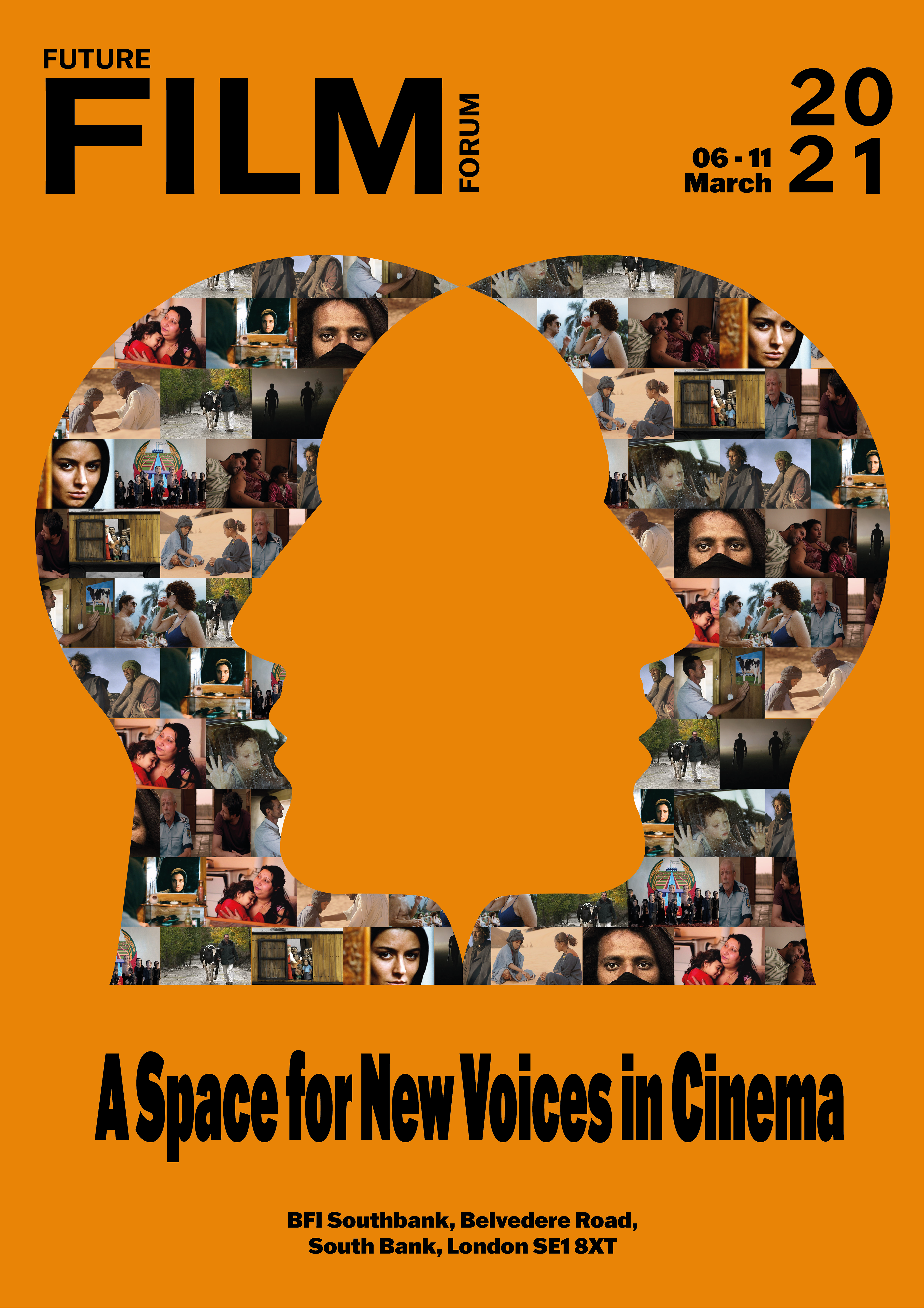
Digital poster version 4
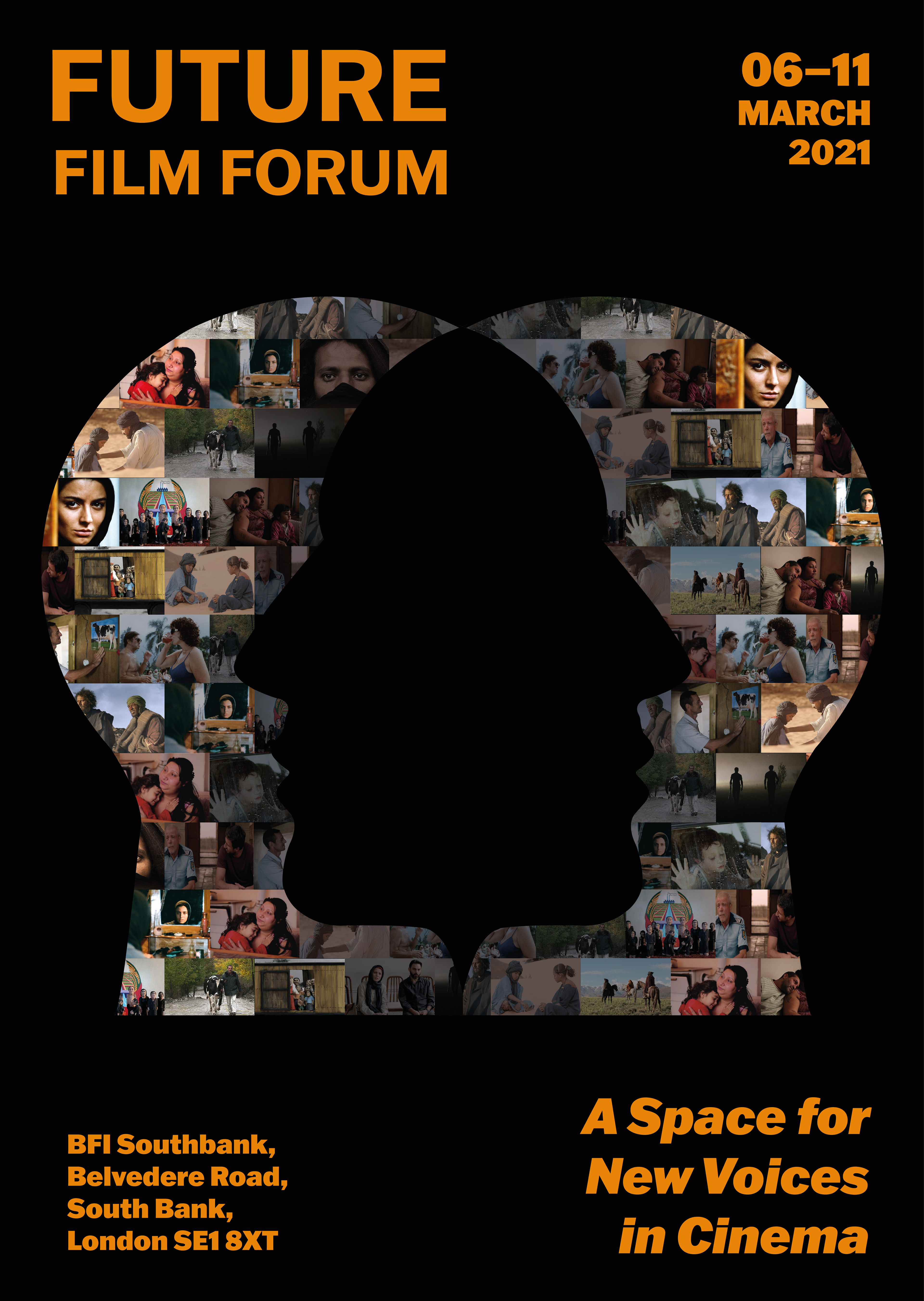
This is the final version decided this week. Compared with other previous versions, I think I still want to stick to the original idea. One reason that I have been doing different tests before is that not everyone can see at a glance that the collage on the poster is two people. Some people think it looks more like a keyhole. All I have been trying to make it look more like two people.


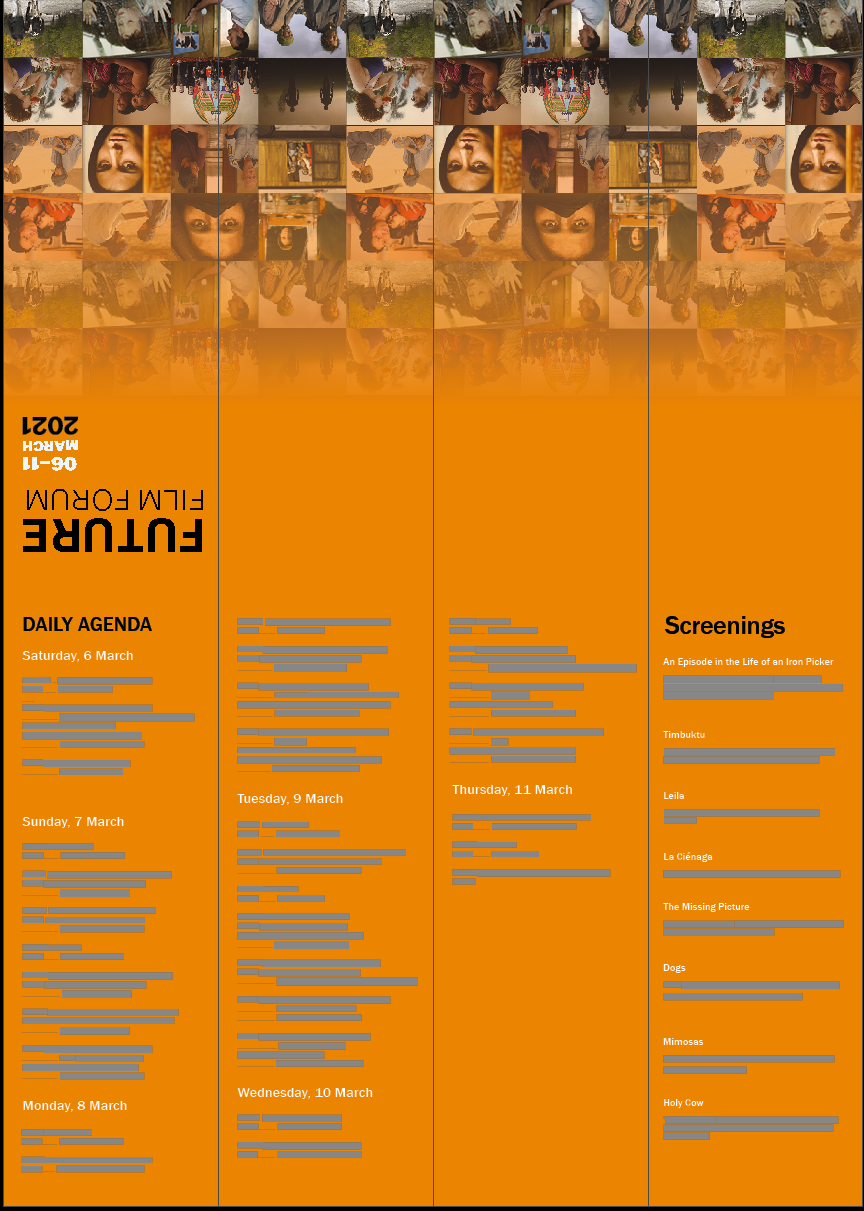
Leaflet design process


I chose to set the main elements of leaflets as the background of the collage related to the poster. This is more relevant to the subject. I have made many different attempts before this. But it seems that using the same elements feels more like the same theme.