
Introduction
Design and create physical and digital packaging for relaunched food products. I chose the British tea brand, Teapigs, for this tea packaging to include a range of options for the product (such as different flavours). The packaging also includes a marketing design.
I did some research about Teapigs in order to get to know the brand better and to give my designs a clearer direction. In November 2006, teapigs was born. They wanted to make quality, whole leaf, delicious tea available to everyone. They mainly use: All natural. no nasties. BIG leaf as their main tagline. The website describes them as using high quality, real tea as an ingredient, but it’s hard to tell from their current packaging. From here I started to redefine their packaging. High quality, fun and organic are my three main packaging priorities.

Research

Initial sketches
In my initial ideas I also tried to start exploring from a puzzle approach, I tried to see how I could make the packaging look more interesting. From this idea I realised that I was too focused on making this packaging into a series, I should have focused more on what the first packaging should look like and then confirm the style and then unify the style.
Research
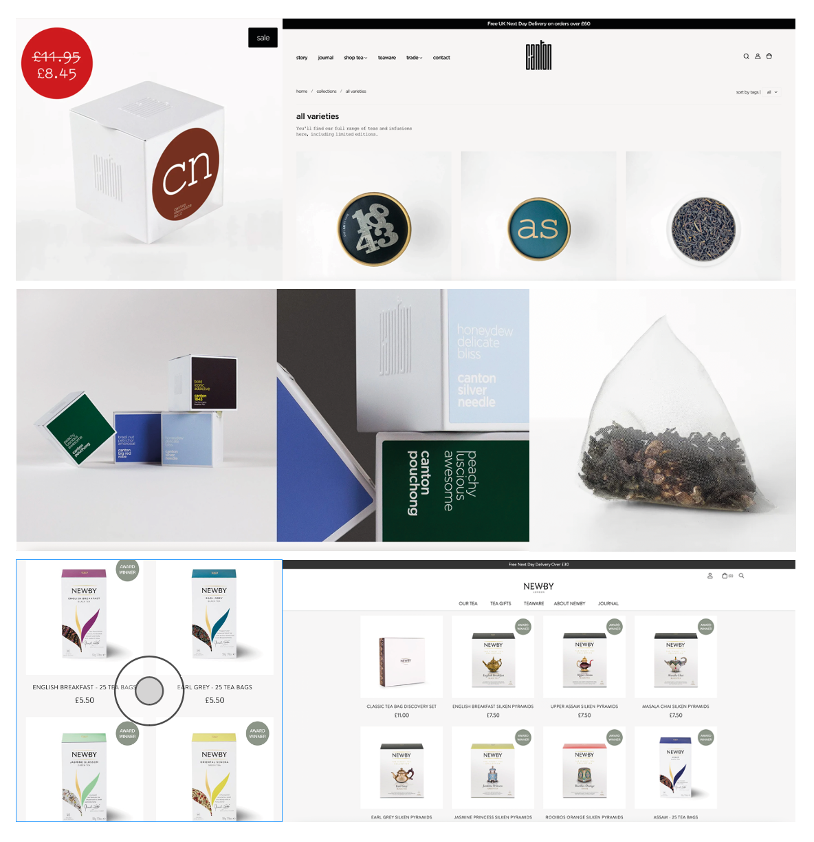
I re-researched two other brands based on high quality tea brands. They are Canton tea and Newby tea. Canton tea is one of the UK’s leading premium tea suppliers. Canton Tea prides itself on fine, rare teas from hand-picked small, family-owned or tiny, local co-operatives. Their teas are mostly organic, ethically sourced, and either loose leaf or packaged in biodegradable plastic-free tea bags. Newby is the world’s most awarded luxury tea brand. Newby is committed to the preservation of not only the character of tea itself, but also its history and culture. In 2011 their Chairman set himself the task of acquiring the world’s greatest collection of teawares to record and preserve tea cultures of the past.The research has helped to clarify the direction of my design.
Rebranding
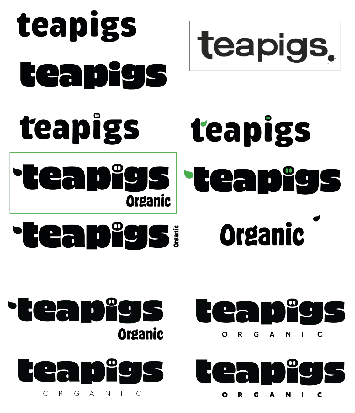
After the research I started my initial design, firstly I changed the branding design of the brand. One of the key points in the packaging was to make it interesting. I felt it was important to make the branding interesting before I could combine it with the packaging design. Making the branding interesting will increase the audience, making the brand interesting might make the public more interested in the brand and more willing to learn more about it. I added a pig’s nose to the “i” to make the word pig more interesting. To highlight that the brand is organic, I tried to put the word organic directly under the branding to get the message across in the most direct way possible.
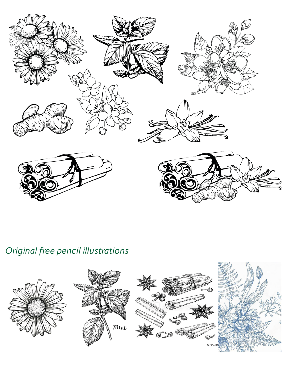
Ingredients sketches
I used free pencil illustrations from the internet and got the lines of the illustrations by using image tracing to put them together based on the other illustrations I chose. On all the illustrations I chose to hand draw the textural details to achieve a unified style. I tried more than two drawings for each of the different tea flavours to select more consistent illustrations.

Design process
I chose to develop individual packs before developing a series of packs, and I experimented with several different typographic designs based on square packs. Firstly I tried a combination of rectangular and semi-circular shapes as a background to highlight the floral illustrations. Secondly I experimented with a rectangular box top and bottom structure, I placed the branding on a rectangle with a background colour and the illustration on a rectangle without a background colour, with the name of the tea type next to it. Lastly I tried to change the graphic to a rectangular square, as I changed the background shape to a square for balance and harmony, considering that the packaging is also square. On the right hand side of the pack I placed Our story as the main message on the right hand side, I hope that keeping this message on the pack will give the customer a greater impression and understanding of the brand.
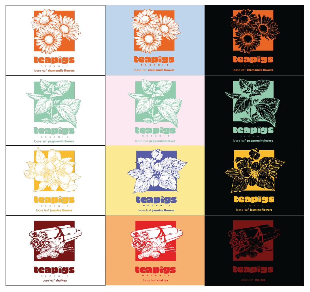
Colour test
In the end I chose a square background as the final style. I tested two other colour backgrounds in order to try out more possibilities. One is a coloured background and the other is an all black background. It is clear to see that when the subject colour is bright enough it works very well on a black background. When the darker colours are combined with the black, it is as if the black has swallowed it up. And on the coloured background, it looks very consistent, but it doesn’t make them look like they come from the same family. Perhaps because the typography makes them look like they come from one collection, but the colours are not enough to bring them together. Given the contrast between the three different background colours, I would have preferred a white background, but given that Teapigs is a tea brand that is sold more in supermarkets, there may not have been a way to stand out on the shelves with just plain white packaging. Colour would have solved this problem better instead.

Information Page
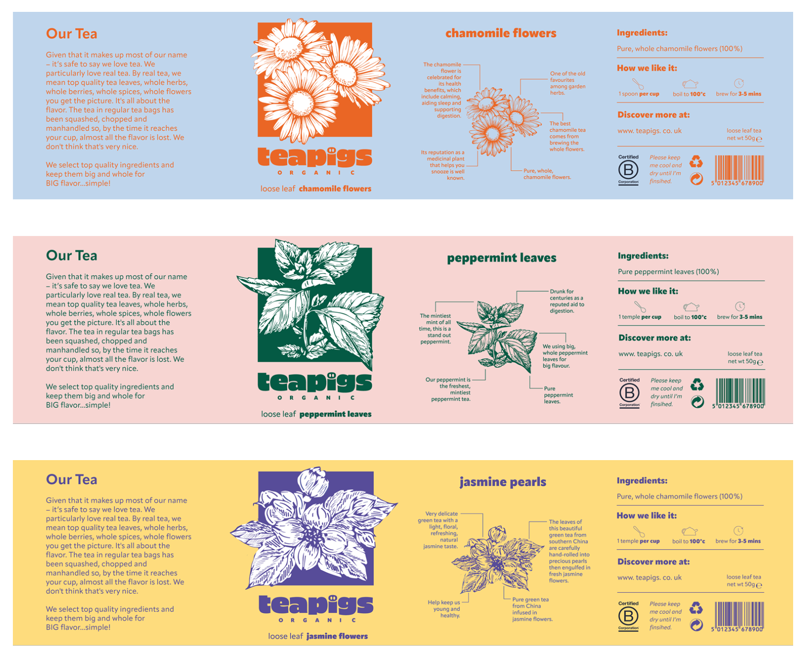
While exploring the packaging front cover, I was also thinking about what kind of information would fill it. Because on the main cover I highlighted the ingredients of that tea package. I tried to extract the illustrations of the ingredients, taking the key information of each tea from the official Teapigs website and placing it in the illustration analysis. On this side, the public can know the ingredients inside each tea package as well as some basic information about the ingredients. This step will allow the wider public to increase their impression of the Teapigs brand more closely. It also enhances the “high quality” mentioned by the brand.
Packaging selection
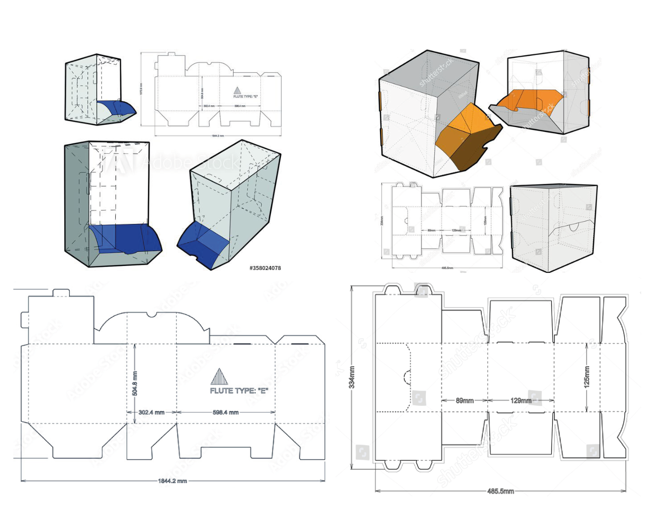
At this stage I started to choose the right box for my packaging. I chose a rectangular box with a side opening and a square box with a front opening. From the point of view of use, the square front-opening box was easier for the public to use. However, this would have ruined my square design, so I scrapped the idea of a box. A rectangular box with side openings was a good alternative, which added some design space to my design.
Design process
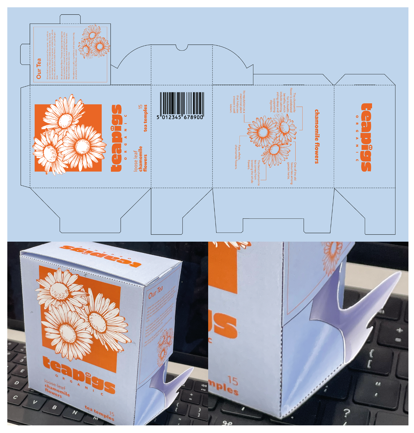
I printed out rectangular side opening boxes. I tested the placement of each piece of information on each side. The left side of the package from the front is actually the bottom of the box. This means that at the bottom I have no information to place and have lost one of the sides of the packaging to place more product information.
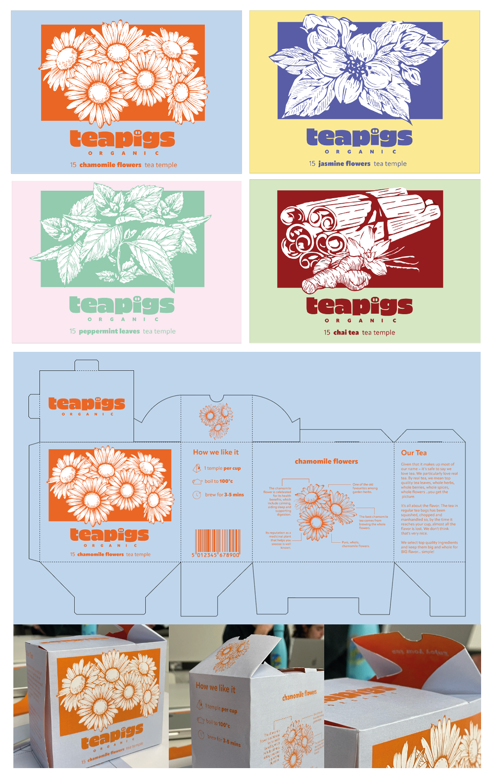
I started to adjust the orientation of my boxes because of the lack of a face to place the information on. I tried to turn the design into a horizontal design instead of being a design. In the process of changing the layout, I spent a lot of time on repositioning the illustrations because the images did not match. I experimented with different placements and how I should enrich my illustrations in
order to completely fill out my horizontal images. By changing this box to landscape, the opening of this pack becomes at the top of the box. This also gives me an extra side to place information about the tea ingredients.
order to completely fill out my horizontal images. By changing this box to landscape, the opening of this pack becomes at the top of the box. This also gives me an extra side to place information about the tea ingredients.
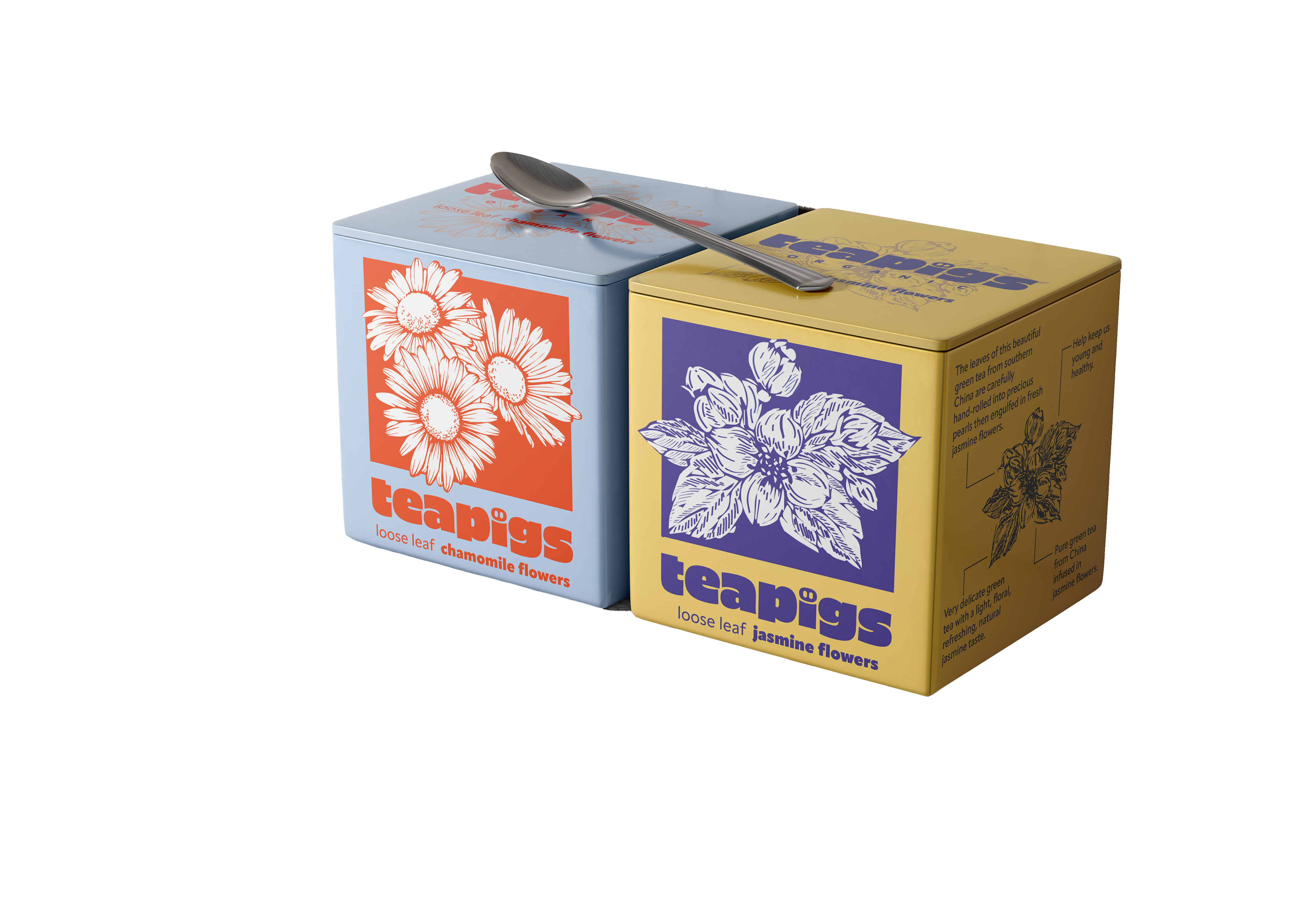
Through testing the rectangular side opening box, my design seems to have gone a little off course. I seem to be following the shape of the box to design my content. I should have adjusted to the box following my design. I reworked the design to be mainly square. On a deeper level it seems that a tea brand wanting to make high quality packaging could consider using a tin can as the packaging. A tin can can lock in the most original flavour of the tea and at the same time be recycled for an eco-friendly effect. I chose the shape of the tin as a square, flat tin.

In the end, I reorganised my information and made a few changes in a few places, my packaging design is divided into four main sides, our tea, front illustration with branding and flavour, ingredient illustration and information page.

Onlien presence
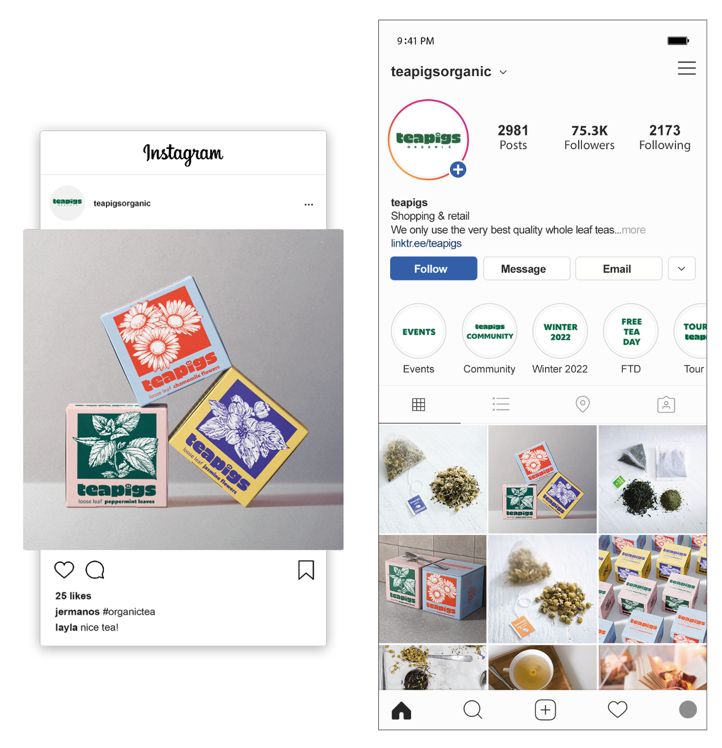
For the online presence, I chose Instagram for teapigs and their official website where you can see the tea products they share on their main Instagram page. This also includes the collection I designed. You will see how the products I have created look on the teapigs website.
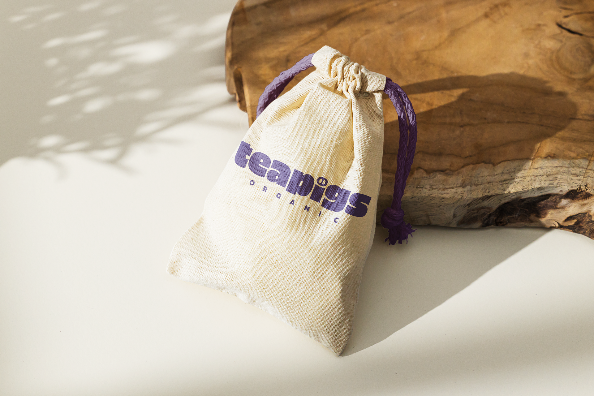
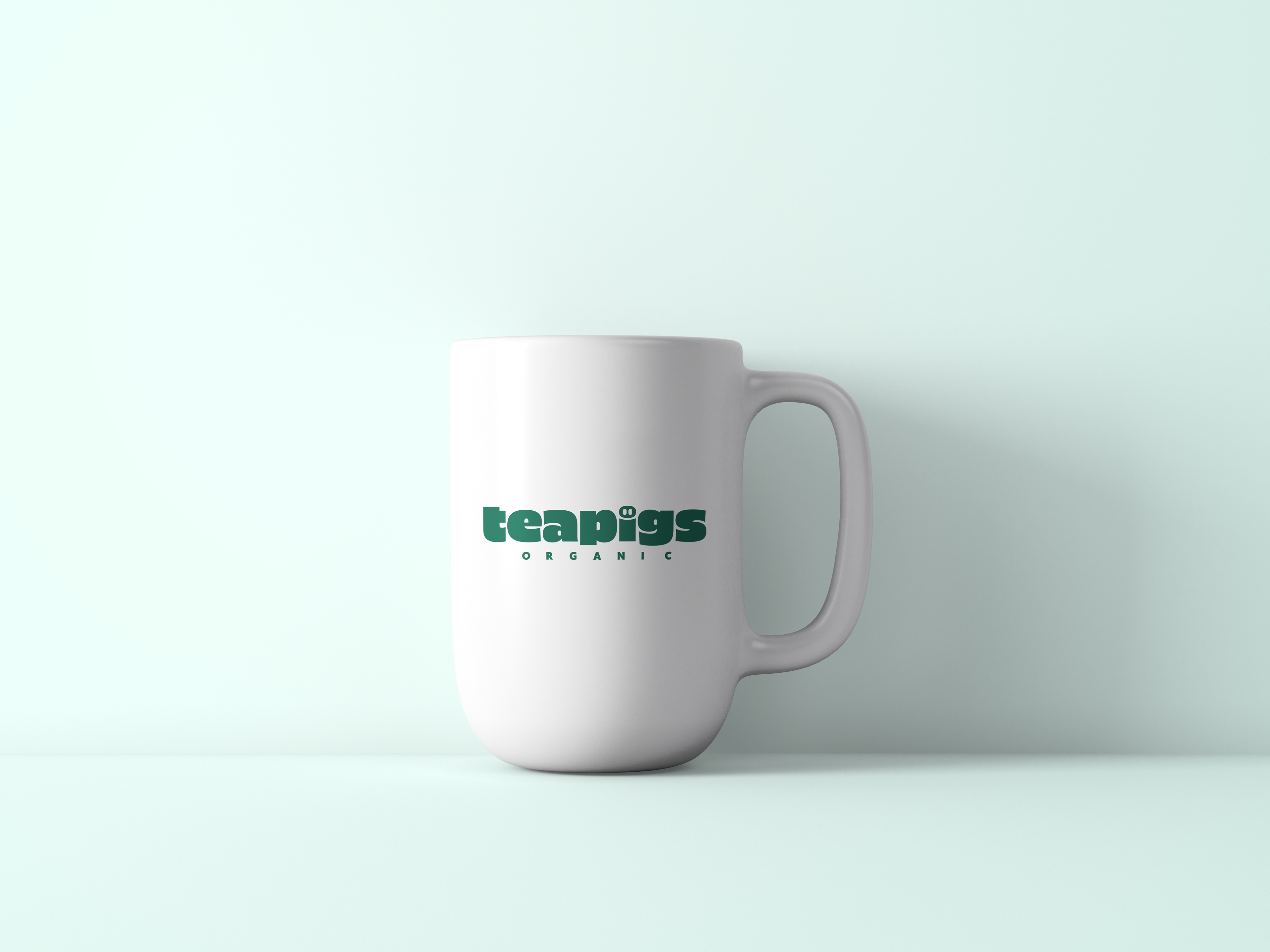


Merchandise
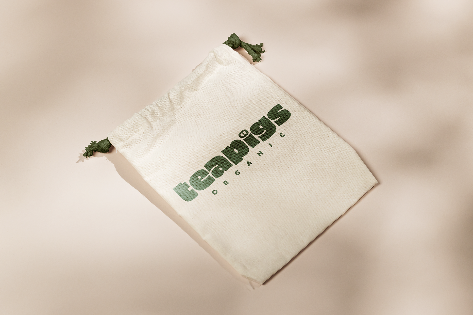
For advertising, I chose to use canvas tied bags, mugs, notebooks and posters. Canvas ties are also reusable items. Posters can be placed in lighted advertisements at various bus stops to advertise the products.


Digital mockup
This is the final outcome of my tea packaging expectations, my designs will all be printed on the tin, but due to my limited
opportunities I was unable to print the final result myself like this. so for the previous digital prototype I used a square box instead. This allowed me to show the other sides of my design. The switch from cardboard boxes to tin cans was due to my redefinition of the teapigs brand as, high quality, organic, funny. Unlike paper, which can get wet and wrinkled when exposed to water, tin cans do not. Some people would say that paper is recyclable. But tin cans are always recyclable. One of the biggest advantages of the tin is that it preserves the original taste of the tea leaves. On the basis of the tin I would actually like to use embossing print finish. This will highlight my illustrations and enhance the texture at the same time.
opportunities I was unable to print the final result myself like this. so for the previous digital prototype I used a square box instead. This allowed me to show the other sides of my design. The switch from cardboard boxes to tin cans was due to my redefinition of the teapigs brand as, high quality, organic, funny. Unlike paper, which can get wet and wrinkled when exposed to water, tin cans do not. Some people would say that paper is recyclable. But tin cans are always recyclable. One of the biggest advantages of the tin is that it preserves the original taste of the tea leaves. On the basis of the tin I would actually like to use embossing print finish. This will highlight my illustrations and enhance the texture at the same time.
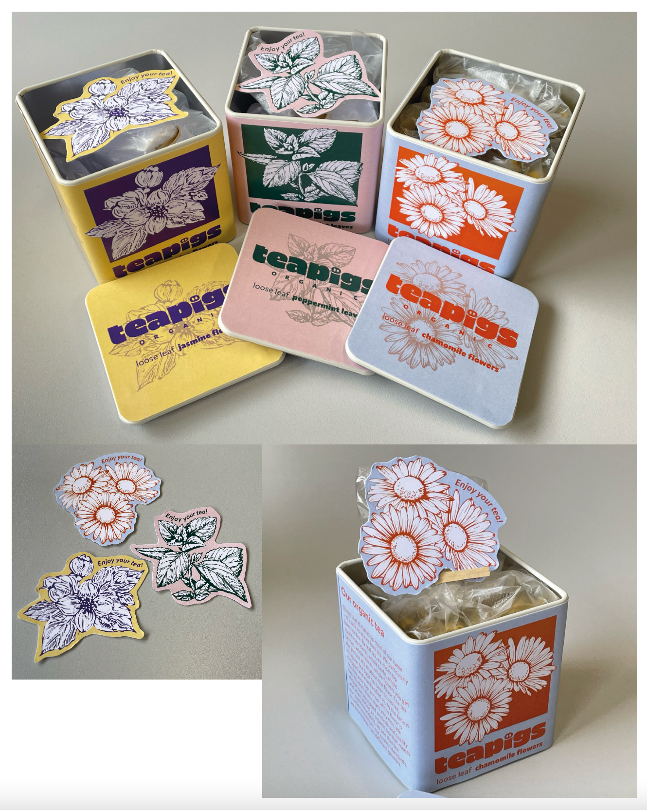
Physical packaging inside
In the packaging I have created a corresponding illustrated card in each tin. Customers can collect them or use them as bookmarks. I have chosen a 250g weight cardboard material for this card. On the card you can also see the words “Enjoy your tea”. This is a great way to impress customers with teapigs.

Physical packaging
These three are the final products I have produced. After modifying the design of the front illustration, the square fits better with the shape of the tin.