Why is period tracking so important?
You can learn more about your body and how it varies with your cycle by keeping a period journal. On a fundamental level, period tracking can inform you of or anticipate the timing of your next period. However, period tracking can reveal so much more about you in terms of your cycle and hormones than just its fundamental purpose. Your overall health can be greatly revealed by having regular periods. Your period may be impacted by factors like being underweight or overweight, which may mean you need to make lifestyle adjustments. By keeping track of your periods, you can determine if you’re exhibiting any symptoms of reproductive diseases like polycystic ovary syndrome. (PCOS). By keeping note of your symptoms over the course of your cycle, you can better understand and anticipate how you might feel at various points in the cycle and adjust your behavior to enhance your physical and mental health as well as your quality of life (lara Care, 2021).
Statistics
The market for apps is booming and these apps offer women the opportunity to monitor their menstrual cycle. It is thought that menstrual tracking apps have been downloaded up to 200 million times worldwide. In the health and fitness category, period trackers are second only to apps that monitor running (BBC, 2016).
Overall thought
Period tracking apps are more than just an app, mobile apps are at the forefront of the market when it comes to healthcare. Most people don’t have time to take care of their health in their busy schedules. Different health related apps remind them and help them to stay on top of their health care. For example, medication reminder apps remind users to take their medication in time for the time of day. Exercise apps help users to do their exercise routine at home according to their comfort level. The Women’s Health Menstrual Tracking app helps track their accurate menstrual tracking dates and menstrual health.
Introduction
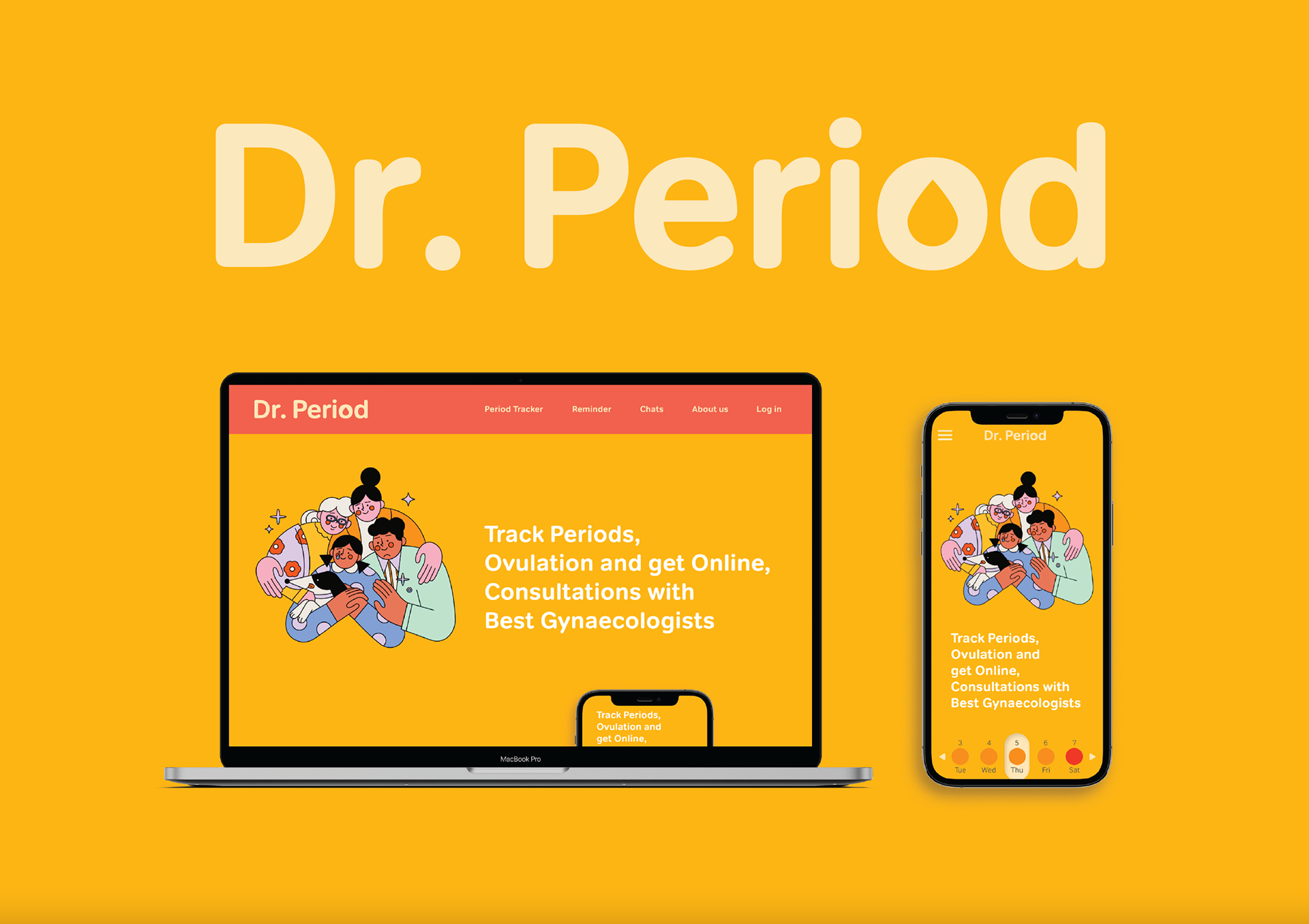
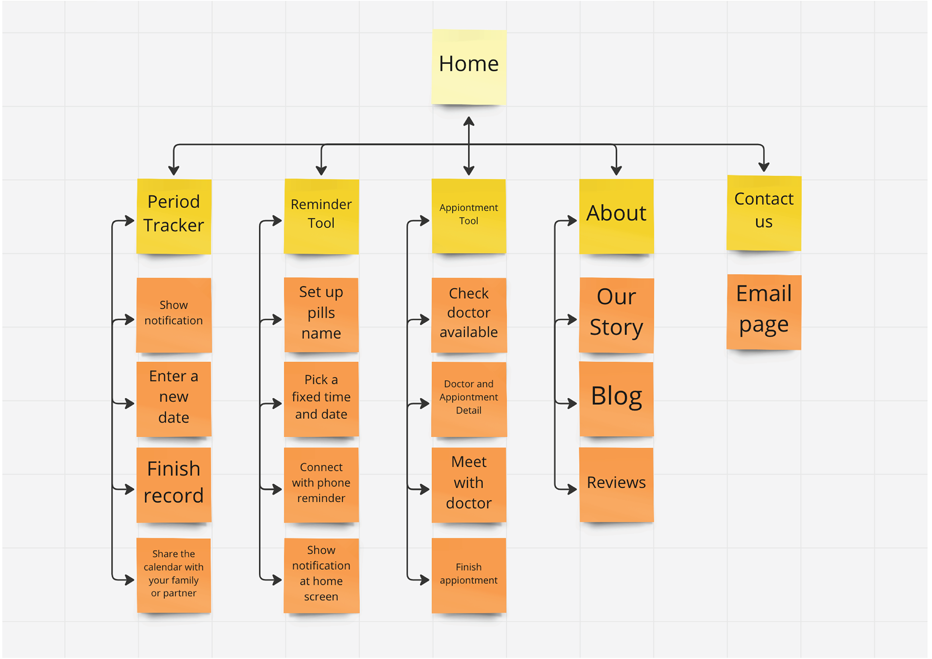
Dr. Period is a period tracker website that works by allowing users to record the start and end dates of their periods, as well as any symptoms they may be experiencing. The website uses this information to predict future periods and to provide reminders for upcoming periods. The website also offers the additional feature of the software being updated with blog posts about period knowledge to help users get a closer look at themselves. In addition, the website supports calendar sharing with family or partners to help them become more aware and attentive to the user’s health.
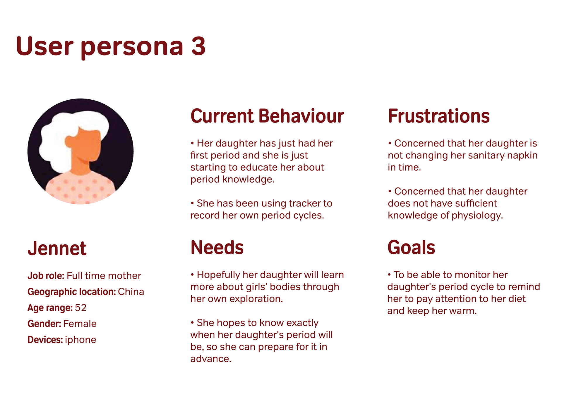
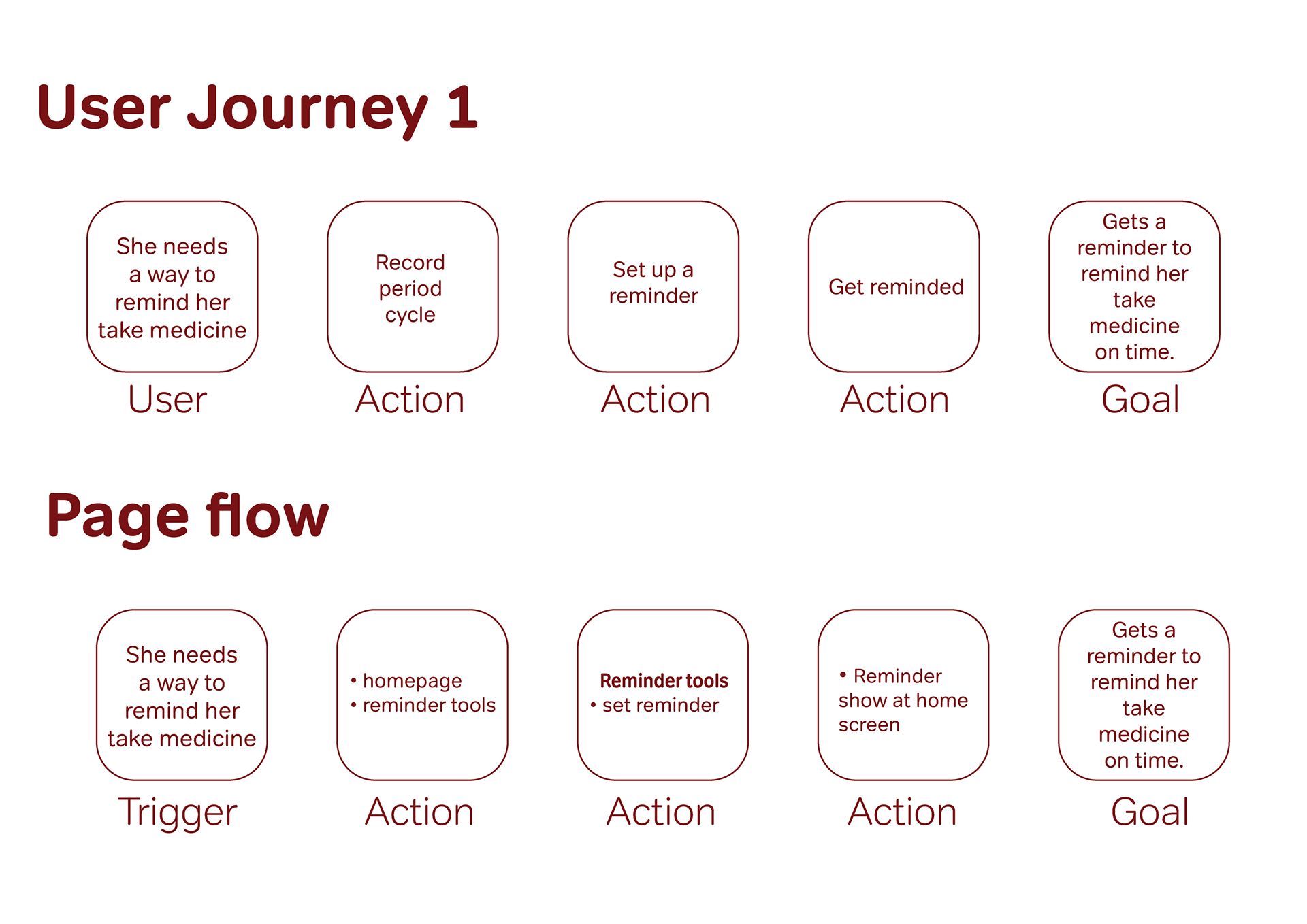


Personas and User journeys
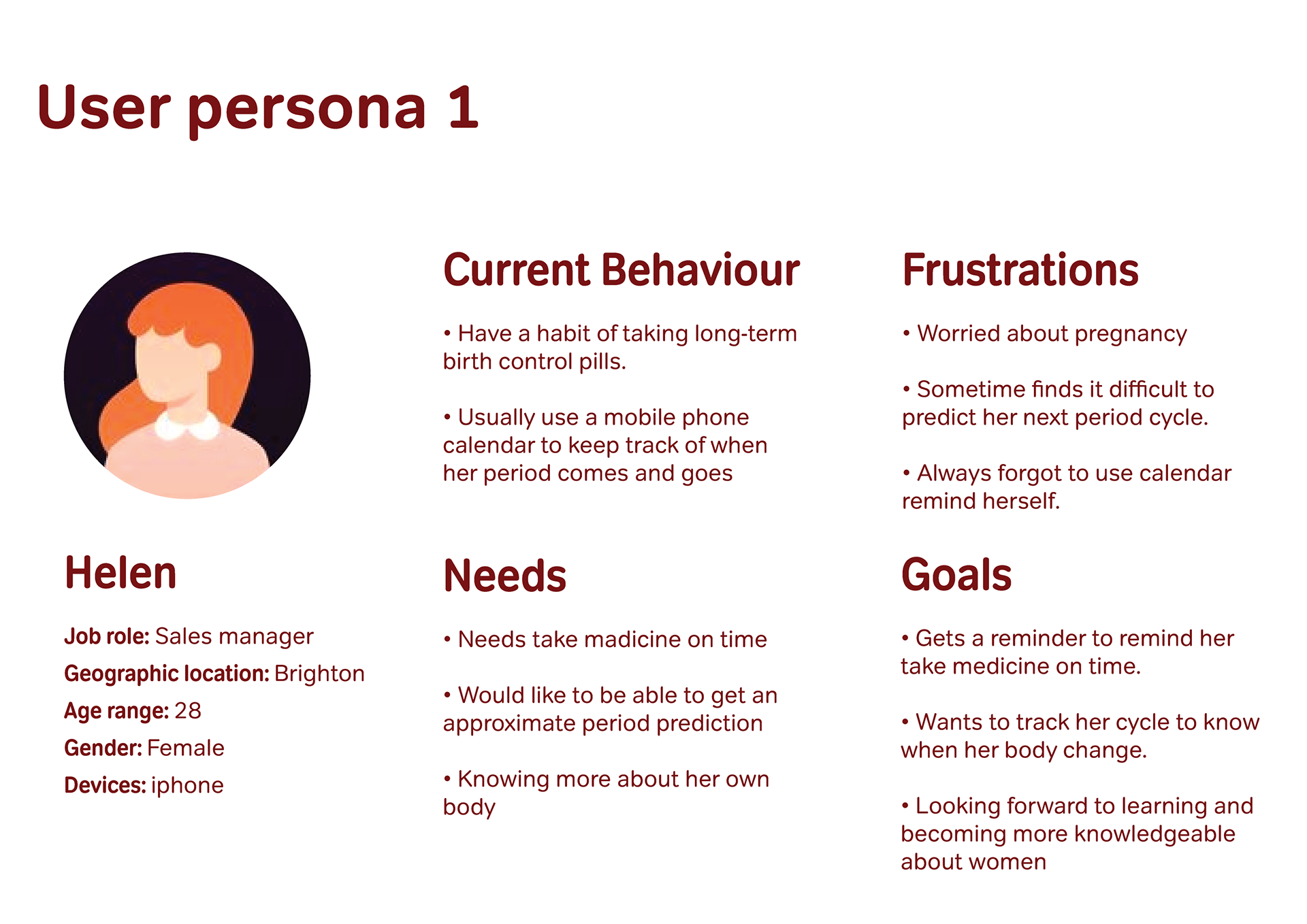
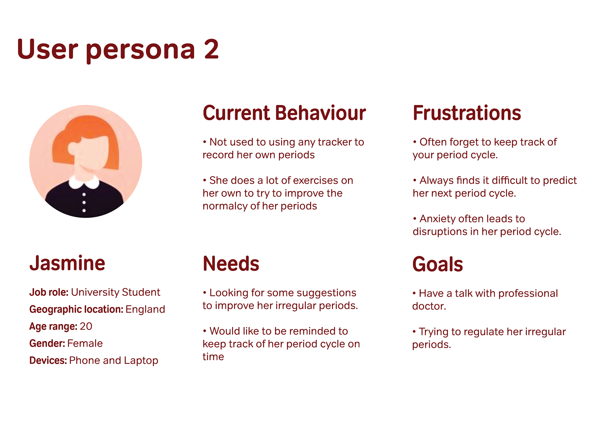
My users are based on my colleagues, me and my mother. I have learnt that women prefer to use this site to learn more about themselves or to keep track of their cycles and to adjust irregular periods in a sensible way. Also different users have different needs and medication reminders are extremely important for women who use medication to help regulate their periods. They need to be taken regularly to prevent endocrine disruption. Being able to consult on the website also helps people to be more aware of their health condition before booking a GP appointment.
Sketching and wireframing
From my interviews with those who had recorded their periods, I found that these people were trying to manage their own health or share their thoughts on wanting to make their families more aware of women’s health. In mapping out the low fidelity I first placed my focus on mobile devices. When I finish designing for a device then designing for the computer side will be easier. I roughly sketched out the typographic placement of the calendar and reminders. Initial ideas were placed on each of the functional pages.
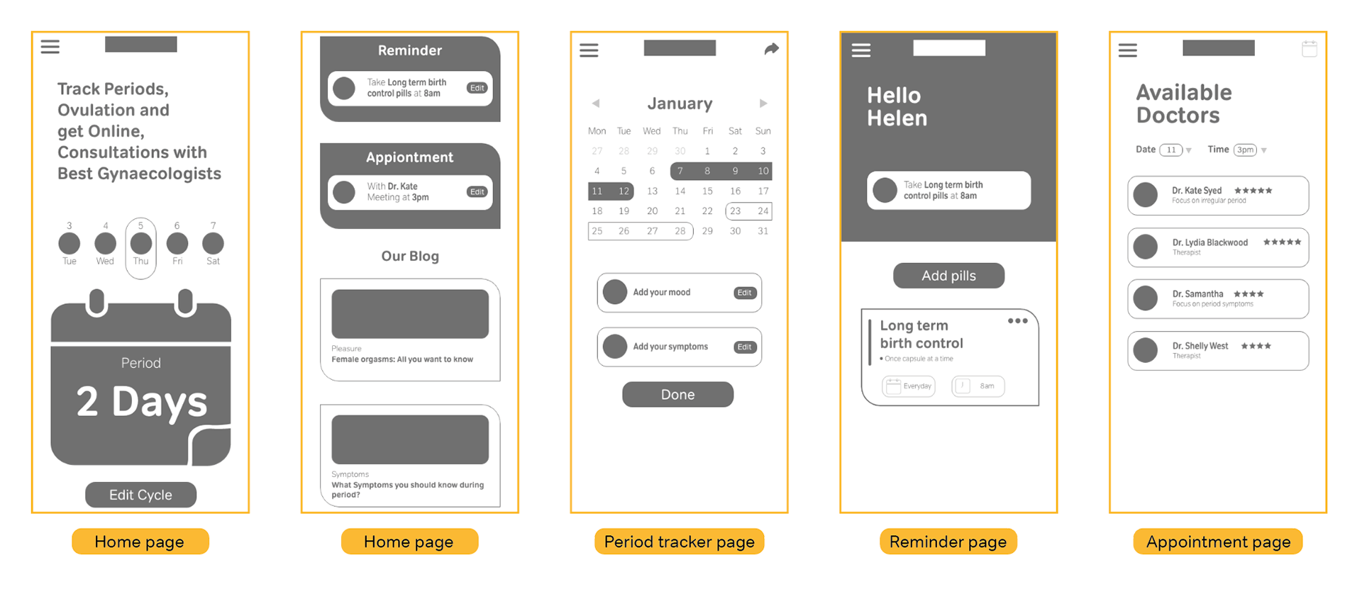
Mobile mid-fidelity wireframes
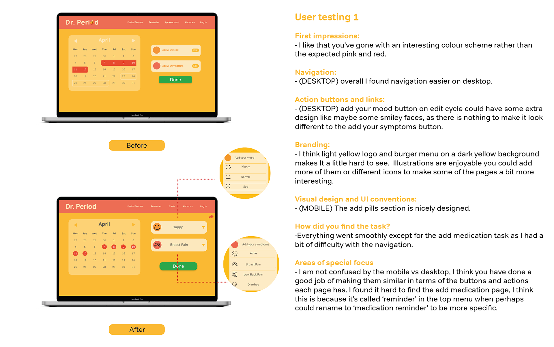
I did user testing in the mid-fidelity prototype, from which I learned that users did not quickly and accurately understand what the boxes on the home page meant. The different boxes made them think that they were clickable pages like articles. The most common finding was that users needed more choice in selecting their period symptoms and moods. I asked users if they were comfortable using this period tracker. Some would say that I couldn’t tell at the very beginning that the dates at the top of the calendar were swipeable, which seemed a little hard to spot. I also asked them if they felt like they were using a website made for women when using the site. Many were very hesitant at this point. Some said that I didn’t know what colours would be used on the site yet, so “ probably yes” in terms of functionality only. I got some ambiguous responses. Some people also suggested that because many of my boxes were very similar but represented different meanings, they were often confused in the selection process.

Desktop mid-fidelity wireframes
The biggest difference in desktop and mobile application design is the screen size. Desktop applications can support a fixed navigation bar, whereas mobile devices are usually limited to a hamburger menu. On mobile devices I use 4 columns as a typographic base, whereas on computer devices I use 12 columns as the main base. Because of the limitations of mobile page size, much of the content needs to be swiped, whereas computer devices see more than in mobile phones because the screen size is large enough to fully contain most of the content.

User testing of prototype

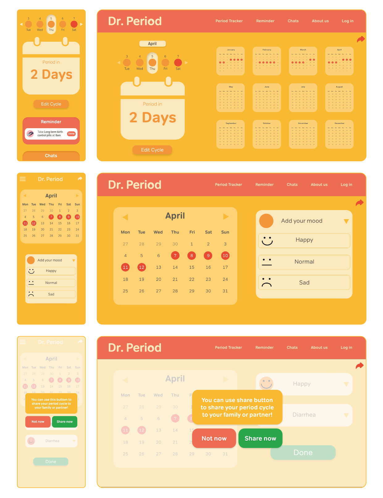
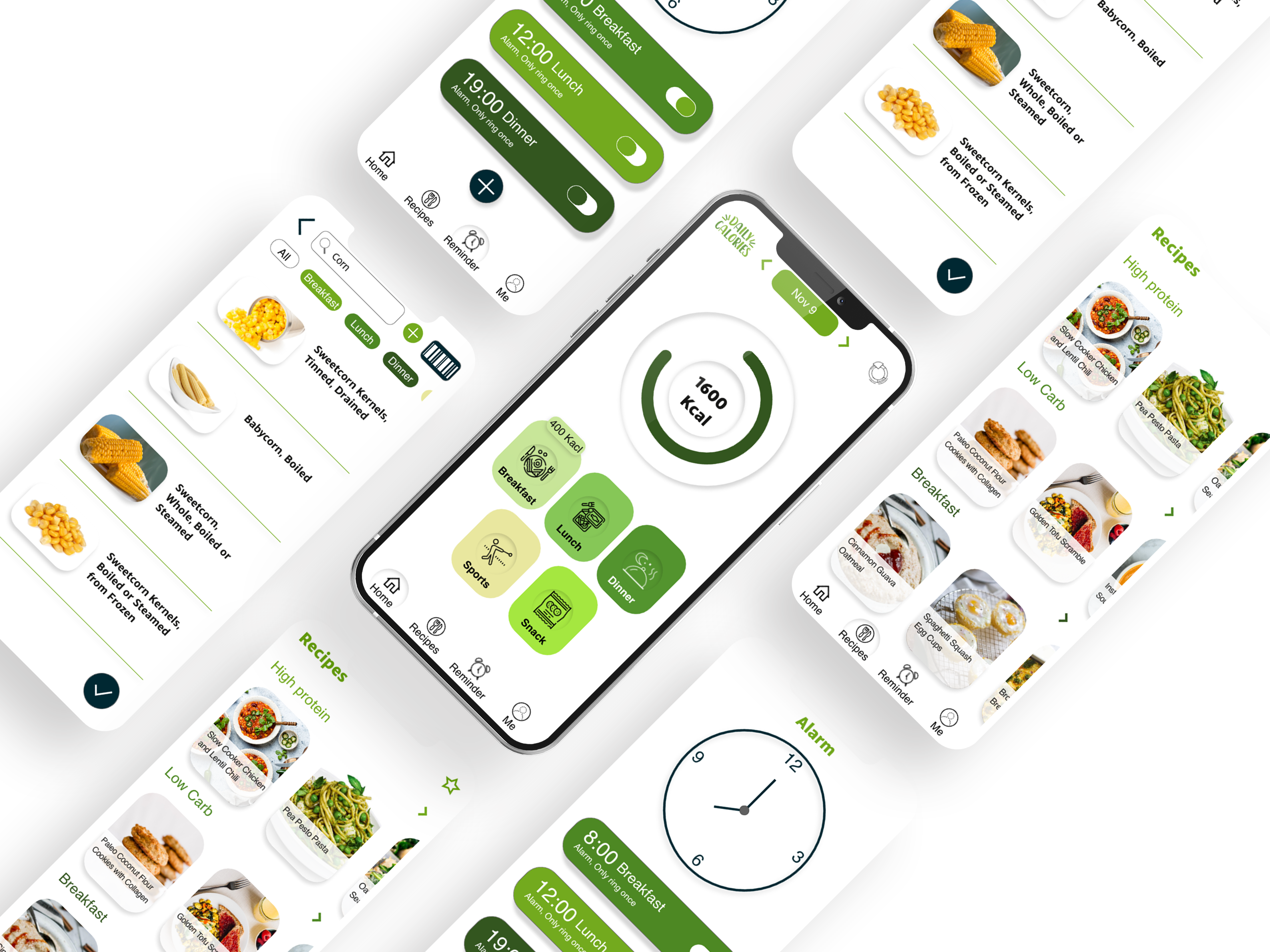
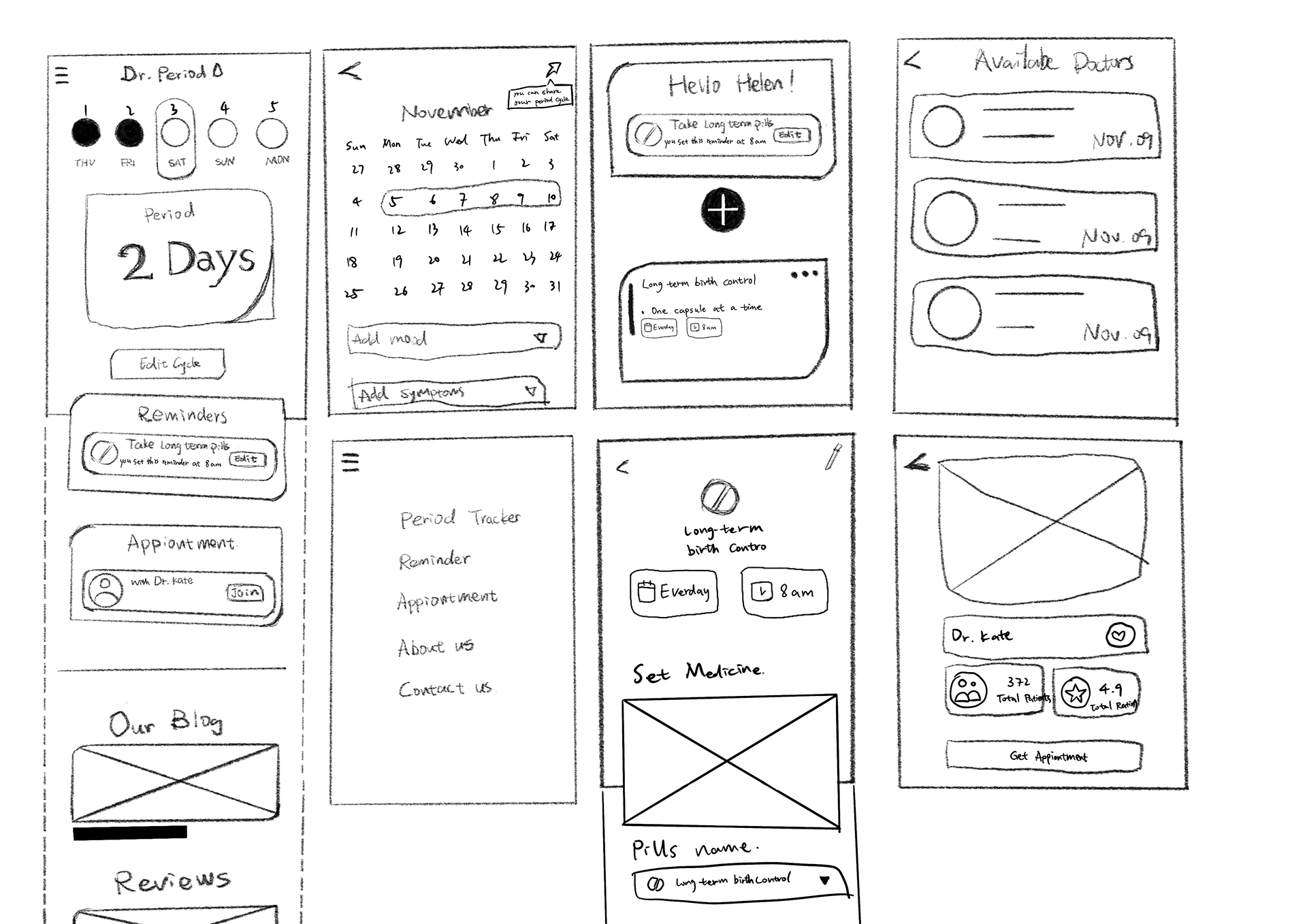
On the mobile page, the homepage shows a countdown reminder of the menstrual date and on the desktop page I have placed the date reminder on a separate page next to the calendar for the year and the menstrual cycle that has been recorded. In the desktop page I have changed the main page to an information page in order to keep the user informed of each function while navigating the web. On the period tracking page, I added “mood” and “symptoms” to allow users to add their own personalised conditions. After adding a period log, users can choose to share the cycle with their family or partner.

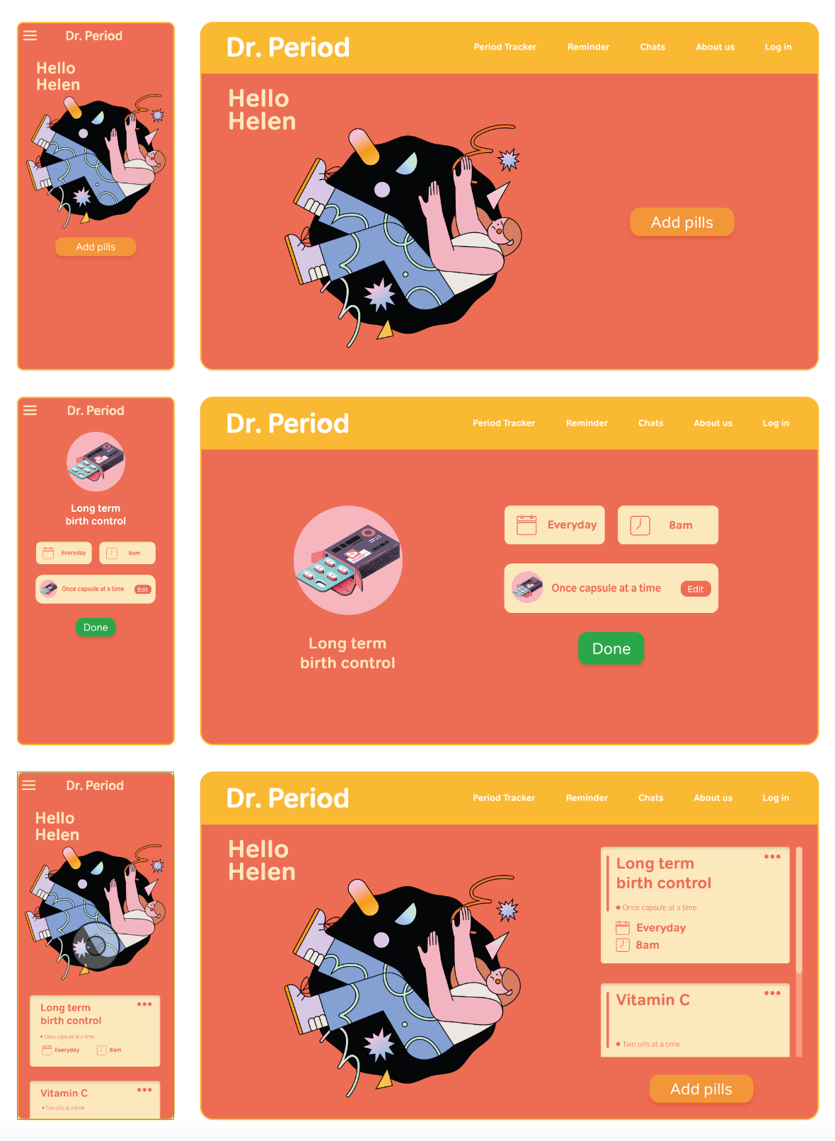
The Medicine reminder page is available to women who have daily medication needs. For example, women who take long-term contraceptives. Drug Reminder swipes through the pages in a top-to-bottom view on the mobile page, while on the desktop page it is a left-to-right to sequential view. After adding a medication, only the label to which the medication has been added can be swiped in the desktop page. The illustration and “Hello XXX” are fixed. The added medication is also displayed on the main page of the mobile page.

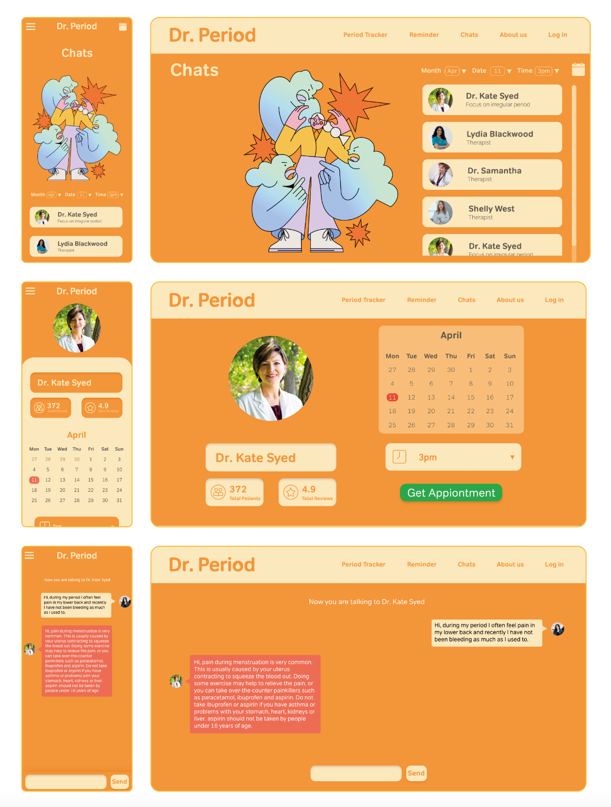
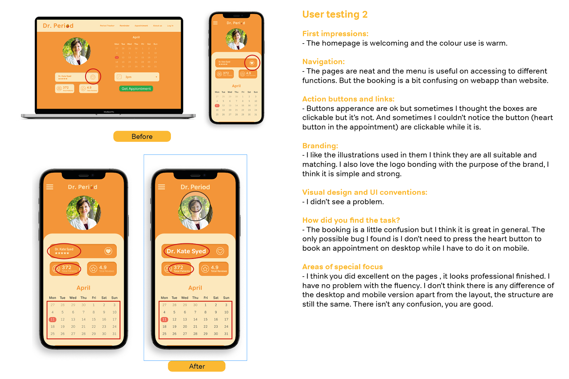
The Chats page is for users to be able to chat online with a consultant about their physical problems via text. Here you can find out more about your health condition and make an appointment with your local GP, and you will need to select the consultant you need to make an appointment. After selecting a date and time, the consultant will communicate with the user one-on-one to understand their needs. You can view your appointments on the calendar icon at the top right hand corner of the mobile or desktop page.
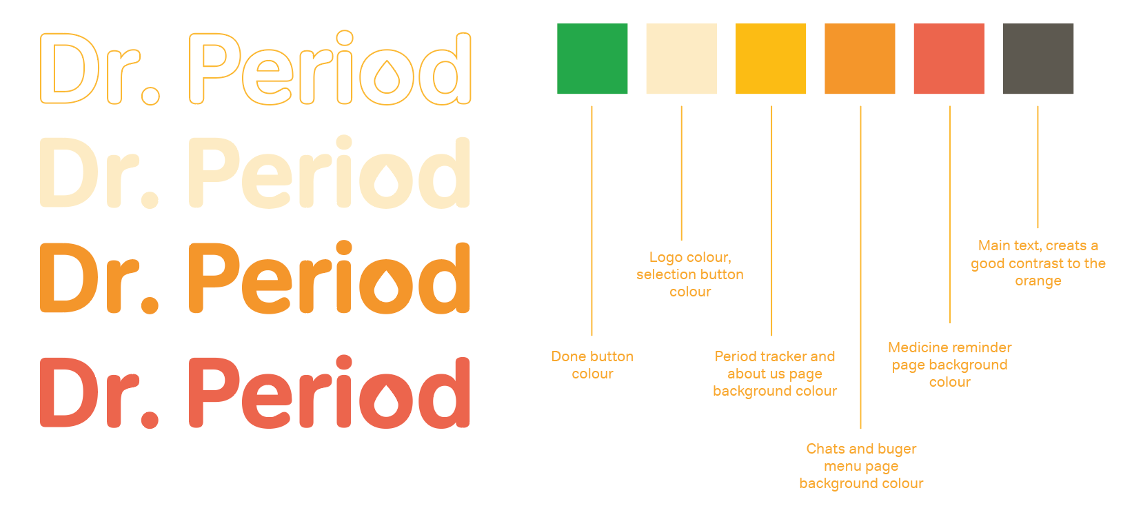
The logo consists of the name Dr. Period, which lets the user know that the software is health based while retaining the word PERIOD. In the letter “o” I have changed the shape of the inside to a teardrop shape. This echoes the blood in menstruation. I have unified the logo into one colour. This way, when the background colour changes, the logo can also be changed at any time. The “O” in the logo is still recognisable even in all single colours.
Mobile prototype
https://xd.adobe.com/view/78f69f87-eb5c-4518-9748-48183ce43575-2da5/
Desktop prototype
https://xd.adobe.com/view/b6330127-b781-4507-810c-f6df7491e6aa-e360/
Check my instagram post: https://www.instagram.com/p/CqCD7YpIzNh/