Who are Oasis?
Oasis is a charity that has been supporting families in Elmbridge, Surrey, and the surrounding areas since 1996. Oasis’ founder, Caroline Edwards, realised the cuts to Surrey’s social and childrens services would leave many families in her local community struggling alone. Caroline originally set up Oasis as a drop-in outreach organisation. As the years went on she realised the drop-in centre was not able to deal with the capacity of families looking for support. This is when Oasis was changed to be what it is today. Which is a charity that supports families every step of the way, from beginning to end.

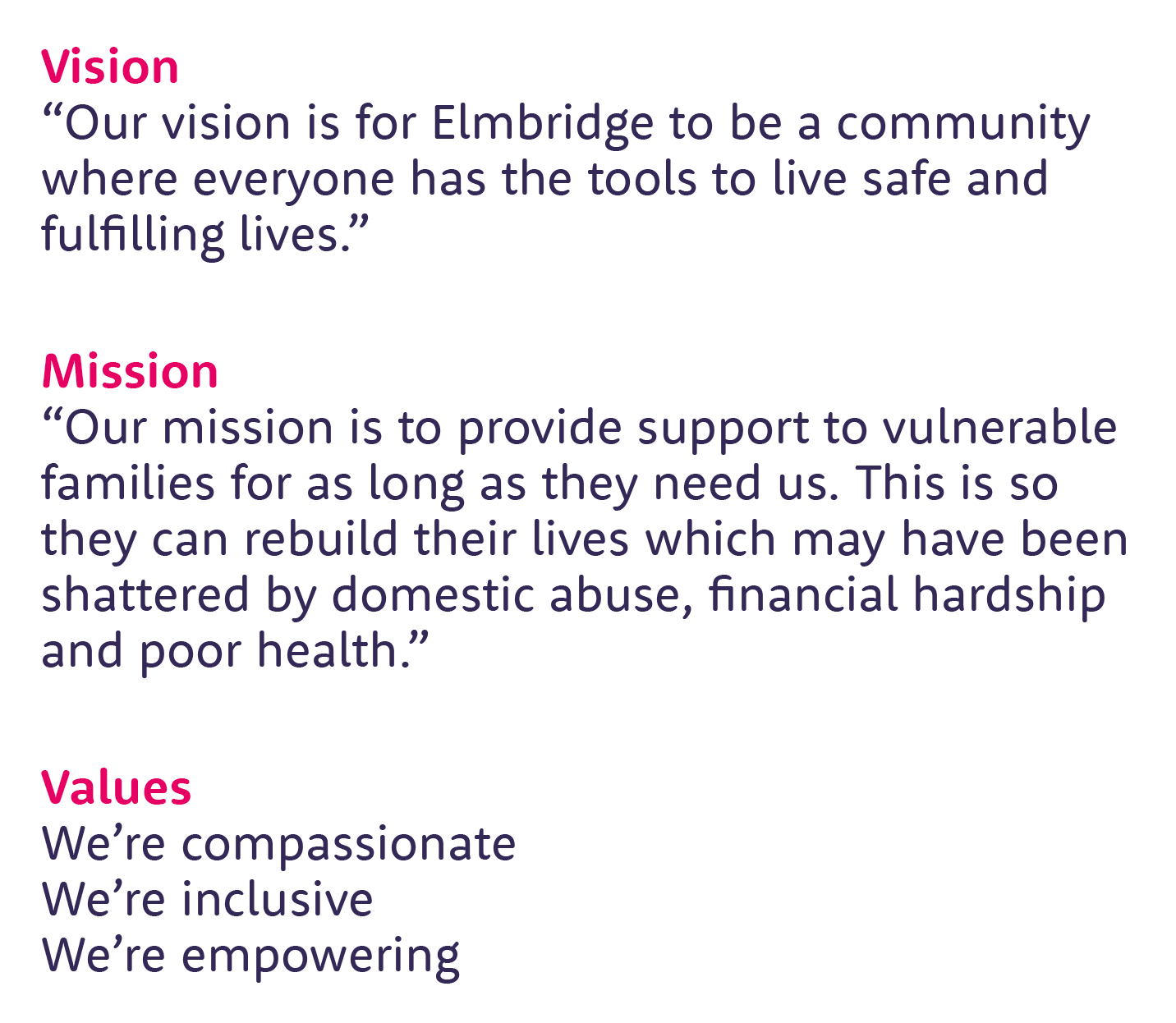
Oasis is a small local charity that relies heavily on the community around them to support them. Because of this, it was important that the vision statement included the name of the area. This is to create a sense of belonging for those who need thensupport but it also creates a sense of responsibilty for others in the area.
The mission statement needed to be transparent about what it is that cause families to go into crisis to evoke sympathy from people so they feel the need to support Oasis. It was also important for us to highlight the fact that Oasis do not set a time limit on how long they can support a family as this is what makes Oaisis different to many of its comparators.
Oasis’ previous values were not yet a concise set of phrases that had been officially discussed and so we have created a set of 3 short phrases that we have based off of our cnverstaios and meetings.

Oasis primary brand personality is the caregiver. This is becuase this exactly what Oasis do. They care for others. People involved with Oasis, whether they are volunteers, nursery workers, counsellors or benefactors, are likely to be caring, nuturing and selfless people.
We have also identified a secondary brand personality, hero. Hero’s are courageous and insiprational. This resonates with Oasis because the people who come to Oasis for support are made to feel proud that they reached out for help. Empowering and inspiring people to want to get out of whatever situation they are in is a key first step to changing lives.

Rooney Sans is the font we have chosen for Oasis. The reasoning behind this is that we wanted the typography to reflect the friendliness and warmth of Oasis just like the colours do. The rounded edges are soft and approachable whilst the cleanliness of the font means ensure text is legible and also can be taken seriously in more serious documents or topics. We also ensured it was a font family that had a wide range of weights that you could access so you have some flexibility with different types of designs.
Providence Sans Pro Bold is the typeface we have used for the tagline.We picked this as we wanted a handwritten font that almost mimicked the handwriting of a child. We wanted this so that there was a visual representation of the hands on, personal, approach that Oasis has with every family.
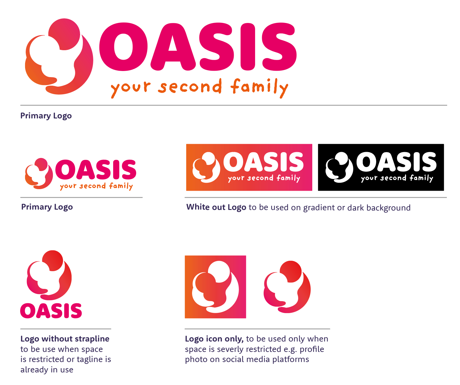

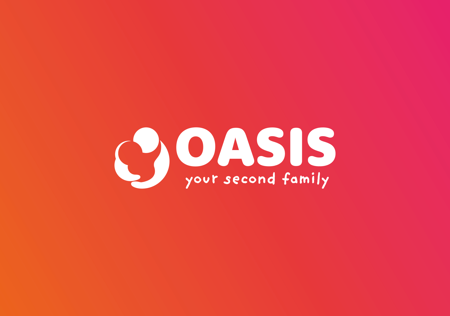
Our primary logo is a combination of an icon with text. The icon depicts 2 people hugging. We’ve made it very rounded to mimic the O from Oasis. This icon be interpret as a parent and child or adult and supporter both of which are suitable interpretations as Oasis help such a wide range of people. We have demonstrated some variations of the primary logo to ensure there is felxibilty in how the logo and elements of the logo can be can be used.
We also added some rules to tell clients about how not to treat our logo. The logo should not be changed in any circumstance. If you need an alternative option (for example not enough space) refer to the previous page for logo variations.
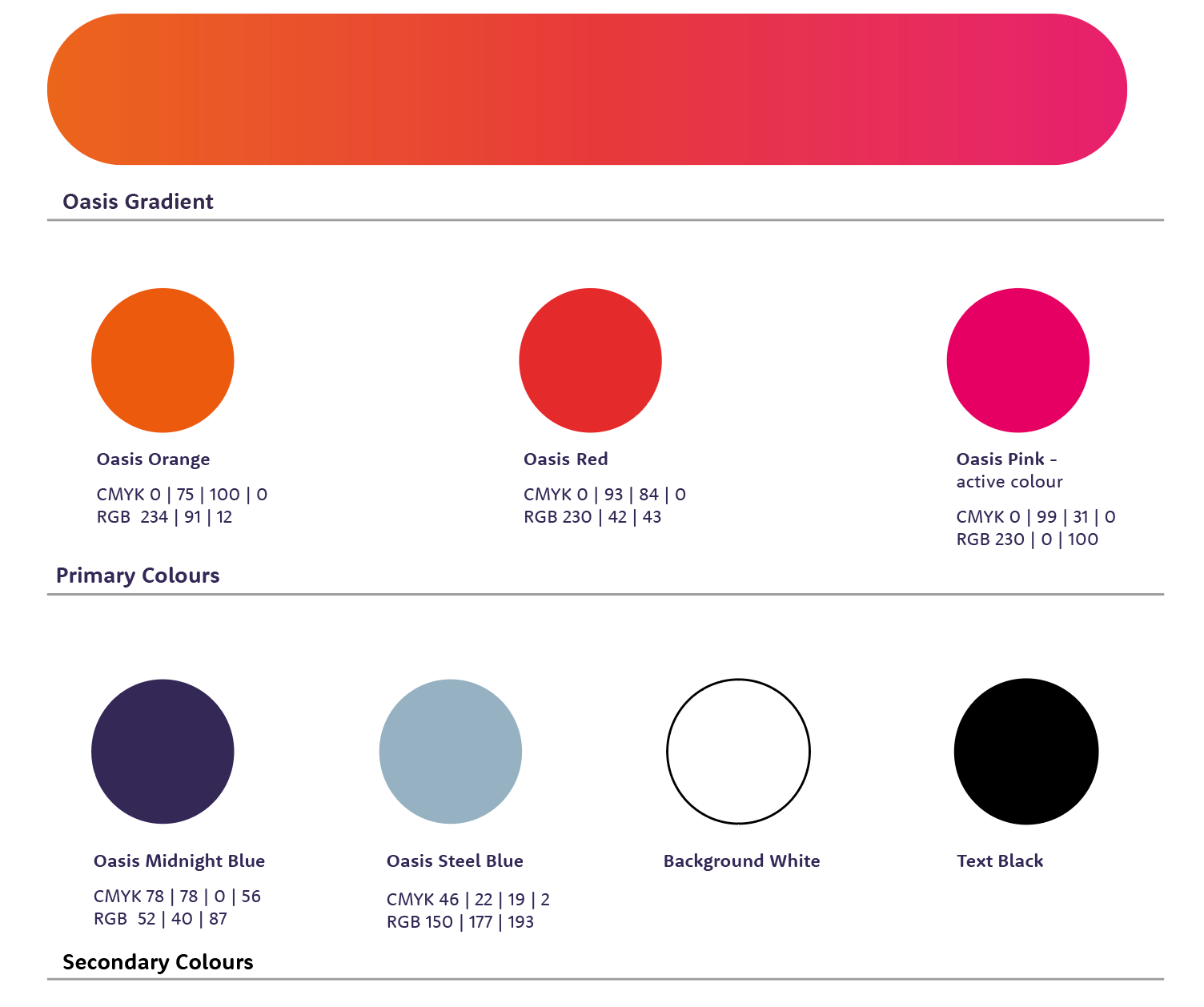
Our colours are warm and friendly to reflect our compassionate nature but also bright to show we are empowered and empowering others. The Oasis gradient should be at the core of our colour application, mostly used for backgrounds. The three main colours that make up this gradient are also core colours that should be used most in our branding. Oasis Pink should be used for calls to action. For example buttons you want people to press on the website such as ‘donate’. We have picked 4 secondary colours that compliment the primary colour palette. These are to be used when more than 3 colours are needed in a design. For example the steel blue can be used for pull outs on the website etc.
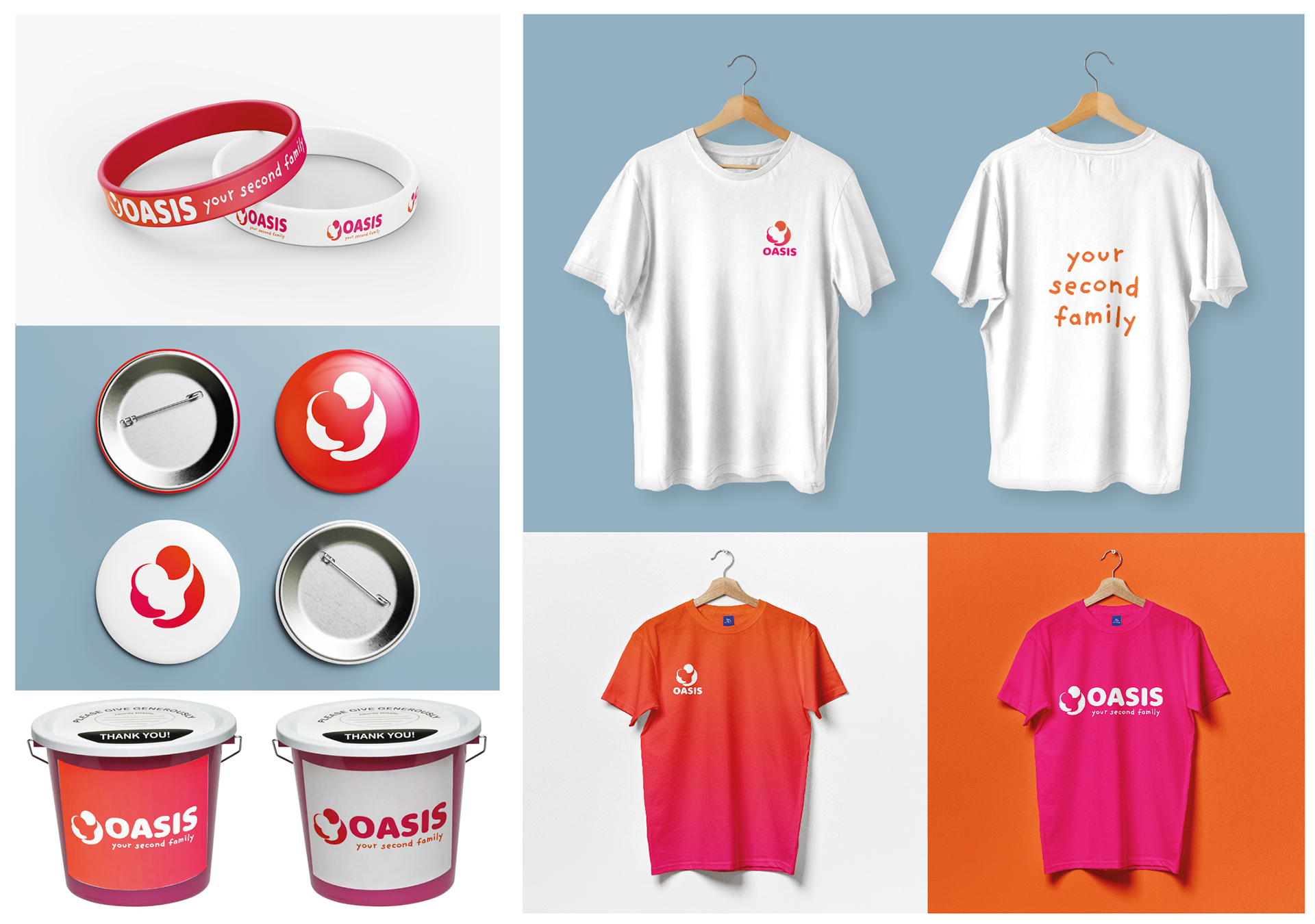
Charity merchandise can be used to maintain donor loyalty, fundraise, raise awareness and engage with stakeholders at events. Having items branded with Oasis’ colours and logo will mean people, especially in the local community, will start to recognise the logo the more they see it. Recognisability will help the people in the community start to trust Oasis more and so will be more willing to set up a regular donation. Trust is important for donators as people work hard to earn their money so they want to make sure it is going somewhere that will use their money well.
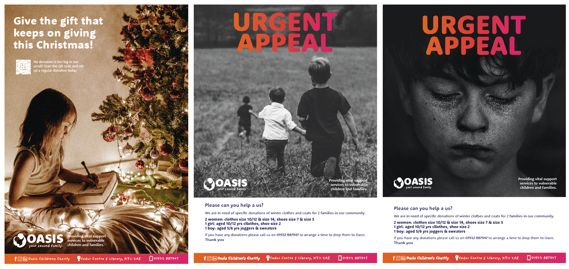
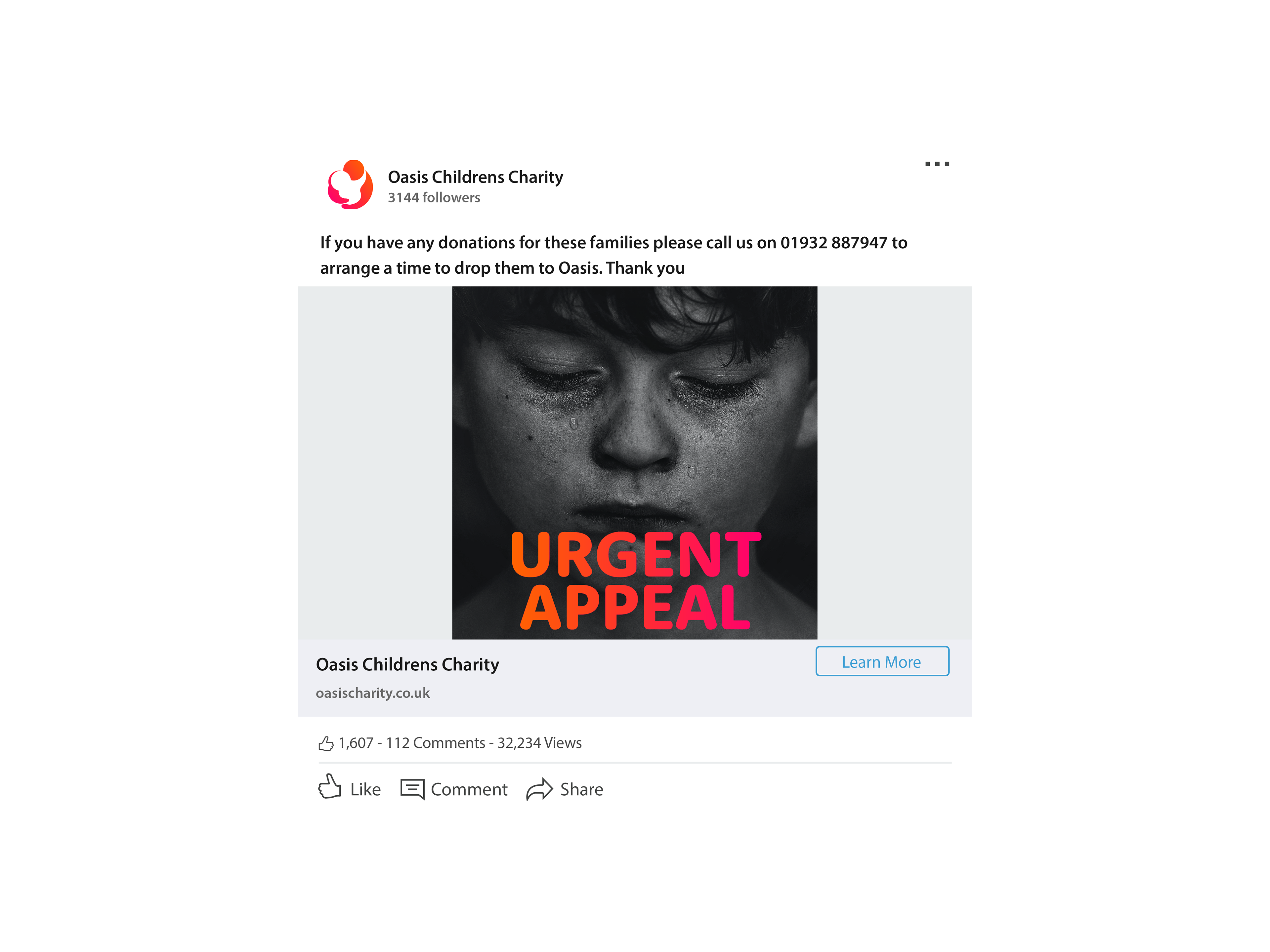
An urgent appeal poster was made with variations of images on them. This is to show the 2 different photographic routes. One more serious and hard hitting, and the other more light-hearted but still in black and white. A consistent branding element that will appear on the posters is the gradient bar at the bottom with the social media handles, phone number and address on. This allows for you to have more freedom with the image choice, for example the Christmas poster on the left, whilst still ensuring the poster is sufficiently branded.
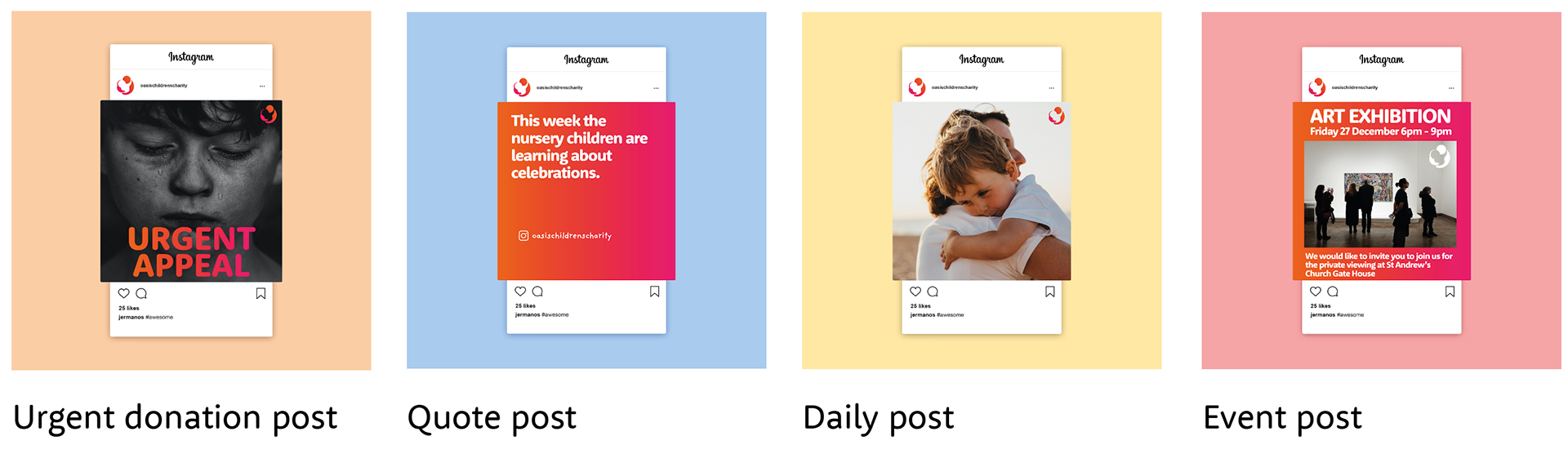

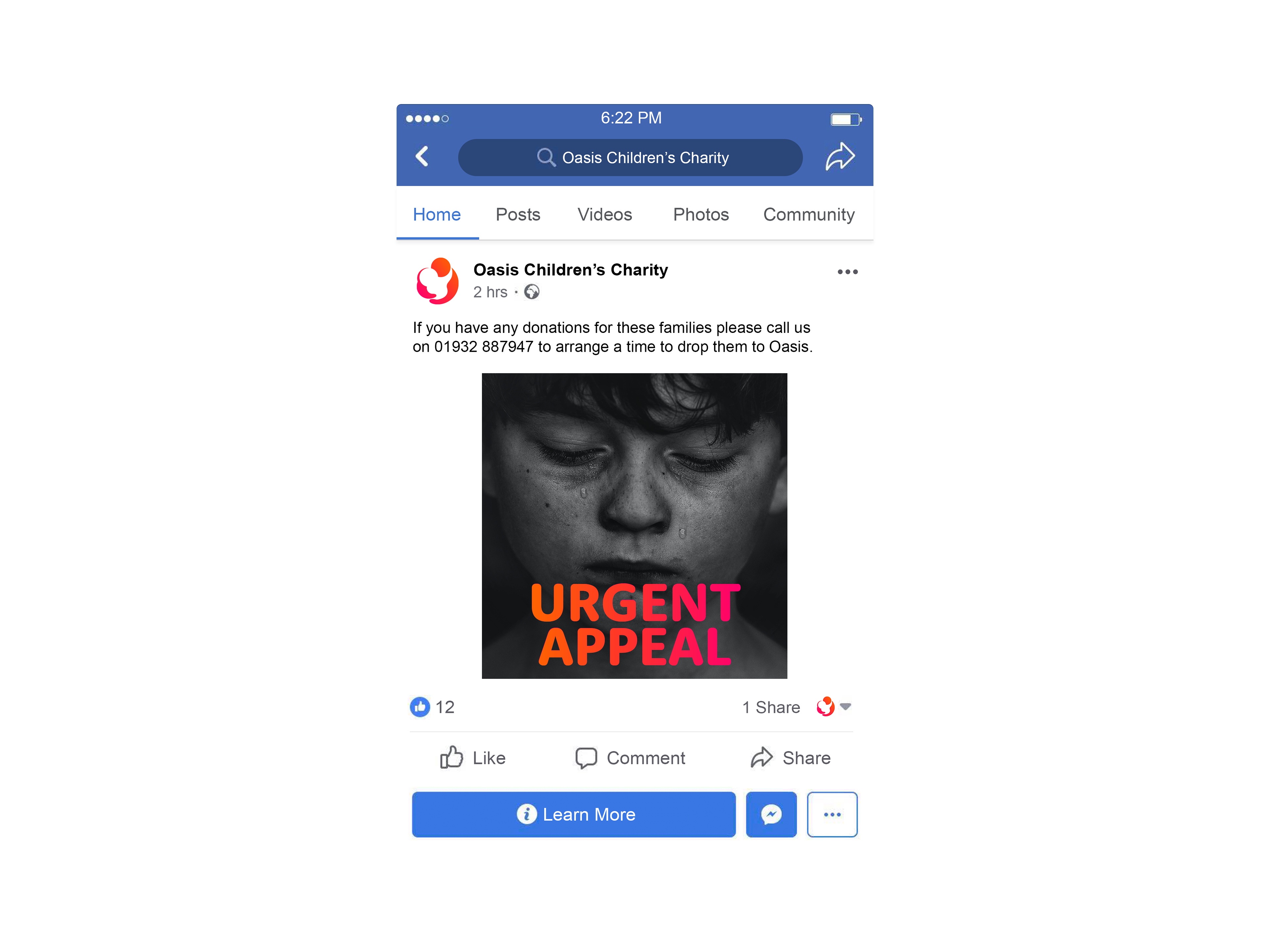
Instagram follows the same colour scheme as explained earlier, with four different post categories based on Oasis’ currently published posts. The urgent donation posts use black and white images with a big and bold headline in the brand gradient. Quote posts use the Oasis gradient for the background. As do events posts, but these should also include an image as well as white text. The Oasis icon should be featured in a corner of all posts, either the original icon or the white out version depending on the background.
Facebook is mainly used for community communication. We would advise you to join any local Facebook groups and share updates and events on there as well as your main page. If you make your Instagram a business profile, you can connect it to the Facebook page. This is useful when posting as the posts will more or less be the same as the Instagram posts. Once you have connected the two accounts you can give the account permission to also post on the Facebook page when you post on Instagram. LinkedIn is also an extremely important part of social media. Sharing content on LinkedIn will help to increase support from companies, businesses, and professionals. This could be especially helpful when looking for volunteer counsellors etc.
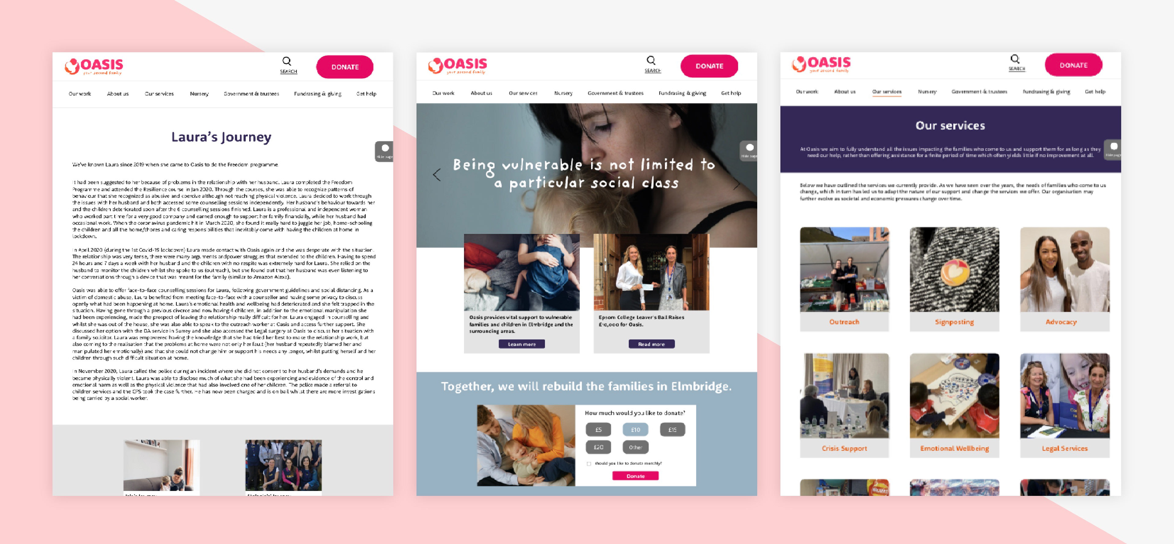
The donation page on the original website consisted of a lot of text and no direct way to make donations on the website itself. So we have created a simple donations page on our prototype that also has a small thank you page at the end that lists how their donation may be used. You can access this donation page from any page on the website as we have placed the donate button on the top bar for easy access. We have also included a donation section on the homepage with pre-selected amounts to choose from. The less obstacles people face to complete a process the more likely they are to follow through to the end and make the donation.
We also add a small ‘hide page’ button on the right. Some users, particularly those in domestic abuse situations, may not want other people to know the website they are visiting. This button would mean a ‘no internet connection’ page would open up if it is clicked, hiding the previous page from others who can see the screen.